A Room That Already Felt Like 2026
A friend moved into a new flat in late autumn, and the first time I walked in I stopped just inside the door. Nothing in the room was grey. The walls were a soft warm khaki, the kind of colour that changes a little as the light moves across it. The sofa was a deep chocolate brown, the sort you sink into rather than sit on. There were burgundy cushions, a terracotta pot with a real olive tree in it, and a brass lamp throwing a warm circle of light onto a pale oak side table. It felt calm. It felt like someone actually lived there, not like a showroom that had been styled for a photo and then left alone.
I asked her when she had painted, and she laughed. She had not hired a designer. She had simply picked colours she liked looking at every day, and it turned out the rest of the design world had arrived at the same place at the same time. That is the story of colour in 2026.
This guide walks through the ten colours that define 2026, one by one, with honest advice on how to try each one. Some you can test with a single cushion on a Saturday afternoon. Others are worth a full wall or a new sofa.
The short answer: interior design color trends for 2026 are warm, earthy and liveable. Chocolate brown leads the year, followed by burgundy and plum, warm khaki neutrals, terracotta, caramel, deep green, seafoam, icy blue and a small jolt of chartreuse. Cool grey is fading, and colour that feels natural and grounding is taking its place.
If you remember one thing, remember this. Pick one trend, not five. A room with one confident colour and quiet supporting pieces always looks better than a room that tries to show off every trend at once.
What Changed, and What the Numbers Say
Colour trends do not change because someone in an office decides they should. They change because enough people, in enough rooms, start wanting the same feeling. For a long time that feeling was clean and cool. Grey floors, white walls, black frames. It photographed well and it asked nothing of you. But after a few years of living inside those rooms, people started to notice something. The rooms looked fine, and they felt like nothing.
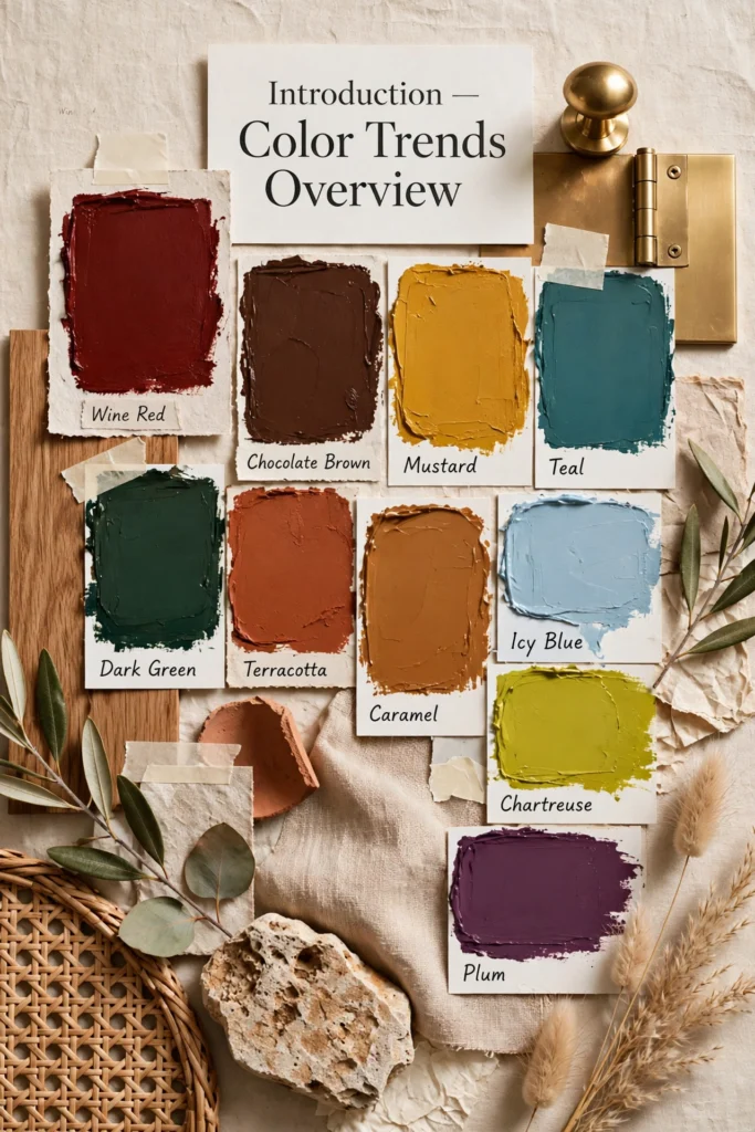
The 1stDibs designer survey for 2026 gives that feeling a number. The survey asked 468 interior designers which colour they expect to see most, and 33 percent picked chocolate brown. That is nearly double the 17 percent who picked it in 2022. Searches tell the same story from the other side. Houzz reported searches for chocolate brown up 153 percent. People are not just admiring brown rooms online. They are actively looking for ways to bring the colour home.
Burgundy and plum have made a similar jump. In the same survey, the share of designers picking burgundy or plum rose from 7 percent to 21 percent. That is a big move for colours that used to be treated as risky. Sherwin-Williams named Universal Khaki, SW 6150, as its Color of the Year for 2026, a warm yellow brown khaki that sits neatly between the earthy neutrals and the deeper browns. Powdery pastels are rising too, soft lilac, pale blue and blush, as a gentle counterweight to all the depth elsewhere in the palette.
None of this means your grey sofa is suddenly wrong. It means the centre of gravity has moved. The colours winning in 2026 are warm, a little dark, and easy to pair with wood, linen, brass and leather. They suit rooms where people cook, read, argue about what to watch, and fall asleep on the sofa. That is the test every trend in this guide has to pass. Does it work on a normal Tuesday, in a normal room, with normal light? All ten of them do.
The Ten Colours Defining 2026
Here they are, in the order that matters most. Brown and burgundy lead because the surveys and the searches point the same way. The neutrals come next because they hold everything together. Then the greens and blues, the warm clay and caramel, and finally the two colours that work best as accents. Read them all, then pick one. Your room will thank you for the restraint.
1. Warm Wine Reds

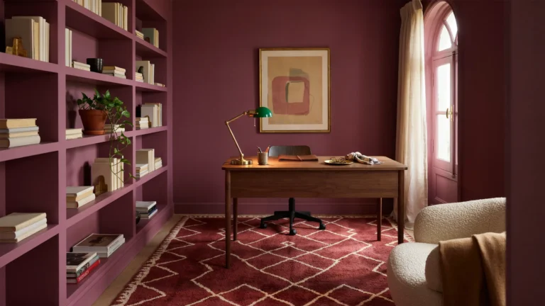
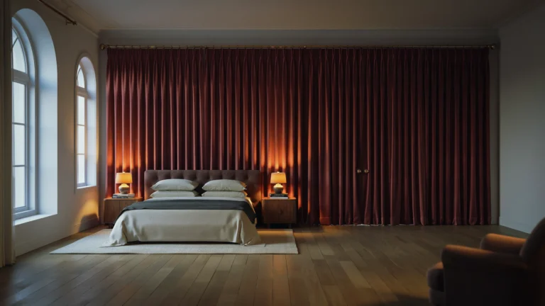
Red has spent the last few years quietly rebuilding its reputation, and in 2026 it has arrived fully formed. This is not the bright fire engine red of a childhood bedroom. The reds designers reach for now are deeper and dustier. Oxblood, burgundy, wine. They feel closer to a leather armchair or a glass of red wine than to a stop sign, and they give a room an instant sense of history and weight.
Try it small first. A pair of burgundy velvet cushions on a cream sofa changes the whole mood of a living room for the price of a dinner out. A wine coloured lampshade does the same in a bedroom. If you have a dining room, a set of burgundy dining chairs is one of the best small commitments in this whole guide, because you see them every single day and they make even a plain table look considered.
Commit big with one wall, not four. A wine red accent wall behind a bed or a dining table creates a backdrop that makes everything in front of it look richer. Wood tones, brass, cream linen and dark art frames all sit beautifully against it.
What to avoid: red on every wall in a small room, which can feel heavy by evening, and pairing wine red with bright white, which makes the red look harsh instead of soft. If your room gets little natural light, keep the red to one wall and let the other walls stay warm and pale. A moody modern vintage bedroom transformation shows how well this kind of deep colour works when it is balanced with soft bedding and warm wood.
2. Rich Chocolate Brown

If 2026 has one defining colour, it is chocolate brown. The 1stDibs survey put it first by a clear margin, with a third of designers naming it the colour of the year, and Houzz searches for it more than doubled. Brown spent years being overlooked in favour of grey, but grey never offered what brown does. Brown feels like being wrapped in something soft. It grounds a room, it hides the marks of daily life, and it makes other colours look better just by standing next to them.
Try it small first. A chocolate throw folded over the arm of a chair, a set of brown linen cushions, or a dark wood tray on a coffee table will tell you within a week whether you love living with the colour. A brown leather chair is a slightly bigger step, but it is one of those pieces that only gets better as it ages and picks up marks.
Commit big with a sofa. A chocolate brown sofa is the anchor of a 2026 living room. It pairs with cream, warm white, pale oak, brass and almost every other colour in this guide. If painting appeals to you more than furniture, chocolate brown wall panelling in a bedroom or a study feels expensive and calm, especially with warm lighting.
What to avoid: painting all four walls dark brown in a small north facing room, where it can feel gloomy instead of cosy, and confusing brown with black. Brown needs warmth around it. Cream, caramel, soft gold and natural wood keep it rich. Cold chrome and icy white push it towards muddy. For more ideas on building a room around warm colour, these interior color trends for cozy homes show how brown sits at the heart of a comfortable palette.
3. Earthy Grounding Neutrals

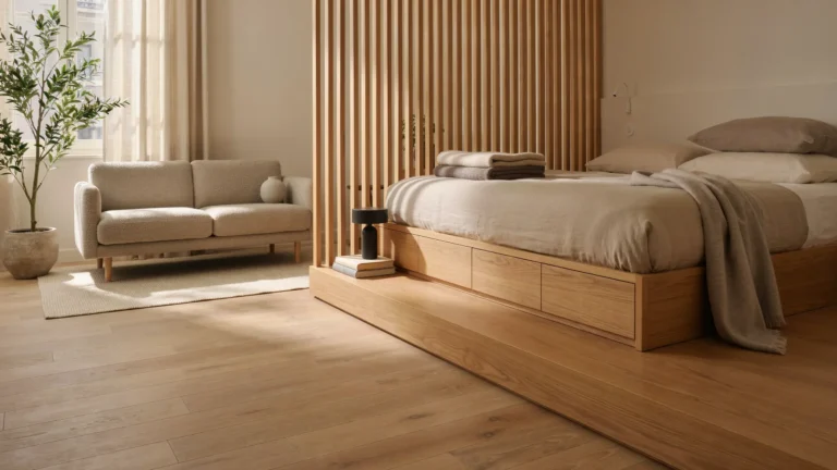
Every bold palette needs a quiet base, and in 2026 that base is warm and earthy rather than cold and flat. Think khaki, warm greige, mushroom, clay beige and soft stone. Sherwin-Williams chose Universal Khaki, SW 6150, as its Color of the Year for 2026, and it captures the mood exactly. It is a yellow brown khaki that reads as neutral from across the room and warm and interesting up close.
Try it small first. Swap in khaki or mushroom bedding, hang linen curtains in a warm stone shade, or paint a single piece of furniture, a dresser or a side table, in a clay beige. These small moves change the temperature of a room without changing its character, which is exactly what you want if you like your furniture and only want the walls to feel kinder.
Commit big with full walls. A limewash or matte finish in warm greige gives a wall texture and depth that flat white never had, and it makes art, wood and plants stand out. These neutrals are also the best choice for a whole home colour, one shade carried through hallways and living spaces so the house feels connected.
What to avoid: flat beige with no texture and nothing warm near it, which can look unfinished rather than calm. Earthy neutrals need company. Wood, linen, wool, rattan and a little black or dark brown for contrast keep them from sliding into bland. A touch of pattern helps too, a striped cushion or a simple woven rug. If you like soft grey tones but want them warmer, these cozy grey boho living room vibes show how grey can still work when it leans warm and textured.
4. Calming Seafoam and Teal
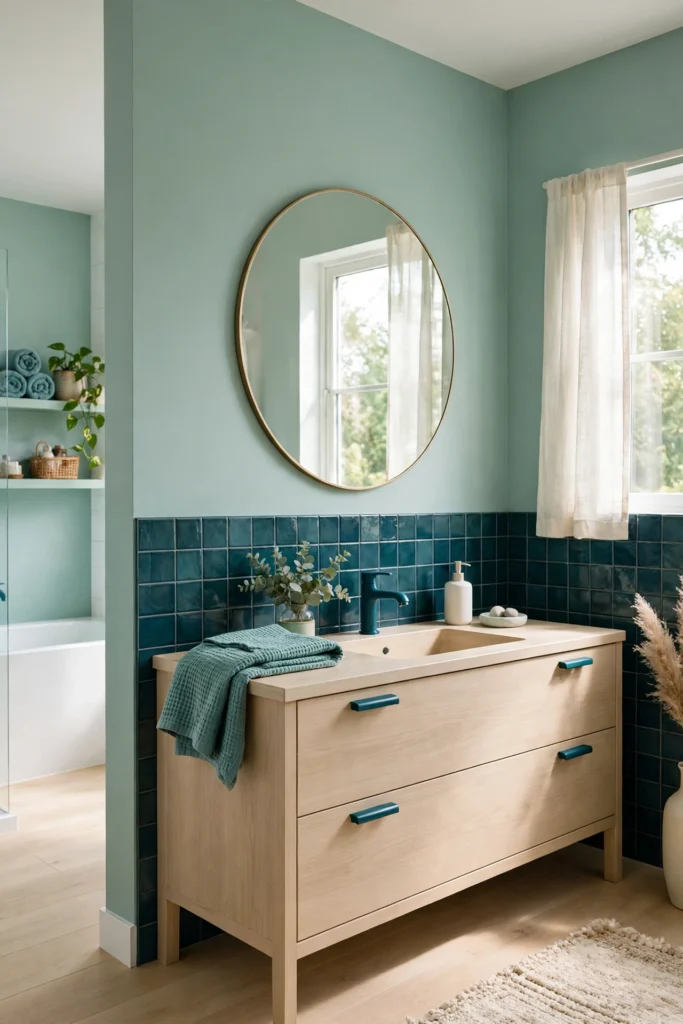
After all the warmth of brown and burgundy, seafoam and teal are the cool breath in the 2026 palette. Seafoam is pale, soft and a little misty. Teal is its deeper, more confident sibling. Together they bring the feeling of water and sky into rooms that need to slow down, which is why they show up most often in bedrooms and bathrooms.
Try it small first. In a bathroom, seafoam towels, a teal soap dish and a small framed print are enough to set the mood. In a bedroom, a seafoam throw at the foot of the bed or a pair of teal cushions against white bedding gives you the colour without repainting anything. A single teal vase on a shelf can anchor a whole corner of a living room, especially next to pale wood.
Commit big with tiles or a wall. A bathroom in seafoam tiles with warm brass taps feels like a small spa, and it is one of the most forgiving colour choices for a room that gets steamy and wet. In a bedroom, a teal wall behind the bed works like a headboard that never needs dusting.
What to avoid: teaming teal with cold chrome and bright white everywhere, which can make the room feel like a swimming pool, and pairing it with strong orange red, which fights it. Teal also needs light. In a dark room, choose the paler seafoam end of the scale and keep the teal for smaller pieces that catch the light.
5. Dark Verdant Green

Dark green is the colour of a library at dusk, and in 2026 it has moved out of the library and into the rest of the house. Verdant green is deep and leafy, richer than sage and softer than emerald. It makes a room feel private and settled, and it has a strange talent for making wood furniture, brass and cream fabric all look more expensive than they are.
Try it small first. Paint a side table or a bookshelf in deep green and watch how it changes the corner it sits in. A set of dark green velvet cushions on a neutral sofa does the same job with no paint at all.
Commit big with cabinets or a full wall. Green kitchen cabinets with brass handles and pale worktops are one of the most loved looks of the year, and they age well because green sits so naturally next to wood and stone. In a bedroom, a dark green wall behind the bed creates a cocoon feeling that helps the room feel restful at night. Dining rooms love it too, especially with a wooden table, candlelight and cream linen.
What to avoid: dark green in a room with almost no natural light and no warm lamps, where it can turn muddy, and pairing it with too many other dark colours at once. Green needs a little light and a little contrast. Cream walls, pale wood floors or a light rug keep it from closing in. Dark walls in a bedroom are a commitment, so it is worth reading these black bedroom wall ideas for a modern makeover first, because the same rules about light, bedding and balance apply to deep green.
6. Sun-Baked Terracotta
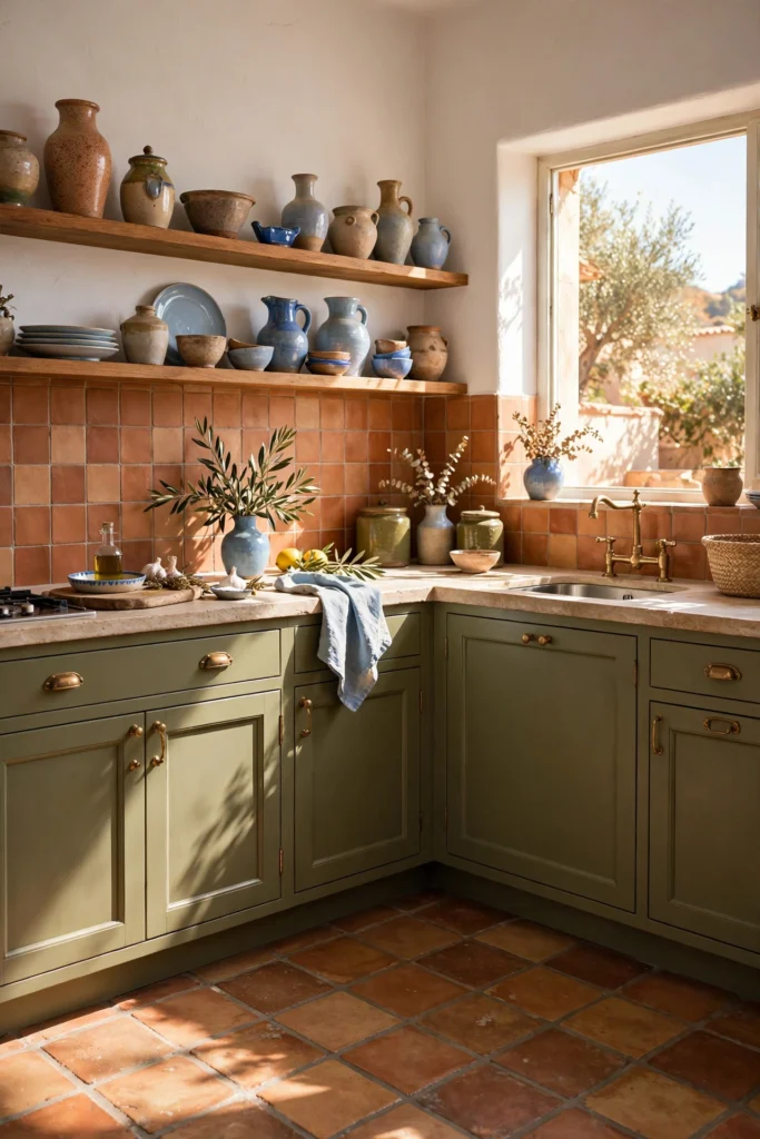
Terracotta is the colour of clay pots left in the sun, and it brings a warmth to a room that no other colour quite matches. It is orange, but a grown up orange, dusty and earthy rather than bright. In 2026 it shows up in kitchens, entryways, living rooms and outdoor spaces, anywhere a room could use a little heat without feeling loud.
Try it small first. A terracotta pot with a real plant is the easiest test in this guide, and it works on a windowsill, a shelf or a floor corner. Terracotta cushions on a cream sofa, a clay coloured throw, or a simple terracotta vase on a dining table all give you the warmth in an afternoon. A terracotta rug under a coffee table can warm up a whole seating area without touching the walls.
Commit big with tiles or plaster. Terracotta floor tiles in a kitchen or entryway are beautiful and practical, hiding dirt far better than pale stone. A terracotta plaster wall, with its soft uneven texture, makes a living room feel like a house in the Mediterranean, especially with pale wood, cream linen and a little olive green nearby.
What to avoid: terracotta next to bright orange or strong pink, which pushes it from earthy to garish, and using it in every room at once. Terracotta is a warm spice, not a base colour. One room, or one strong piece per room, is the right amount. In a kitchen it pairs beautifully with wood and cream, and if you are thinking about bolder cabinet colours, these bold kitchen cabinet color trends show how far you can take colour in the hardest working room of the house.
7. Golden Caramel Tones
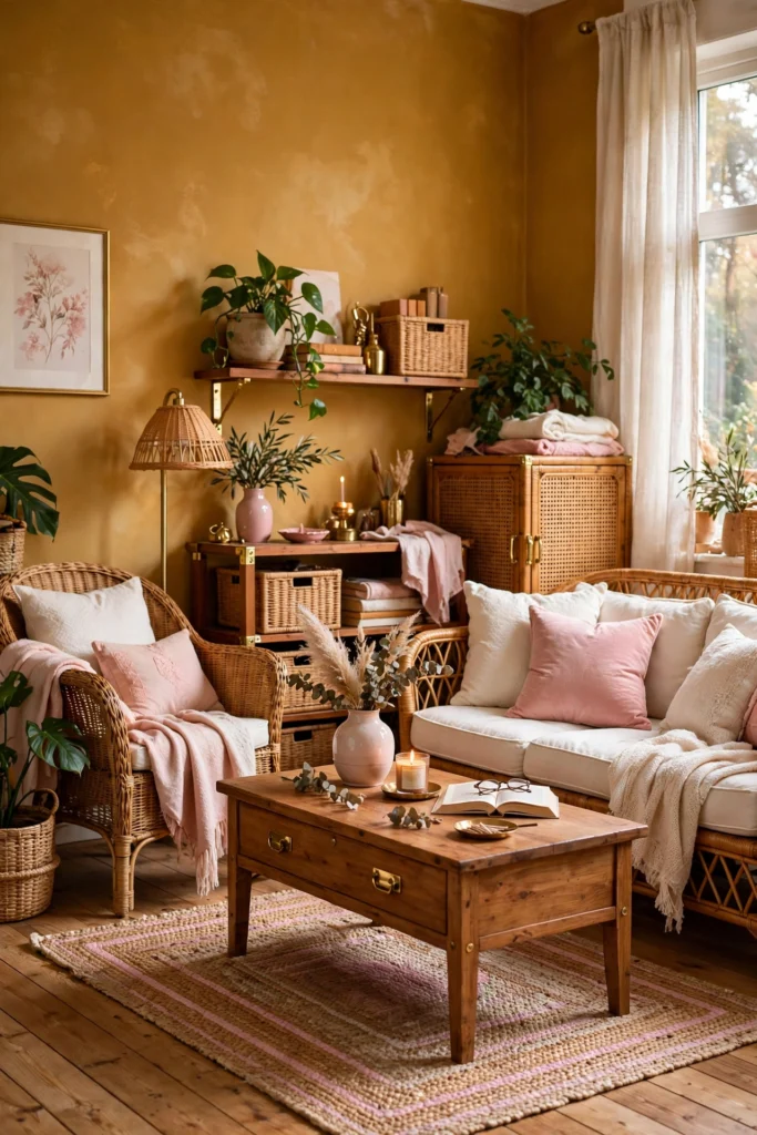
Caramel is the sweetest colour in the 2026 palette, and the easiest to love. Honey, amber, toffee, golden brown. It sits between brown and yellow, and it does something lovely to a room in the late afternoon, when the low sun hits it and the whole space seems to glow. Caramel suits reading corners, living rooms and anywhere you sit down with a cup of tea and stay a while.
Try it small first. A caramel throw over a grey or cream sofa is an instant change, and it is one of the cheapest experiments on this list. A caramel lampshade, a honey coloured cushion, or a piece of art with warm amber tones will tell you quickly whether the colour suits your light. Leather is caramel’s natural partner, so a small leather tray or a caramel leather cushion cover is a good test too.
Commit big with a sofa or wood. A caramel leather sofa is a classic for a reason, and it only improves as it softens and darkens with age. If a new sofa is too much, a caramel accent wall in a living room or a study adds warmth without the cost, especially behind a bookshelf or a reading chair.
What to avoid: caramel piled on top of orange and gold, which can turn a room syrupy, and caramel in a room that already runs warm, where it can feel heavy by summer. Caramel needs a cool note nearby, a cream wall, a pale rug, a little black in a frame or a lamp, to keep it fresh.
8. Icy Frosted Blue
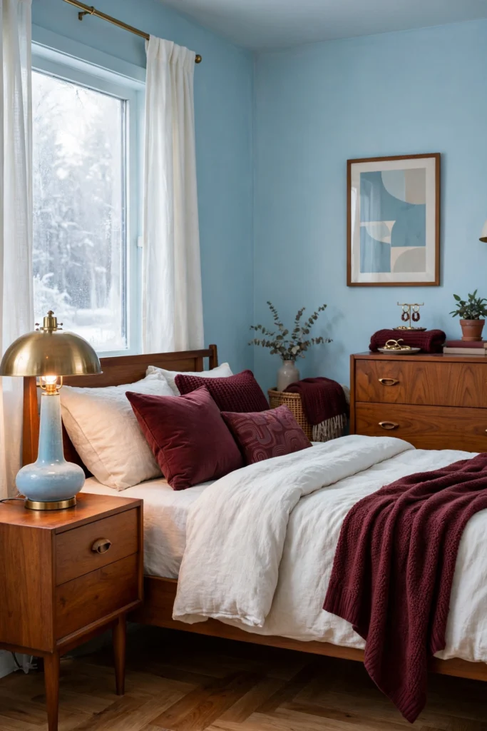
Not every 2026 colour is dark and earthy. Icy frosted blue is the pale counterweight, a soft blue that feels like cold morning light. It is the colour of the powdery pastels that are rising this year, and it works best in rooms that need to feel bigger, calmer and a little cooler. Bedrooms, bathrooms and small living rooms are its natural home.
Try it small first. Pale blue bedding changes the feel of a bedroom more than almost any other single swap, and it costs less than a tin of paint. In a living room, icy blue cushions on a white or cream sofa, or a pale blue throw folded over a chair, give you the freshness without repainting. A pale blue vase or a framed print with a lot of sky in it can do the same in a hallway.
Commit big with a full room. A bedroom painted top to bottom in a pale frosted blue, ceiling included, feels like sleeping inside a calm sky, especially with white bedding and pale wood furniture. In a bathroom, pale blue tiles with white grout and warm wood accessories feel clean without feeling clinical.
What to avoid: using it in a cold north facing room with no warm textiles, where it can feel chilly instead of fresh, and pairing it with stark white and silver everywhere, which can turn the room into an icebox. Icy blue needs warmth beside it. A cream rug, a wooden frame, a brass lamp or a soft beige throw keeps the balance right.
9. Playful Chartreuse

Chartreuse is the wild card of 2026, a yellow green that sits somewhere between lime and spring leaf. It is the only colour on this list that is genuinely playful, and it works precisely because everything else in the palette is so grounded. A little chartreuse wakes a room up. A lot of it gives you a headache. The trick is knowing which is which.
Try it small first, and small really means small. One chartreuse cushion on a brown sofa. One piece of art with a chartreuse shape in it. A single chair, reupholstered or painted, in a dining room full of wood and cream. These tiny doses give you the energy of the colour without letting it take over, and they are easy to swap out if you tire of it.
Commit big only if you are sure. The bravest use of chartreuse is a single statement piece, an armchair, a painted dresser, a front door, in an otherwise calm room. A full chartreuse wall is for the very confident only, and even then it works best in a room with lots of white and wood to calm it down.
What to avoid: chartreuse with other neons, which turns a room into a highlighter, and chartreuse in a small room where you sit for hours, like a home office. It is an accent colour, not a base colour, and it should never have to compete with another loud colour in the same view. One jolt per room is the rule.
10. Sophisticated Plum
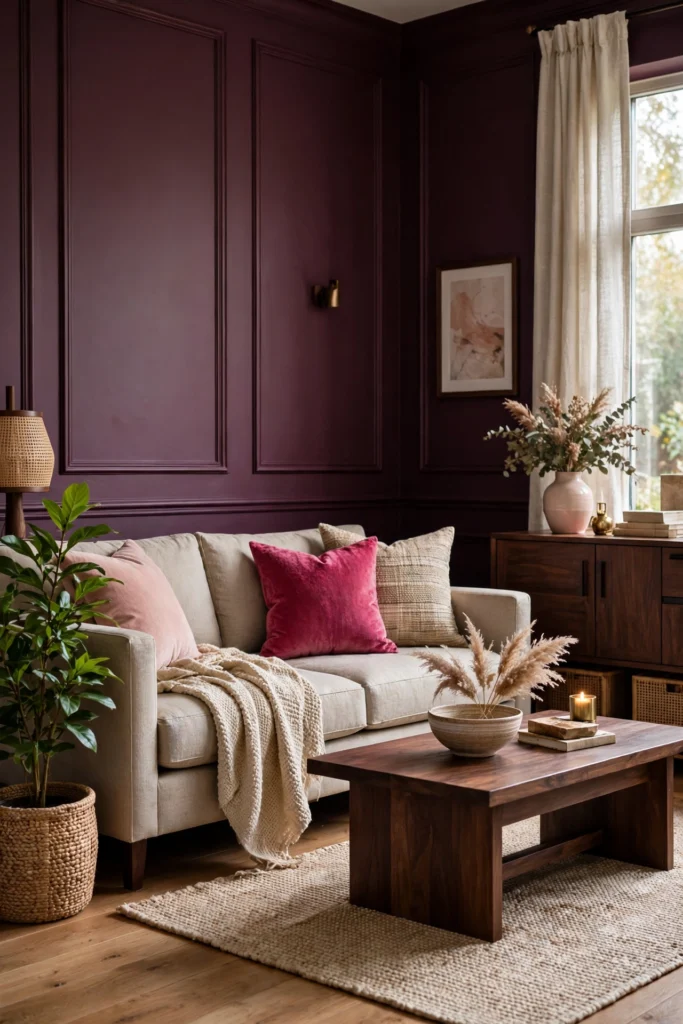
Plum closes the list the way a good dessert closes a meal. It is deep, a little mysterious, and more versatile than it looks. Plum sits between purple and wine, and in 2026 it has stepped out of the shadows. The designer survey that put burgundy on the rise counted plum alongside it, with the two colours together jumping from 7 percent to 21 percent of designers naming them. People are ready for depth, and plum delivers it with a softness that pure purple never had.
Try it small first. Plum velvet cushions on a cream or grey sofa are quietly luxurious, and a plum throw on a bed changes the whole feeling of a bedroom. A plum lampshade gives off a warm, rosy light in the evening that is far more flattering than plain white.
Commit big with a bedroom wall or a velvet headboard. Plum behind a bed, paired with cream bedding, brass lamps and pale wood, is one of the most restful combinations in this guide, and it feels far more personal than a plain white bedroom. A plum velvet armchair in a living room corner does the same job on a smaller scale. In a dining room, plum walls with a wooden table and candlelight create a setting that makes people linger after dinner.
What to avoid: plum piled on purple, lilac and pink all at once, which turns sophisticated into sugary, and plum in a room with no warm light. Plum needs a lamp or two to show its depth. In daylight it can read almost brown, which is fine, but in the evening, with warm bulbs, it comes alive.
Every 2026 Colour at a Glance
If you have read this far and still cannot choose, this table is for you. It puts all ten colours side by side, with the cheapest way to test each one and the mistake most people make with it. Start at the top, work down, and notice which row makes you think of a specific room in your house. That is your colour.
| Trend | Where It Works Best | Cheapest Way to Try It | What to Avoid |
|---|---|---|---|
| Warm wine reds | Dining rooms, libraries, powder rooms, bedrooms | Burgundy velvet cushions or a wine lampshade | All four walls red, or red with bright white |
| Chocolate brown | Living rooms, bedrooms, studies, kitchens | A brown throw or a set of linen cushions | Dark brown walls in a small north facing room |
| Earthy neutrals | Every room, hallways, whole home colour | Khaki bedding or a clay beige side table | Flat beige with no texture or warm materials |
| Seafoam and teal | Bathrooms, bedrooms, coastal rooms | Seafoam towels or a teal vase | Teal with cold chrome and bright white only |
| Dark verdant green | Kitchens, libraries, dining rooms, bedrooms | Green cushions or a painted side table | Dark green with no light and no contrast |
| Sun baked terracotta | Kitchens, entryways, living rooms, patios | A terracotta pot with a real plant | Terracotta next to bright orange or pink |
| Golden caramel | Living rooms, reading corners, studies | A caramel throw on a cream sofa | Caramel piled on orange and gold |
| Icy frosted blue | Bedrooms, bathrooms, small living rooms | Pale blue bedding or a blue throw | Icy blue in a cold room with no warm textiles |
| Playful chartreuse | As an accent in living and dining rooms | One chartreuse cushion or a small art print | Chartreuse with other neons, or a full wall |
| Sophisticated plum | Bedrooms, dining rooms, quiet corners | Plum velvet cushions or a plum throw | Plum mixed with purple, lilac and pink at once |
Which Trend Fits Your Room?
A trend list is only useful if it helps you choose, so here is a simple way to decide. Answer three questions about your room, honestly, and the right colour usually picks itself.
Start with your light
Stand in the room at midday and again in the evening. If it gets strong warm sun, you can handle the deep colours, chocolate brown, wine red, dark green, plum, because the light will keep them lively. If the room is north facing or shaded, and the light is cool and flat, the pale end of the list will serve you better. Icy blue, seafoam and the earthy neutrals all work in low light, and they look better there than a dark colour that never gets a chance to shine.
Start with your room size
Small rooms love pale colours and one dark accent, not four dark walls. A large living room can take a chocolate sofa, a terracotta rug and a dark green bookcase all at once, because there is enough air and light between the pieces for each colour to breathe. If your room is small, spend your boldness on one piece, a chair, a wall, a rug, and keep the rest quiet.
Start with your nerve
Be honest about how much change you actually enjoy. If you repaint every year and love a project, a wine red dining room or a green kitchen is a wonderful weekend. If you prefer to buy something once and live with it for a decade, choose the neutrals or the chocolate brown, because they are the colours you are least likely to tire of. And if you rent, or you simply do not want to paint, the small tests in this guide are the whole plan. Cushions, throws, lampshades and art are not a lesser version of the trend. For most people, they are the trend.
One more thought. The best colour for your room is the one you keep noticing. If you have read this guide and one colour keeps coming back to mind, that is your answer. The surveys and the searches are useful, but they describe other people’s houses. Yours is the one you have to live in.
Questions People Ask Before They Paint
What is the most popular interior colour for 2026?
Chocolate brown leads the year. In the 1stDibs designer survey for 2026, 33 percent of the 468 designers surveyed named it the colour they expect to see most, nearly double the 17 percent who picked it in 2022. Searches for chocolate brown on Houzz rose 153 percent.
What is the Sherwin-Williams Color of the Year for 2026?
Universal Khaki, SW 6150. It is a warm yellow brown khaki that works as a neutral with real warmth in it. It sits well with wood, linen, brass and most of the deeper colours on this list, which is why it makes a good whole home colour if you want one shade to carry through several rooms.
Are grey walls out of style in 2026?
Grey is not banned, but cool grey has lost its place at the centre of things. Warm greys, greige and mushroom tones still work, especially when they are paired with wood, texture and a warm accent colour. If your room is already grey, you do not need to repaint. Add warmth around the grey, caramel cushions, a wooden tray, a brass lamp, and the room will feel current again.
Can I mix two 2026 trends in one room?
Yes, and most good rooms do. The rule is one lead colour and one supporting colour, not two leads fighting each other. Chocolate brown with caramel, plum with cream and brass, terracotta with olive green, teal with warm wood. Keep the lead colour on the biggest piece, the sofa or the wall, and let the second colour appear in smaller pieces. Three or more strong colours in one room is where things start to look unsettled.
What colour should I pick if I rent?
Pick a colour you can carry in and carry out. Textiles are your best friend: bedding, throws, cushions, curtains and rugs in chocolate brown, plum, terracotta or seafoam. A large piece of art in your chosen colour does the work of a painted wall. Plants in terracotta pots, a coloured lampshade, a painted secondhand side table. None of these need a landlord’s permission, and all of them move with you.
How do I test a dark colour before painting a whole wall?
Paint a large piece of card, at least the size of a poster, and tape it to the wall. Live with it for three or four days and look at it in morning light, evening light and lamplight. A small paint swatch lies to you. It looks darker on a big wall than it does on a tiny card, and it changes completely between daylight and lamplight. The poster sized test is the cheapest insurance in decorating.
Pick One Trend This Month
Reading about colour is pleasant. Living with it is better. Here is a small plan that turns this guide into a room you can actually sit in, without a renovation and without regret.
- Choose one room. Not the whole house. The room you spend the most waking time in, usually the living room or the bedroom. One room, one decision.
- Choose one trend. The one you kept thinking about while you read. Write it down, and write down where it will go, the sofa, one wall, the bedding. A colour with a place is a plan. A colour without a place is a daydream.
- Try it small this weekend. Buy the cushion, the throw, the pot, the lampshade. Live with it for two weeks. Notice it in the morning and in the evening. If you stop seeing it, it fits. If it keeps shouting at you, it does not.
- Commit, or change course. If the small test feels right, go bigger. Paint the wall, order the sofa, hang the curtains. If it feels wrong, you have lost the price of a cushion and learned something useful about your taste. That is a good trade.
Colour is the fastest and cheapest way to change how a room feels, and 2026 has given us a generous palette to choose from. Warm browns, deep wines, soft khakis, sun baked clay, cool blues and one bright jolt of green. Start this month, start small, and let the room tell you whether you picked right. It will, usually within a week.