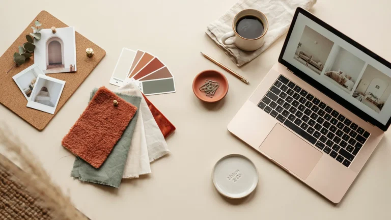
A room can have beautiful furniture and still feel unfinished if the colors do not work together. The right palette gives the eye somewhere to rest, brings out the character of materials, and can make an ordinary room feel much more considered. That is why choosing paint is rarely just about picking a favorite color from a small card.
These 22 Beautiful Interior Color Trends for Cozy Homes focus on shades that feel comfortable, layered, and easy to live with. Some are soft enough for a quiet bedroom, while others bring depth to a living room, dining area, or kitchen. Warm whites, earthy greens, gentle blues, brown-based neutrals, soft pinks, and richer shades all have a place in a cozy home.
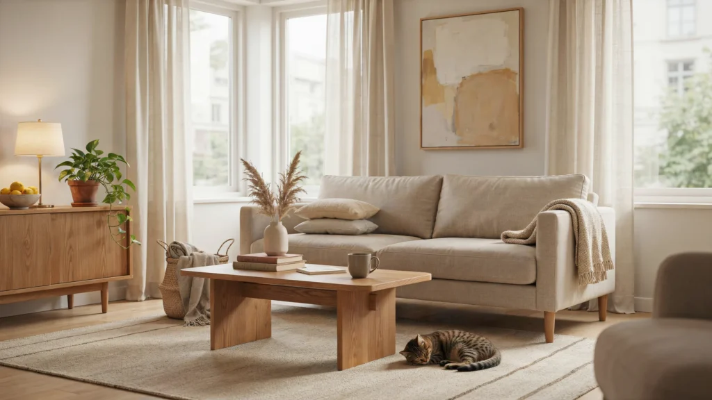
Natural and artificial light also matter. A color can look warmer during the afternoon and noticeably cooler under evening lighting, so always test a sample on the actual wall before committing. The reference interiors also show how natural wood, neutral upholstery, and layered textures can make a paint color feel warmer and more inviting.
1. Warm White With Natural Wood
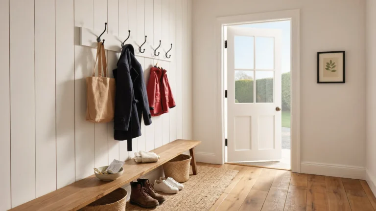
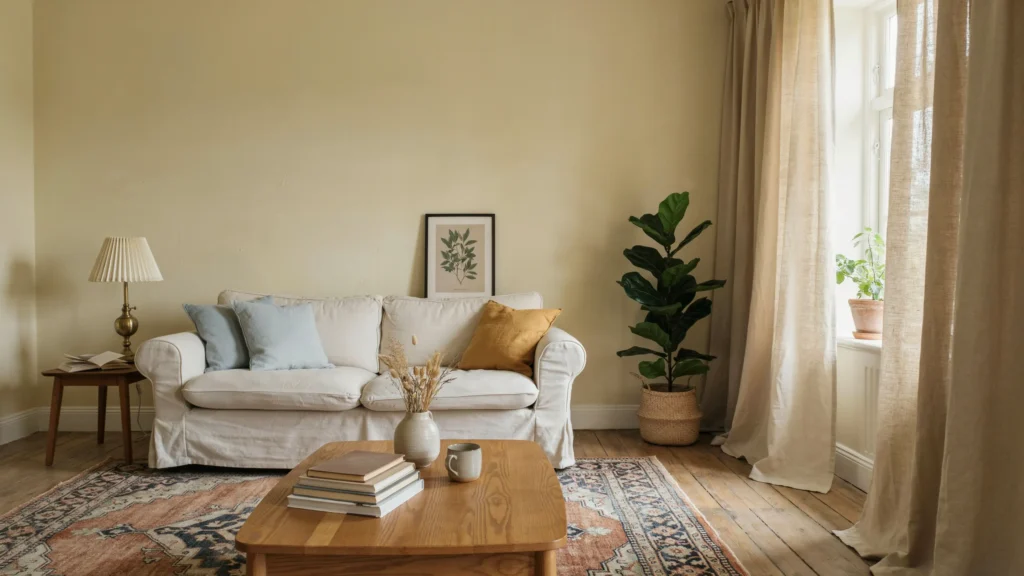
Warm white is an easy starting point when you want a room to feel bright without looking stark. Instead of pairing it with an entirely white scheme, bring in oak flooring, walnut furniture, woven baskets, linen curtains, or a timber coffee table.This combination works especially well in living rooms because the wood adds visual warmth while the pale walls keep the room open. A white with subtle warm undertones can also sit comfortably beside beige, cream, tan, and muted green accessories.
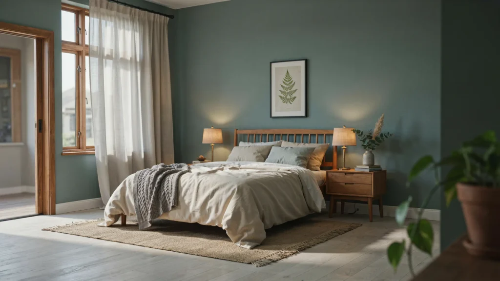
2. Soft Sage Green
Sage green remains a practical choice when you want color without making the room feel intense. Its muted quality works beautifully with pale wood, cream upholstery, aged brass, stone, and natural fabrics.Try it on all four walls in a bedroom or home office. In a kitchen, sage cabinetry can create the same effect while allowing the walls to remain lighter. Green-gray variations can also give a kitchen a quieter, almost spa-like character.
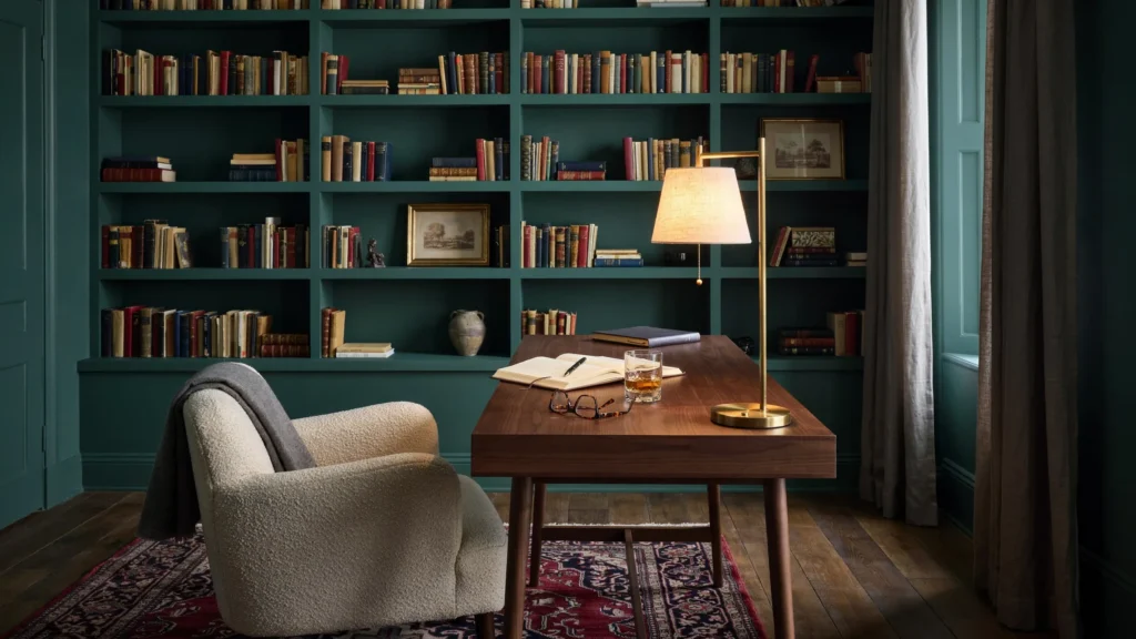
3. Deep Green for a Moody Room
If you prefer rooms with more depth, move from soft sage into a darker foliage green. Deep green can make a study, library corner, dining room, or bedroom feel intimate without relying on black.Balance the walls with lighter upholstery and warm timber. Brass lighting and framed artwork can prevent the darker color from becoming flat. The reference material shows how deep green can create a rich, enveloping setting when paired with strong architectural details.
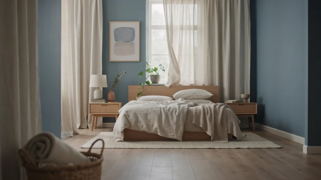
4. Muted Blue for a Restful Bedroom
Muted blue is a useful choice when you want a bedroom to feel calm but not completely neutral. Look for blue shades that have a softened or slightly gray quality rather than an electric finish.Pair the walls with ivory bedding, light oak, brushed metal, and simple artwork. You can also carry the same blue onto trim or a ceiling for a more enveloping effect. Soft blue can feel relaxed while still giving the room enough personality.
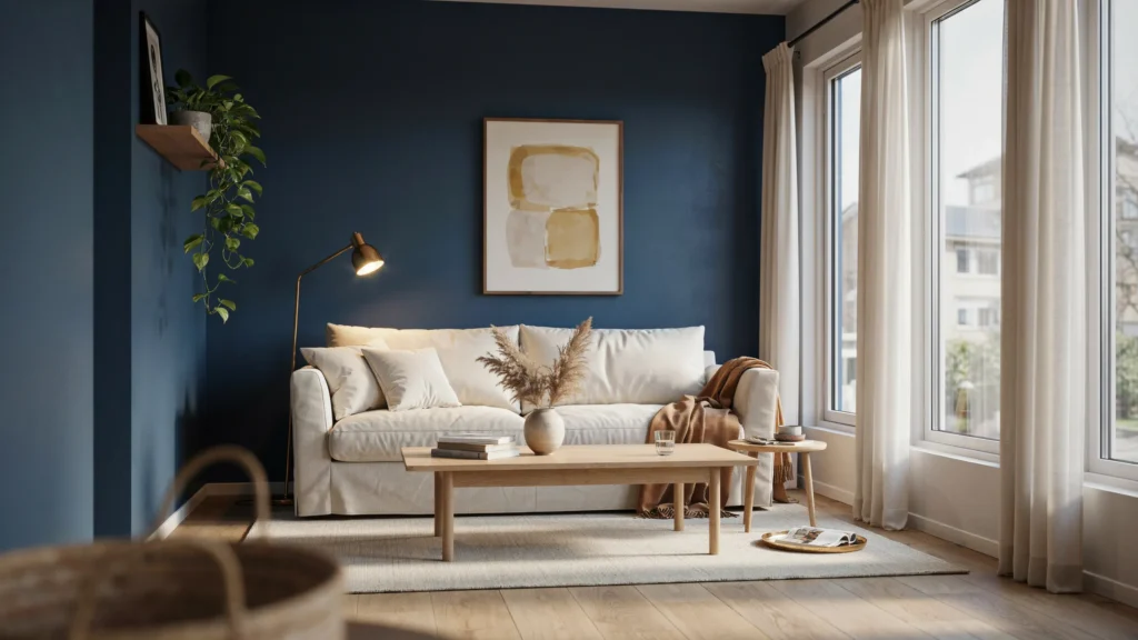
5. Rich Navy With Light Accents
Navy is ideal when you want a stronger color but still want the room to feel polished. Use it behind a sofa, across a dining room, or throughout a small study.The key is contrast. Cream furniture, pale rugs, natural wood, and lighter artwork keep navy from feeling too heavy. Rooms with generous daylight can handle deeper navy particularly well, while smaller spaces may benefit from using it on one architectural feature. Rich navy is also presented in the reference material as a grounding color when balanced with natural light and lighter accents.
6. Light Clay for a Lived-In Feel
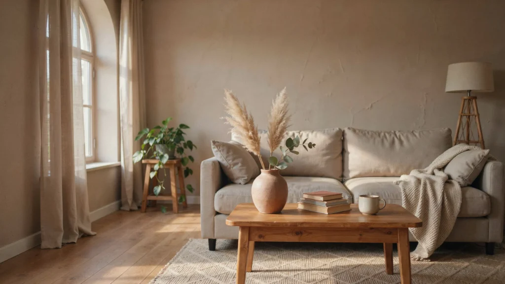
Light clay sits between beige, tan, and soft earthy pink. It is a good alternative to bright white when you want walls to have more character without introducing a dramatic color.Use it with plaster textures, aged wood, linen, stone, and handmade ceramics. A textured finish can make the shade feel even more natural and give a newer room a less polished, more lived-in appearance.
7. Peachy Pink as a Soft Neutral
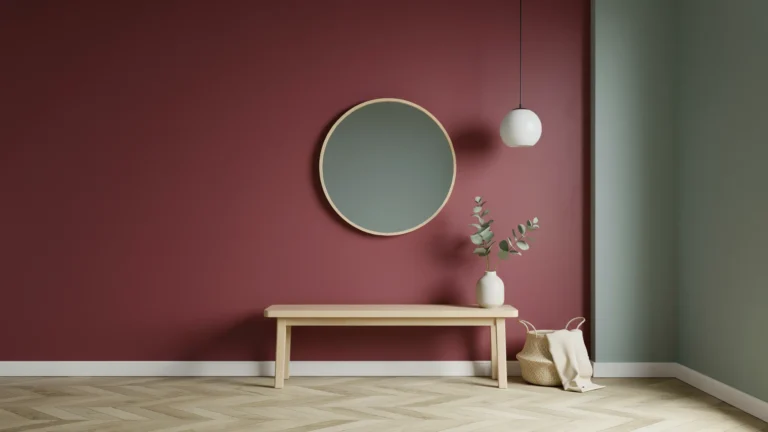
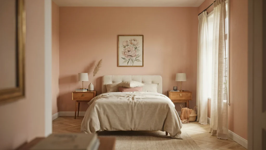
Pale peachy pink can work almost like a neutral when it has enough warmth and is used with restrained furniture. It is especially attractive in bedrooms, sitting rooms, and spaces with warm natural light.Cream, terracotta, pale wood, and muted red accents help the color feel intentional rather than overly sweet. The reference examples show pale pink working as a neutral alongside warmer furnishings.
8. Earthy Brown for a Cocooning Bedroom
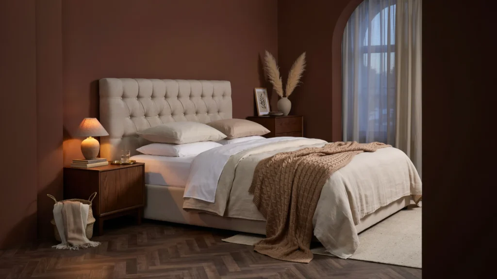
Brown is having a strong moment in interiors because it brings warmth without depending on bright color. A deep brown wall can create a cocoon-like setting around a bed, especially when the room contains soft fabrics and warm lighting.Choose chocolate, reddish brown, or coffee-inspired shades according to the existing flooring and furniture. Keep some lighter surfaces in the room so the color has contrast instead of becoming visually dense. Deep brown bedrooms are also highlighted in the reference material for their enveloping quality.
9. Pale Gray With Warm Textiles
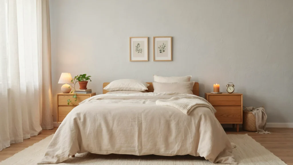
Gray does not have to make a room feel cold. Choose a pale gray with a softer undertone and combine it with oatmeal fabrics, warm timber, cream upholstery, and woven accessories.This approach works particularly well when you want a quiet bedroom or minimalist living room. The reference interiors use pale gray as a soothing bedroom backdrop, showing how the color can stay understated while still giving the room definition.
10. Sage Gray in the Kitchen
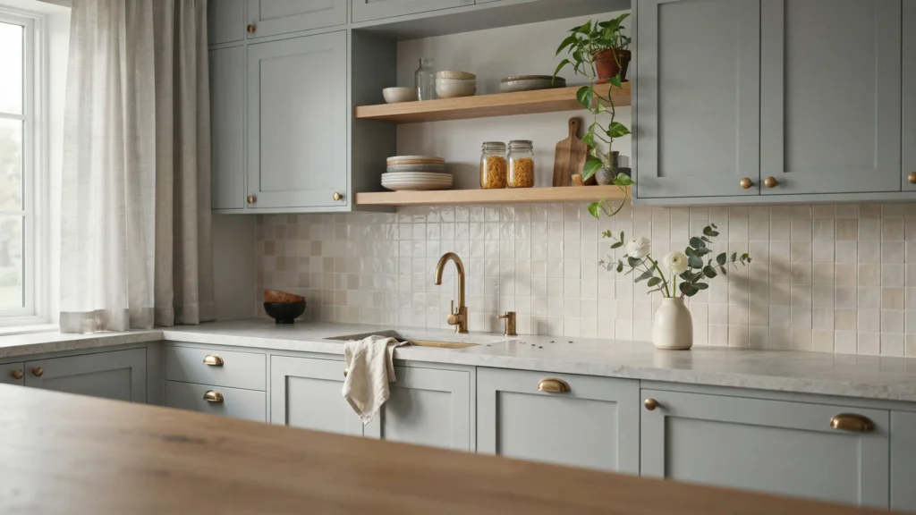
For a kitchen that feels calmer than a standard white scheme, consider a gray with a green undertone. This shade works naturally with marble, pale oak, brushed brass, and off-white walls.Use it on cabinets rather than every surface if you want a lighter result. The muted green-gray family can soften the hard lines of cabinetry while keeping the kitchen practical and sophisticated. A kitchen example in the reference material uses this type of color to create a tranquil atmosphere.
11. Warm Peach With Cream
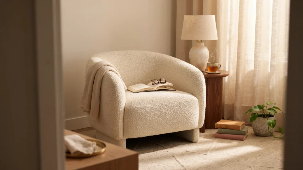
Warm peach becomes particularly attractive when it shares a room with creamy white rather than brilliant white. The two colors create a gentle contrast that feels sunny during the day and comfortable under warm lamps at night.Try this pairing in a bedroom, breakfast nook, or reading area. Add walnut or medium-toned wood if the room needs more depth.
12. Pale Yellow for a Cheerful Home
Pale yellow can bring warmth without the strong energy of saturated yellow. It is useful in rooms that receive limited daylight or spaces where you want a cheerful backdrop.Keep the rest of the palette simple with cream, natural wood, faded blue, or soft gray. Pale yellow has also been used in interiors where the goal is to combine warmth and brightness without making the room feel loud.
13. Sky Blue on the Ceiling
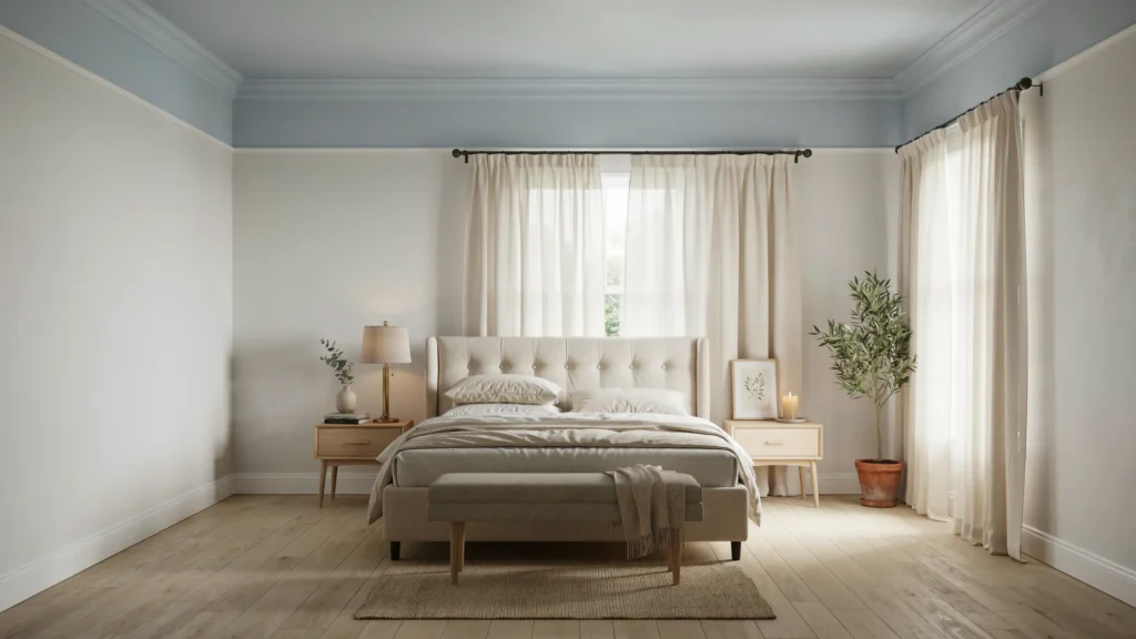
You do not always need to put your favorite color on the walls. A soft sky blue ceiling can create an unexpected layer while keeping the walls neutral.This works particularly well in bedrooms and traditional living rooms with decorative molding. Pair the ceiling with warm white walls, cream fabrics, and natural wood. The reference material shows sky blue used overhead to echo the feeling of an open sky while keeping the room elegant.
14. Classic White With Stronger Details
Classic white is still valuable because it gives furniture and artwork room to become the focus. Instead of making the entire room plain, use white as the foundation and add contrast through wood, black accents, patterned fabrics, or colorful artwork.White also works well when the room has interesting architectural details. The reference examples show white functioning as a clean backdrop in bathrooms and living spaces.
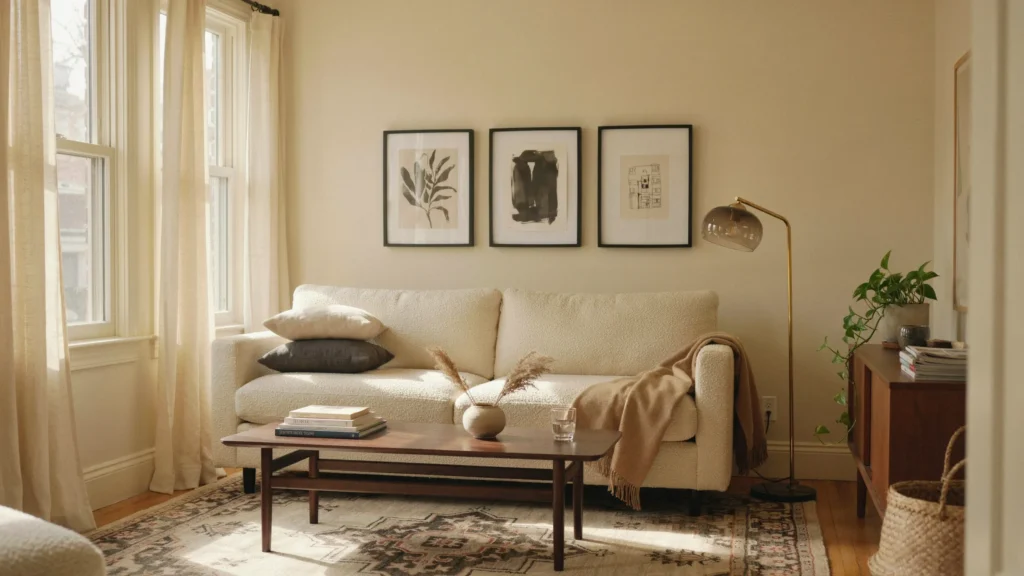
15. Dusty Mauve for the Dining Room
Dusty mauve brings a quiet amount of color to dining spaces. Because it sits between gray and violet, it can feel much softer than a saturated purple.Use warm wood furniture, cream upholstery, aged brass, and simple artwork to keep the palette grounded. It works especially well when you want a dining room to feel intimate without using a very dark wall color.
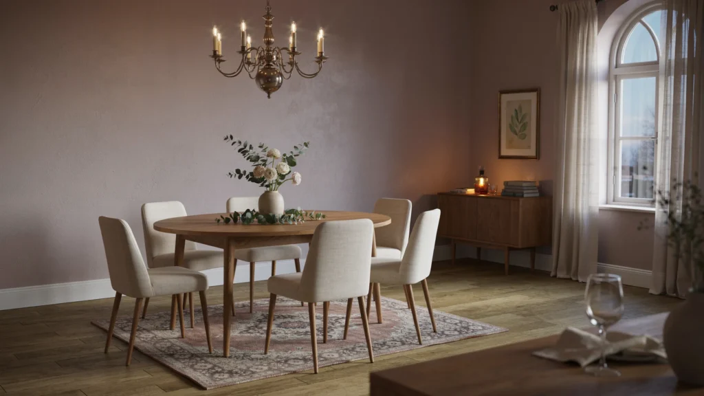
16. Soft Lilac With Cream
Lilac can be surprisingly comfortable when you choose a muted version instead of a bright purple. Gray undertones help the shade sit quietly in the room while cream and natural wood keep it warm.Try this color in a bedroom, dressing area, or small sitting room. The reference examples pair muted lilac with cream and blue accents for a softer overall palette.
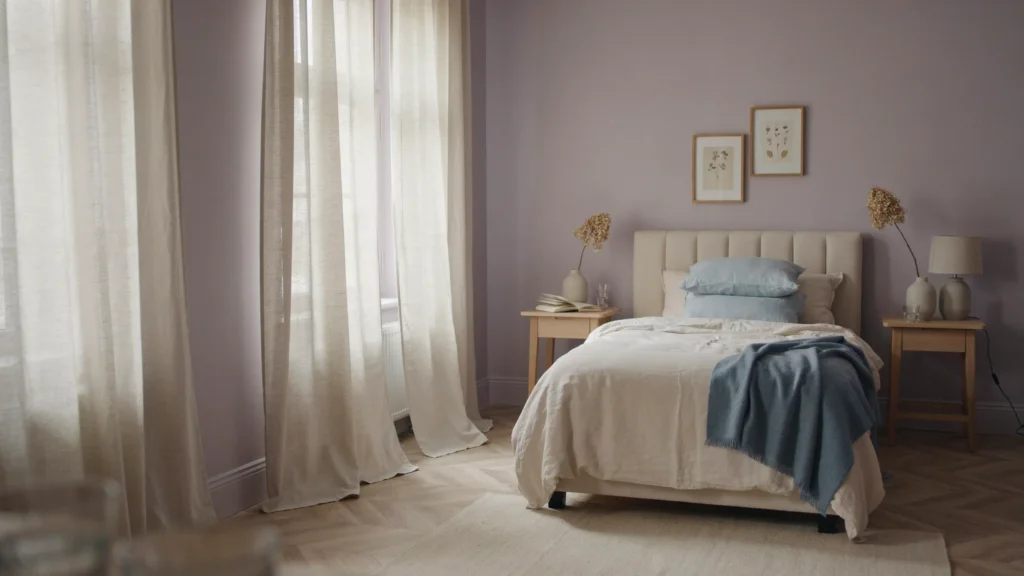
17. Deep Teal as an Accent Color
Deep teal can add personality without requiring an entire room to become dark. Paint one wall, a built-in cabinet, a reading nook, or even the door and trim.Pair teal with warm white, brass, walnut, and faded patterned fabrics. This approach creates a focal point while allowing the rest of the room to remain calm. A reference example uses deep teal on a wall, door, and moldings while keeping another wall available for contrasting material.
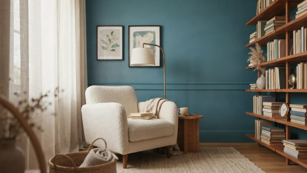
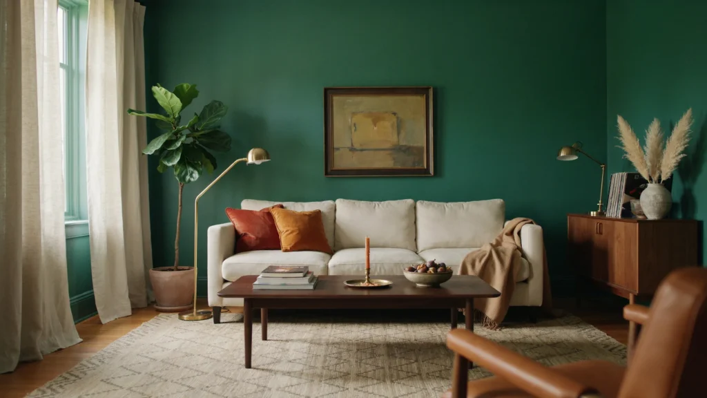
18. Emerald Green for a Dramatic Living Room
Emerald green is for homeowners who want color to become part of the room’s identity. Its jewel-like depth looks especially rich with cream seating, dark wood, brass, and traditional artwork.You do not need many additional colors. Let the green walls carry most of the visual weight, then use two or three supporting shades through furniture and accessories. Dark jewel-tone green is described in the reference material as creating a strong connection with the feeling of nature.
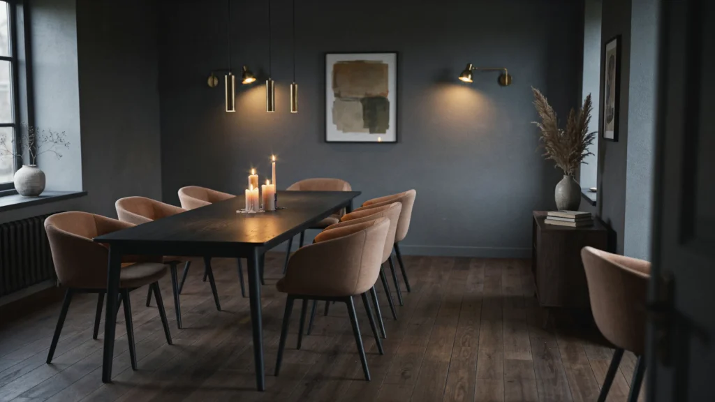
19. Dark Gray With Warm Lighting
Dark gray can make a dining room or lounge feel intimate, especially when the lighting has a warm temperature. Instead of filling the room with cool gray furniture, introduce wood, tan leather, cream fabric, and warm metallic details.Candles, table lamps, and wall lights can soften the darker backdrop after sunset. A dark gray room in the reference material demonstrates how accessories and lighting can shift the mood toward relaxation.
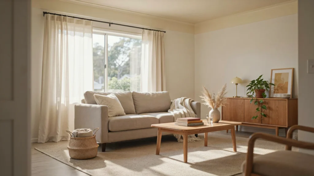
20. White With Yellow Undertones
Not every white needs to look crisp or cool. A white with a gentle yellow undertone can make a sunlit room feel warmer, particularly when paired with cream, beige, and natural materials.This is a useful choice for living rooms where you want brightness without the sharp feeling that some pure whites can create. A reference example combines a soft white with a warm yellow-influenced ceiling to create a light and inviting atmosphere.
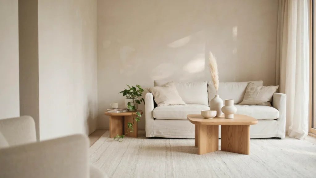
21. White-on-White With Natural Texture
A white-on-white room can still feel rich when the interest comes from texture rather than color. Combine different whites through walls, upholstery, curtains, ceramics, rugs, and bedding.Then introduce one natural material such as oak, rattan, stone, or linen. The reference material notes how off-white and neutral whites can recede while allowing small accents and surrounding materials to carry the visual interest.
22. Aubergine for a Rich Home Office
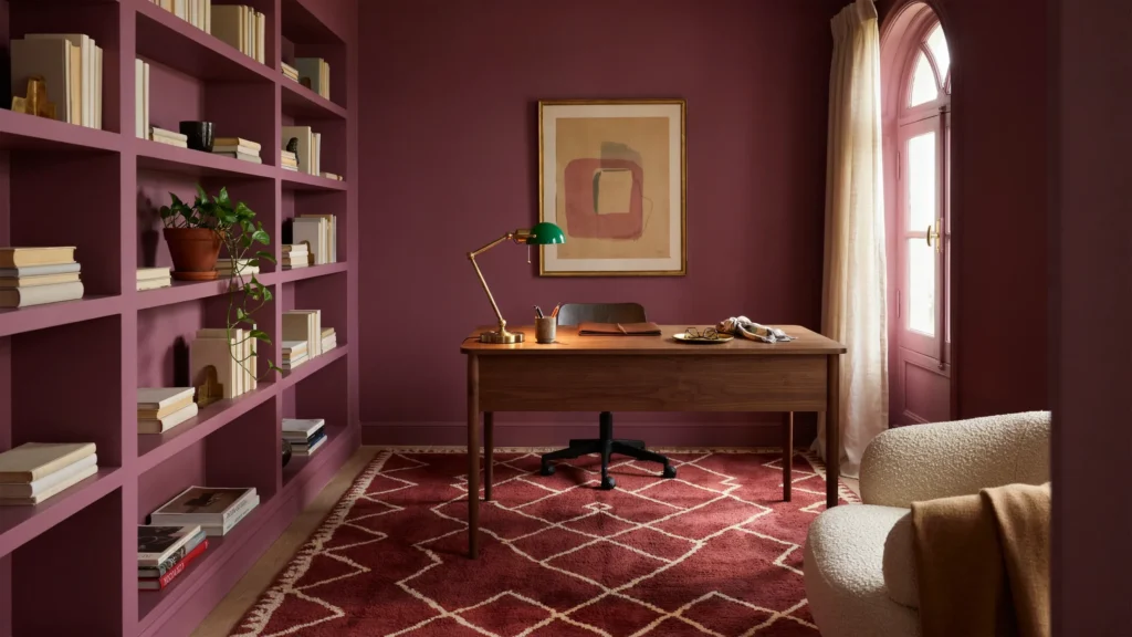
Aubergine is a strong choice for a home office when you want the room to feel substantial and creative. It is deeper than mauve but softer than black, making it useful for a dramatic workspace.Balance it with warm wood, cream books, brass hardware, and controlled lighting. Painting the walls, shelving, and trim in related tones can make a small office feel deliberately designed rather than visually fragmented. The reference material uses a rich aubergine shade across an office as a deep, relaxing backdrop.
How to Choose the Right Interior Color
Before buying several gallons of paint, look at the room you already have. Flooring, countertops, furniture, curtains, rugs, and even the view outside the window can influence how a color reads.
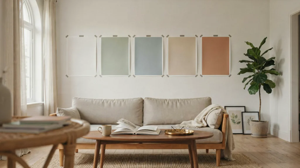
Natural light is one of the biggest variables. A shade that looks creamy beside a sunny window may appear noticeably different in a darker corner. Artificial lighting can shift the appearance again, so check your sample during morning, afternoon, and evening.
It is also useful to identify undertones. Two beige paints may look completely different because one leans pink while another leans yellow. The same happens with whites, grays, greens, and blues. The reference article specifically recommends testing colors in the actual room because natural, fluorescent, and incandescent light can change how paint appears.
How to Make Color Feel Cozy Instead of Busy
The easiest approach is to build the room around one main color and then repeat related shades through smaller pieces. For example, sage walls can connect with olive cushions, beige curtains, pale wood, and cream upholstery.
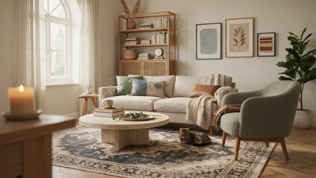
Texture is just as important as color. Linen, wool, boucle, wood, stone, rattan, and aged metal can make a restrained palette feel much more interesting. If every surface has the same finish, even a beautiful color can feel flat.
Another useful method is choosing one anchor item first. It could be a rug, artwork, patterned chair, or vintage cabinet. Pull two or three supporting colors from that piece instead of trying to coordinate every item separately. This approach is also recommended in the reference material as a way to let one meaningful object guide the room’s color direction.
FAQs About Interior Color Trends
What colors make a home feel cozy?
Warm whites, earthy browns, muted greens, soft blues, clay tones, dusty mauve, and warm peach can all create a comfortable atmosphere. The result depends on how the color interacts with lighting, furniture, flooring, and texture.
What is the best color for a small room?
There is no single best color for every small room. Warm whites and pale neutrals can keep a compact space feeling open, while a darker shade can create an intentionally intimate look.
Are dark colors good for cozy interiors?
Yes. Deep green, navy, brown, aubergine, and dark gray can make a room feel enclosed and intimate. Balance them with lighter furniture, natural wood, reflective details, and suitable lighting.
Should every room in a house use the same color palette?
The rooms do not need identical colors, but some connection between them helps the home feel cohesive. Repeating warm wood, cream, beige, brass, or one accent color can create continuity while allowing individual rooms to have their own personality.
How can I test an interior paint color before painting the whole room?
Paint a generous sample on the actual wall and observe it at different times of day. Check it beside flooring, furniture, trim, and fabrics because surrounding materials can change how the color appears.