Gray paint looks simple on a paint chip and complicated on a wall, because every gray carries an undertone. The safest way to choose is to find the undertone first, match it to the fixed finishes already in the room, then check how the light in that room changes it through the day. A warm gray or greige suits a cool north facing room, a balanced or slightly cool gray suits a bright south facing room, and a large sample tested in morning light, afternoon light and lamplight tells you more than any small chip ever will.
If you want a short starting point, sample a warm gray, a greige and a cool gray side by side, live with them for two days, and pick the one that still looks calm at night. The shade names below are starting points to sample, not guarantees, because the same paint can look different in your room.
Gray has earned its place as the most useful neutral in home decor. It sits quietly behind furniture, and it can feel soft and warm or crisp and modern. The trouble starts when the gray on the wall is not the gray you thought you bought.
That shift is not your imagination, and it is not bad paint. It is undertone plus light plus the other colours already in the room, all working together. My own view is simple, and it comes from seeing too many rushed repaints. I would rather spend a weekend testing three large samples than spend a month living with a wall colour I keep trying to love.
Why Every Gray Has an Undertone
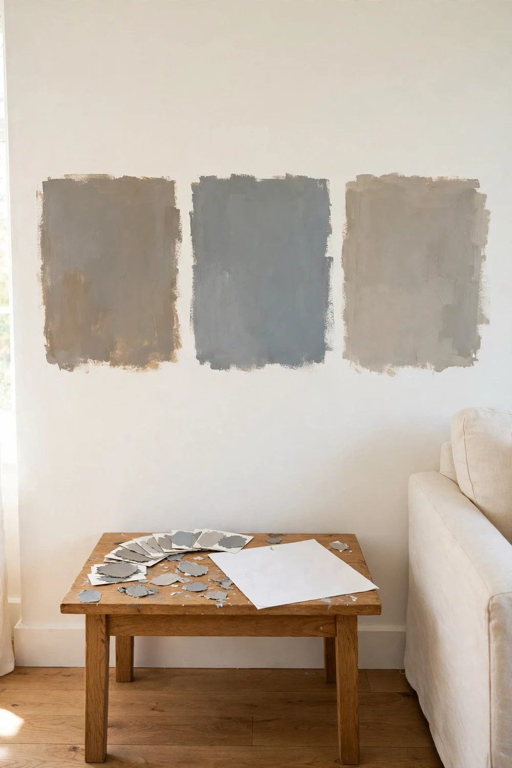
Paint companies mix gray from more than black and white. They add small amounts of blue, green, violet, red or yellow, and those small additions are the undertone. On a small chip the undertone can be hard to see. On a full wall, with daylight moving across it and furniture beside it, the undertone comes forward and shapes the whole feeling of the room.
A cool gray usually leans blue, green or violet. It feels fresh, clean and calm, and it suits rooms with plenty of warm wood or warm sunlight. A warm gray usually leans red, yellow or brown. It feels softer and cosier, and it suits rooms that feel cold or shaded. Greige sits in the middle, a mix of gray and beige, and it can lean either way. That middle ground is why greige has become so popular. It gives you the calm of gray without the chill, and the warmth of beige without the yellow cast.
The fastest way to spot an undertone is comparison. Put two gray chips side by side on a white sheet of paper. One will suddenly look bluer, the other warmer, even if both looked plain gray on their own. Try the same trick next to your flooring, your sofa fabric and your kitchen cabinets. Undertone also explains why a gray that looked perfect in a friend’s house can look wrong in yours. Her floors may be warm oak, yours may be cool gray tile. The paint is the same, but the company it keeps is different.
Warm Gray, Cool Gray and Greige: The Three Families
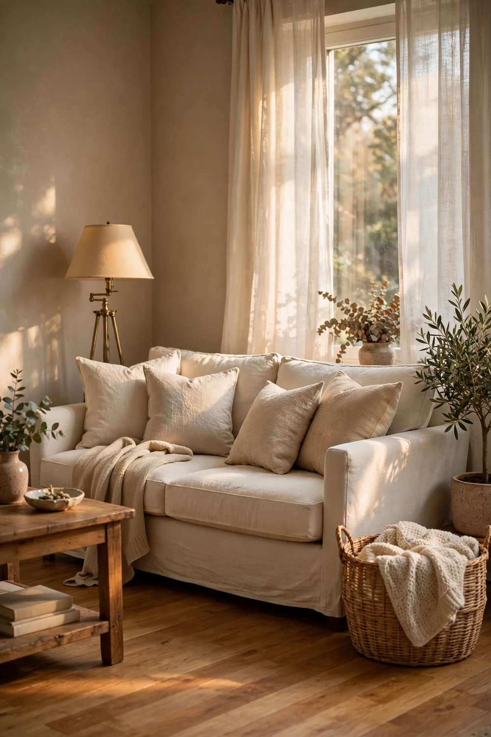
It helps to think of gray in three families rather than hundreds of separate shades. Once you know which family suits your room, the list of shades worth sampling gets much shorter, and the decision gets much calmer.
Warm grays lean toward red, yellow or brown. They feel welcoming and soft, and they pair well with cream trim, warm wood floors, brass details and natural fibres like linen and rattan. They suit a room that feels cold, or a living room or bedroom you want to feel cosy. The risk is that a warm gray can tip into beige or even pink in warm lamplight, so test it at night as well as in the day.
Cool grays lean toward blue, green or violet. They feel clean, calm and modern, and they pair well with white trim, chrome or black details, cool stone and crisp white bedding. They suit bright rooms, kitchens and bathrooms, and anyone who loves a fresh, airy look. The risk is that a cool gray can feel cold in a shaded room, especially in the evening. Greige is the bridge between the two. It mixes gray with beige, and the best greiges feel balanced rather than muddy. A warm greige works beautifully in open plan living spaces, because it connects with wood floors and cream sofas without turning yellow. A cooler greige, sometimes called gray green, works well in bedrooms and bathrooms where you want calm without coldness.
| Gray family | Undertone | Feels like | Works best with | Watch out for |
|---|---|---|---|---|
| Warm gray | Red, yellow or brown | Soft, cosy, welcoming | Warm wood, cream trim, brass, linen | Can turn beige or pink under warm bulbs |
| Cool gray | Blue, green or violet | Fresh, clean, calm | White trim, chrome, black details, cool stone | Can feel cold in shaded or north facing rooms |
| Greige | Balanced gray and beige | Warm but still gray | Wood floors, cream sofas, mixed metals | Can look muddy if the room is very dark |
If you are still unsure which family to start with, look at the largest fixed surface in the room. A warm oak floor points toward warm gray or greige. A cool gray tile floor points toward cool gray or gray green. Colour trends also play a part, though they should never lead the decision. Warm grays, greige and gray green shades read current right now, and charcoal is holding strong as an accent. Cold, flat, generic cool grays are less dominant than they were a few years ago. That does not make a cool gray wrong. It simply means a cool gray needs a reason, such as bright light or cool finishes.
How Light Direction Changes Gray
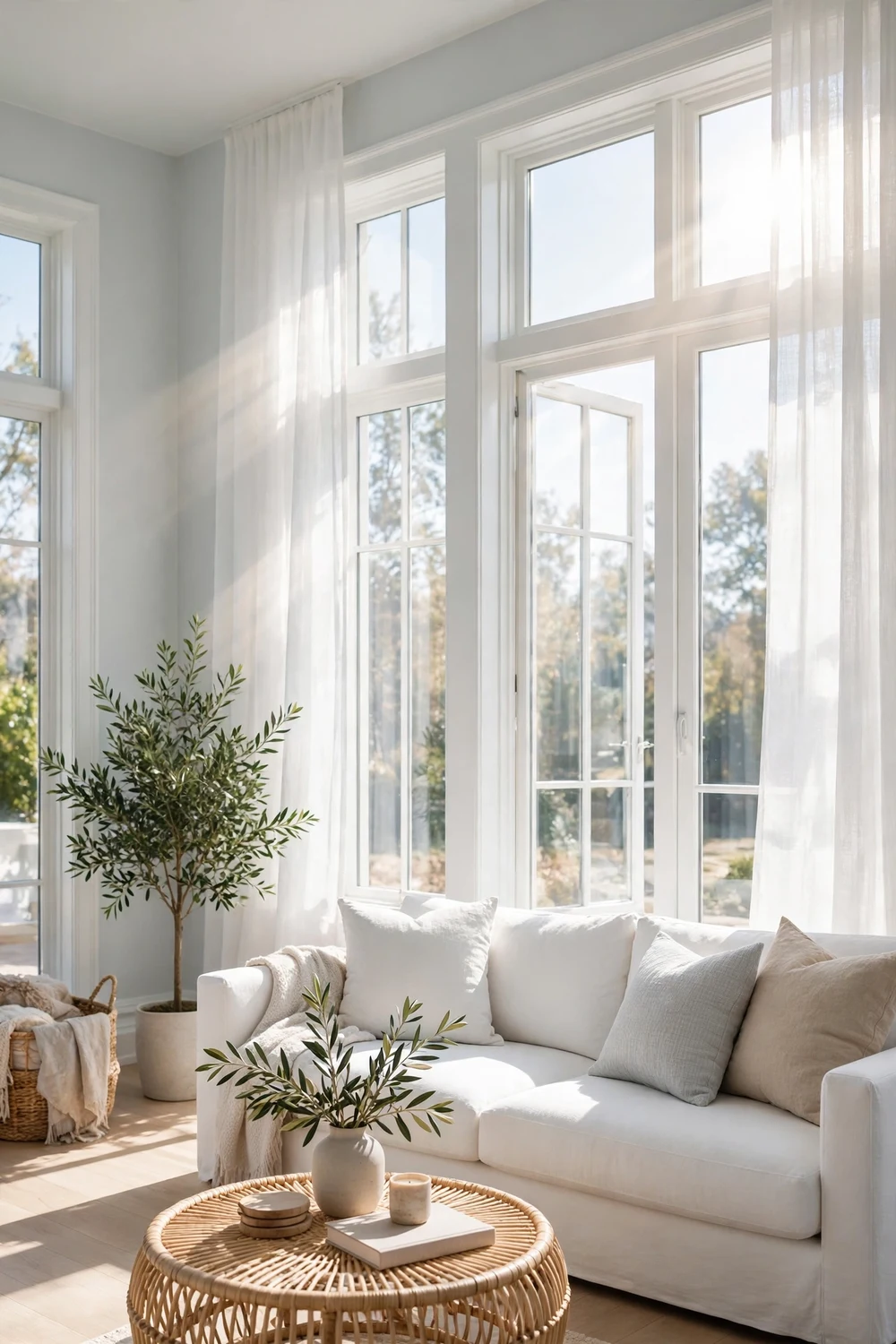
Light direction is the second big factor, and it is the one most people skip. A room does not have one light. It has morning light, midday light, afternoon light and lamplight, and each one changes gray a little.
North facing rooms get steady, cool light all day. There is little direct sun, so the light stays soft and slightly blue. That cool light strengthens blue and violet undertones, which means a cool gray can look bluer and colder than you expected. A warm gray or greige is usually safer here, because its warmth balances the cool light. If you love cool gray and your room faces north, choose one with a gentle green undertone rather than a blue one, and test it on the darkest wall.
South facing rooms get the strongest, warmest light, with direct sun for much of the day. That warm light softens cool grays and can make warm grays look warmer, sometimes almost beige by mid afternoon. A balanced gray or a slightly cool gray often works best here. East facing rooms get bright, warm light in the morning and softer light in the afternoon. West facing rooms do the opposite. In both cases, test morning and evening rather than trusting one quick look.
Artificial light matters just as much. Warm white bulbs add yellow and can push a warm gray toward beige. Cool white bulbs add blue and can push a cool gray toward steel. Daylight bulbs sit in the middle and show colour most honestly. If you plan to change bulbs, decide that before you test paint, because a new bulb can change the wall as much as a new shade.
| Window direction | Light character | Gray that usually works | Gray to test with care |
|---|---|---|---|
| North | Steady, cool, little direct sun | Warm gray or greige | Cool blue gray, which can look colder |
| South | Strong, warm, direct sun most of the day | Balanced gray or slightly cool gray | Very warm gray, which can turn beige |
| East | Bright and warm in the morning, softer later | Balanced gray or soft greige | Strong cool gray, which can feel flat by evening |
| West | Cooler in the morning, warm gold in the afternoon | Cool gray or gray green | Very warm gray, which can glow too gold at sunset |
| Small or shaded windows | Low light all day | Light warm gray or pale greige | Mid tone or dark gray on all four walls |
For a wider look at how colour behaves across a whole home, see our guide to 22 beautiful interior color trends for cozy homes. Light sets the mood, and the paint should work with it, not against it.
Match Gray to Your Fixed Finishes First
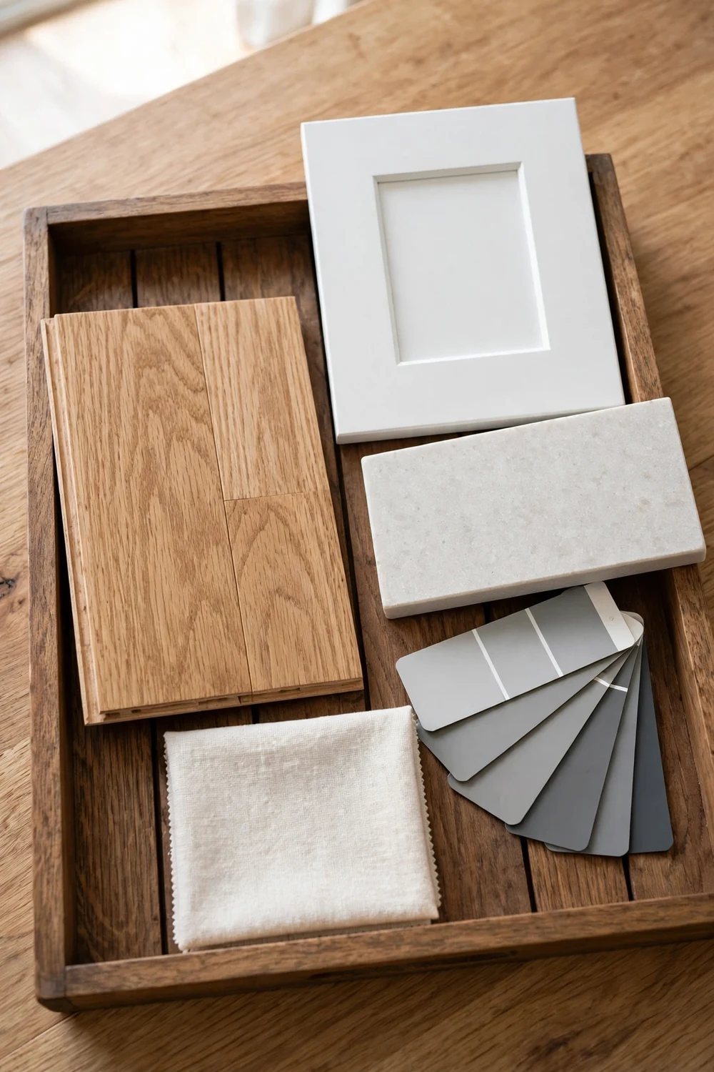
Before you fall in love with a shade, look at the things in the room that will not change. Flooring, kitchen cabinets, countertops, fireplace stone, tile and trim are fixed finishes, and they all carry their own undertones. Gray paint has to live beside them every day, so the match to those finishes matters more than the match to a cushion or a curtain.
Start with the floor, because it covers the most area. Warm oak or honey toned wood has yellow and red in it, so it pairs naturally with warm gray or greige. Cool gray tile or pale concrete has blue or green in it, so it pairs naturally with cool gray or gray green. Dark walnut floors can take almost any gray, but a warm gray usually feels more settled beside them than a cold blue gray.
Next, look at the trim and doors. Crisp white trim next to a warm greige can make the walls look beige by comparison, because the white pulls the warmth forward. If your trim is bright white, test your warm gray right beside it, in a corner where the two meet. Cream trim has the opposite effect. It softens cool grays and can make a pale cool gray look almost white, so check that pairing too.
Kitchen cabinets and countertops need the same care. White cabinets with cool marble counters suit a cool gray or a pale gray green. Cream cabinets with warm wood or beige stone suit warm gray or greige. If you are choosing gray for a kitchen, hold the sample against the cabinet door and the counter edge together. Our roundup of 20 bold kitchen cabinet color trends you need to try shows how cabinet colour and wall colour work as a pair.
LRV Explained in Plain Words
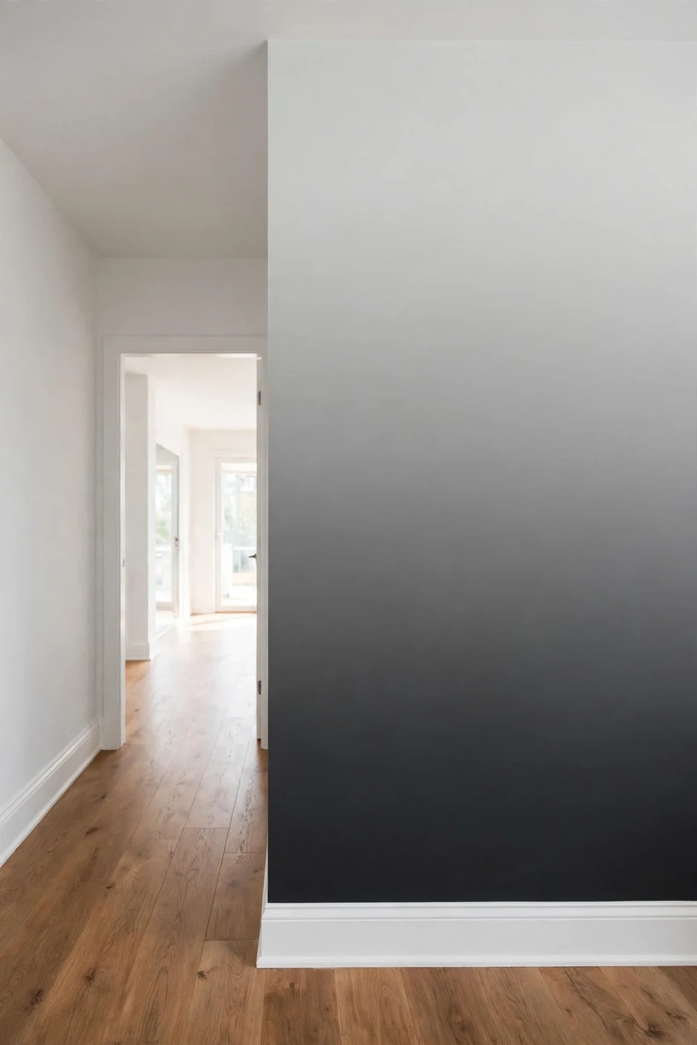
LRV stands for Light Reflectance Value, and it is printed on most paint colour cards. It runs from 0 to 100. A value near 0 means the colour absorbs almost all light and looks very dark. A value near 100 means it reflects almost all light and looks very pale. A pale gray might have an LRV near 80, a mid gray near 50, and a charcoal near 15.
LRV compares depth only. It tells you how light or dark a shade is compared with another shade. It does not tell you the undertone. Two grays can share the same LRV and look completely different on the wall, one blue and one warm, because LRV says nothing about the blue or the warmth.
Use LRV as a depth guide, in this order. First, choose the undertone family that suits your light and finishes. Then use LRV to pick the depth inside that family. In a small or dark room, a higher LRV, roughly 65 or above, keeps the walls light and open. In a large, bright room, a mid LRV, roughly 45 to 60, gives the walls presence without making the room feel heavy. For an accent wall, a low LRV, roughly 10 to 25, gives drama and depth.
How to Test Gray Paint Properly
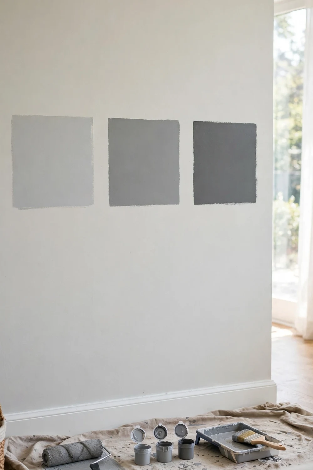
Small chips lie, or at least they hide the truth. A chip is too small to show undertone, too small to show how light moves across a wall, and too small to show how the colour sits next to your floor and trim. Proper testing takes a little more effort, but it is the difference between a colour you love and a colour you repaint.
Buy sample pots of your top three shades, not ten. Three is enough to compare clearly, and ten turns the test into noise. Paint each sample in a large patch, at least 60 centimetres square, on the wall you will see most, and paint a second patch on the darkest wall in the room. Leave a white gap between patches so they do not blend, and label each patch lightly in pencil so you remember which is which.
Live with the patches for at least two days. Look at them in the morning, at midday, in the late afternoon, and at night under your usual lamps. Notice which shade stays calm in all four lights and which one changes in a way you dislike. A shade that looks perfect at noon but purple at night is not the right shade. Two coats of the sample, over a neutral base, give the truest read. Finally, trust the test more than the name. The patch on your wall, in your light, next to your finishes, is the only opinion that counts.
Room by Room Picks
Gray is not one decision. It is a series of small decisions, one per room, because each room has different light, different finishes and a different job to do. The picks below are starting points to sample, grouped by room, so you can test with a clear shortlist instead of a whole paint chart.
In the living room, a warm greige or a balanced mid gray usually suits best, because it stays calm through the day and sits well with both wood and fabric. If the room faces north, lean warm. If it faces south and gets strong sun, a balanced gray with a hint of cool will hold its colour better. Our ideas for 22 cozy grey boho living room vibes to try show how gray walls can carry layered texture, plants and soft textiles without feeling cold.
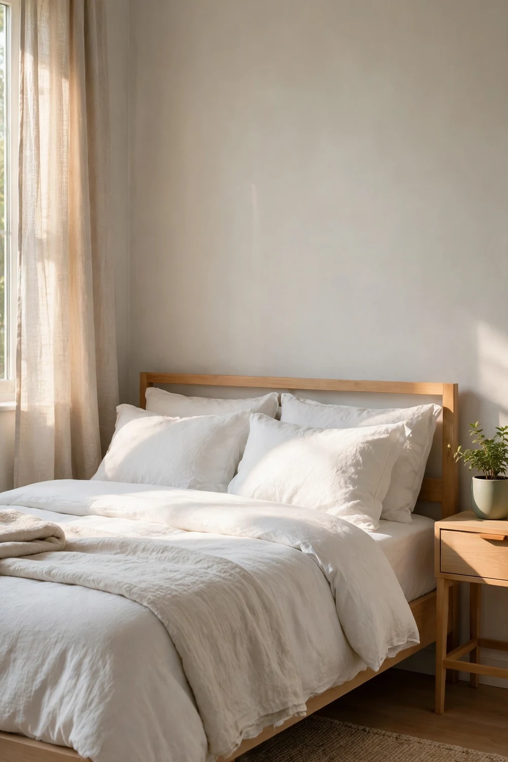
In the bedroom, gray should help you rest. Pale warm grays and pale greiges are the safest starting point, because they feel soft in lamplight and gentle in the morning. A pale gray green can also work well here, with white bedding and wood furniture. Avoid strong blue grays in a north facing bedroom unless you have tested them at night. If you want drama, use charcoal on the wall behind the bed only, and keep the other walls pale.
In the kitchen, a cool gray or a pale gray green works well with white cabinets and marble or pale stone, while a warm greige works well with cream cabinets and warm wood. A washable matt or eggshell finish is easier to live with than flat matt in a busy kitchen. Test your sample next to the cabinet door and the worktop together, under the kitchen lights you use at night.
In the bathroom, pale cool grays and gray greens suit white suites and chrome fittings. Warm greige suits stone tile and brass fittings, and it feels softer in a windowless bathroom. Keep the LRV fairly high unless you are deliberately creating a dark, spa like mood with charcoal on one wall. In hallways, a mid greige or a balanced gray is a good bridge, because it sits comfortably next to the colours in the rooms it joins.
| Room | Good starting point | Shades to sample | Best paired with |
|---|---|---|---|
| Living room | Warm greige or balanced mid gray | Agreeable Gray, Revere Pewter | Warm wood, cream textiles, mixed metals |
| Bedroom | Pale warm gray or pale greige | Classic Gray, Gray Owl | White bedding, wood furniture, soft lamps |
| Kitchen | Cool gray or pale gray green | Stonington Gray, Passive | White cabinets, pale stone, chrome |
| Bathroom | Pale cool gray or gray green | Gray Owl, Stonington Gray | White suite, chrome, pale tile |
| Hallway | Mid greige or balanced gray | Repose Gray, Agreeable Gray | White trim, wood floor, warm light |
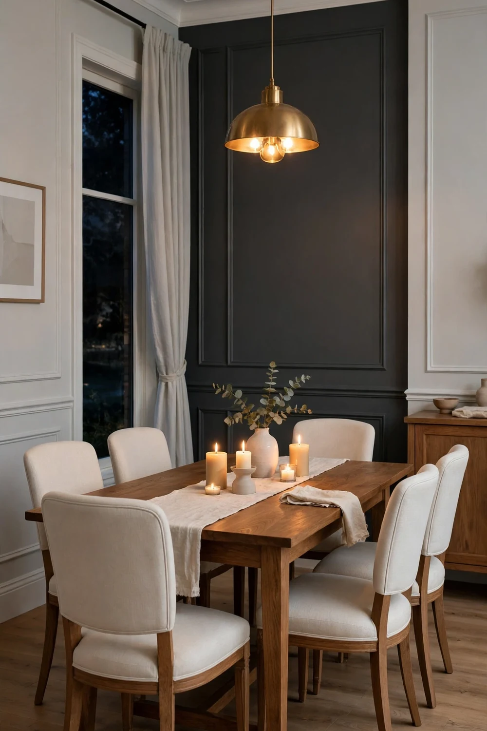
| Dining room | Mid gray or charcoal accent wall | Chelsea Gray, Kendall Charcoal | White trim, warm wood table, candlelight |
One note on the shade names in this guide. They are widely cited starting points to sample, not promises. Sherwin Williams Repose Gray SW 7015 is a balanced gray that many people test first. Agreeable Gray SW 7029 is a warm greige for open plan spaces. Benjamin Moore Revere Pewter HC 172 is a warm greige with depth. Classic Gray OC 23 is a pale warm gray for bedrooms. Stonington Gray HC 170 is a cool gray green for kitchens and bathrooms. Gray Owl OC 52 is a pale cool gray that needs good light. Chelsea Gray HC 168 and Kendall Charcoal HC 166 are deeper shades for accent walls. Passive SW is a soft cool gray for bright rooms. Sample two or three from the row that matches your room. If you want more ideas for using colour with confidence, our guide to 12 ways to use color in interior design like a pro covers balance, contrast and accent placement. For the bigger picture, see also top 10 color trends in interior design this year.
What to Avoid When Choosing Gray
Most gray mistakes come from the same few habits. The first is choosing from a tiny chip in a shop. A chip hides undertone, hides depth and hides the effect of your light. Always move to large samples on the wall before you buy the full tin. The second is testing only in daylight. A gray that looks perfect at noon can turn purple, blue or beige under lamps, and you will live with it under lamps every evening. Test at night, every time.
The third mistake is ignoring the fixed finishes. A beautiful cool gray can clash with warm oak floors, and a beautiful warm gray can clash with cool gray tile. The fourth mistake is painting all four walls in a dark gray in a small, shaded room. Dark gray can be gorgeous, but it needs light and scale to carry it. In a small dark room, use it on one wall and keep the rest pale. The fifth mistake is following a trend without testing it in your light. Trends are useful for ideas, not for decisions. And the sixth mistake is rushing because the painter is booked. A painter can wait a day. A repaint costs far more than a day of testing.
Questions About Choosing Gray Paint
What is the best gray paint colour for a living room?
There is no single best gray for every living room, because light and flooring change the answer. A warm greige or a balanced mid gray is the safest starting point. Sample Agreeable Gray and Revere Pewter first if your room is north facing or has warm wood floors, and sample Repose Gray first if your room is bright and south facing. Test large patches for two days, and pick the shade that stays calm in morning, afternoon and lamplight.
How do I tell if a gray is warm or cool?
Compare it with other grays on a white sheet of paper. A warm gray will look slightly yellow, red or brown next to a true gray. A cool gray will look slightly blue, green or violet. Hold the chip against your floor and your trim as well, because fixed finishes pull the undertone out. Undertone is much easier to see on a large patch than on a chip.
Why does my gray paint look blue on the wall?
It usually means the shade has a blue or violet undertone and your room light is cool, often in a north facing room or under cool white bulbs. The undertone was always there, but the small chip hid it. To fix it, test a warm gray or a greige with a similar depth on the same wall under the same light.
What is greige, and is it better than gray?
Greige is a mix of gray and beige. It is not better than gray in general, but it is often easier to live with, because it adds warmth without turning yellow like older beige paints. Greige suits open plan living spaces, north facing rooms and homes with warm wood floors. Choose the family that matches your light and finishes, not the name that sounds newest.
Should gray walls have white or cream trim?
Both can work, and the choice changes how the wall looks. Crisp white trim gives a clean contrast and suits cool grays and charcoal. Cream trim softens the contrast and suits warm grays and greige. Test them together, because crisp white can push a warm greige toward beige, and cream can make a pale cool gray look almost white.
How many gray samples should I test?
Three is a good number. Pick one warm gray or greige, one balanced gray and one cool gray, or pick three shades inside the family that suits your room. Paint each one in a large patch, at least 60 centimetres square, on two walls, and live with them for two days. More than five samples usually makes the decision harder, not easier.
Your Two Day Plan for a Gray You Will Love
Choosing gray does not need to be stressful. It needs a short, clear plan, and then a little patience while the samples do their work. Start by naming the undertone family that suits your room. Look at the light direction, look at the floor and the trim, and pick warm, cool or greige as your starting family. Then pick three shades inside that family, using the room by room table above as your shortlist.
On day one, paint large patches on the main wall and the darkest wall, label them, and look at them in daylight and in the evening. On day two, look again in the morning and the afternoon, and notice which shade stays calm in every light. If none of the three feels right, that is useful information too. It usually means the family is wrong, so try three shades from the next family rather than sampling ten more from the same one.
When you have your shade, buy enough paint for two coats, keep the paint code and the finish written down, and keep a small leftover tin for touch ups. Paint the room, let it dry fully, and live with it for a week before you judge it. For a final touch of drama, consider a darker shade as an accent. Our ideas for 20 black accent wall ideas to create a dramatic focal point show the same principle at the darkest end of the scale. Gray is a quiet colour, and that is its strength. Chosen well, it lets your furniture, your light and your life take centre stage.