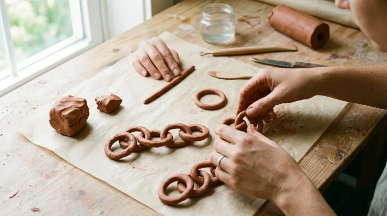
Why Does One Target Room Look Designer and Another Look Like a Showroom Aisle?
Walk into two homes furnished with similar pieces from the same store and the difference can be startling. One room feels calm, collected and quietly expensive. The other feels flat, even though every item is new and every item matches. The pieces are not the whole story. The way they are chosen, mixed and given room to breathe is what makes the difference.That question is the right place to start with Studio McGee decor at Target. The collection is built around a modern organic look, which means clean shapes softened by natural materials, warm colour and texture you want to touch. When a room follows those ideas, it reads as designer led. When a room only copies a display, with every item in the same finish and the same tone, it reads as a set. Nobody lives in a set.
The designer look comes from restraint and mixing, not from buying more. Choose a warm neutral base, add two or three natural materials, layer texture at different heights, include one piece that looks older or handmade, and leave some empty space on every surface.That short answer explains most of what follows in this guide. We will decode each principle in plain terms, show how it works in a living room, a bedroom, an entryway and a dining room, and finish with a sensible shopping order so you do not buy the decorative extras before the pieces that actually set the tone.
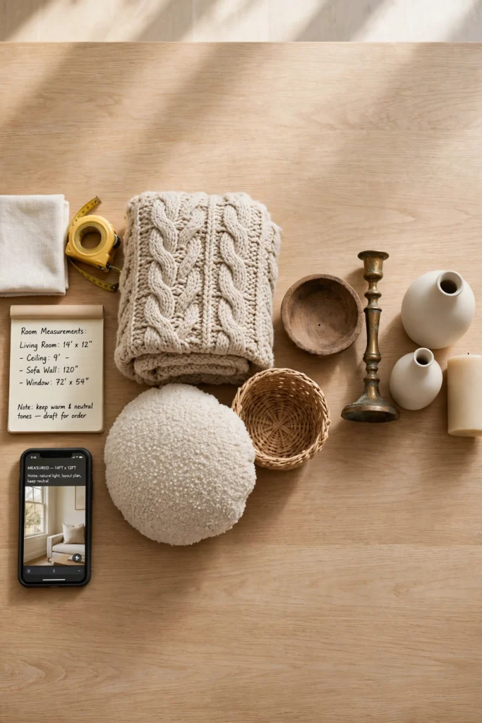
Measure the main pieces too. Write down the length of the longest wall, the width available for a sofa, the space between a sofa and a coffee table, and the height of the ceiling. Keep those numbers on your phone. They will stop you buying a rug that is too small, a mirror that is too high, or a console that crowds a walkway. Good styling starts with numbers, even if the finished room looks effortless.
Principle One: Warm Neutrals, Not Plain White
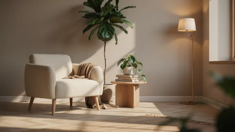
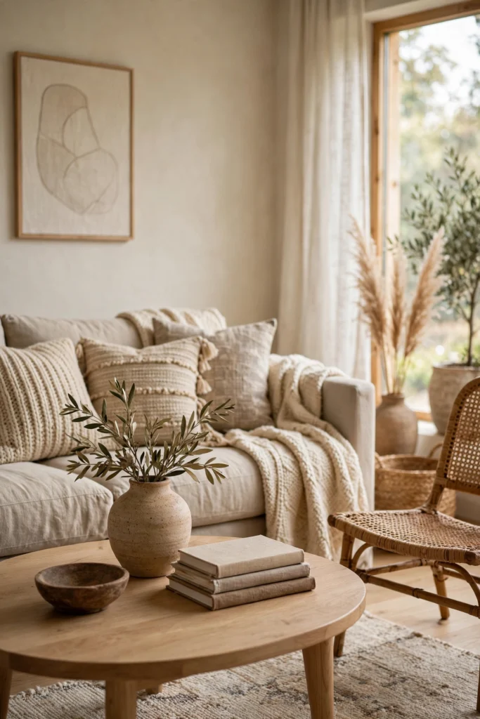
The Studio McGee palette is often described as neutral, but that word hides a lot of choice. The neutrals here are warm. Think cream, oatmeal, soft taupe, warm grey, muted sage and gentle clay. Pure bright white walls, cool grey sofas and stark black accents can make the same shapes feel cold. Warm neutrals do the opposite. They make wood look richer, brass look softer and greenery look more alive.Start with one main neutral for the largest pieces. A cream or oatmeal sofa is a safe anchor because it will work with almost any wood tone and almost any accent colour you add later. Then add a second neutral that is a little deeper, perhaps a warm taupe throw or taupe cushions, so the room has depth instead of one flat wash of pale colour. A third tone, used in small amounts, can be sage green, terracotta or dusty blue. Three tones are usually enough. More than that, and the calm feeling starts to slip away.
For a practical colour check, hold fabric samples against your sofa in daylight and again in evening lamplight. Colours shift a lot between those two lights. A cushion that looks soft beige at noon can look pink or grey at night. Choosing in both lights avoids the common mistake of a room that looks right in the shop and odd at home. If you are choosing paint for one accent wall or for a small room, sample two warm neutrals side by side and live with them for a few days before you commit.Colour also works through repetition. A warm wood tone on a coffee table, a picture frame and a tray will tie a room together more quietly than matching everything exactly. The eye notices the echo without feeling lectured by it. That is why rooms in this style often feel cohesive even when the pieces come from different places and different years. For more ideas on building a warm palette, see these interior color trends for cozy homes, which show how muted tones can still feel rich and layered.
Principle Two: Mixed Materials Instead of Matching Sets
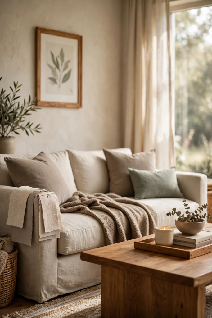
A matching furniture set is the fastest way to make a room look like a showroom. Every piece in the same wood, the same finish and the same style leaves nothing for the eye to explore. The Studio McGee approach mixes materials on purpose. Wood sits next to woven rattan, brass sits next to ceramic, linen sits next to leather, and stone sits next to glass. The mix is what makes a room feel collected over time rather than bought in one afternoon.
A useful rule is to aim for three materials in the main sightline of a room. In a living room that might be warm wood, woven texture and brushed brass. In a bedroom it might be wood, linen and ceramic. In a dining room it might be wood, stone and rattan. Three is enough to create interest. Five or six competing materials in one view can feel restless, especially in a small room.Burl wood deserves a special mention because it appears so often in this style. Its swirling grain gives a plain console or side table a sense of age and character without needing any extra decoration. Pair it with simple shapes around it. A burl wood table with a plain linen sofa and a single sculptural vase will look intentional. The same table surrounded by patterned cushions, patterned rugs and ornate frames will look crowded. Let the most interesting material in the room have some quiet around it.
Principle Three: Layered Texture You Can Feel
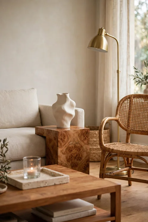
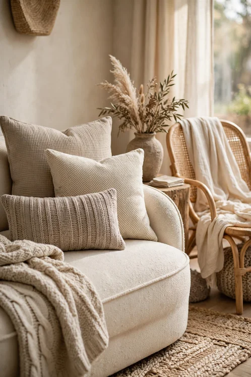
Texture is the reason a neutral room does not feel boring. Without it, cream on cream on cream can look washed out. With it, the same palette feels warm and inviting. Texture comes from boucle, linen, cotton, wool, rattan, woven grass, rough ceramic and soft leather. Each material catches light differently, so the room changes through the day even when the colours stay the same.Layer texture from the floor up. Start with a rug that has some visible weave, not a flat printed rug that looks like a photograph of texture. Add upholstery in a fabric with a slight nub or slub, such as linen or boucle. Then add cushions and throws in different weaves, one smooth, one chunky, one with a subtle pattern. The hand should notice a change at each layer. If everything feels the same, add one rougher or softer piece and the whole arrangement will lift.
Throws are a good place to practise this. A chunky knit throw folded over the arm of a sofa adds weight and warmth. A lighter cotton throw draped across a chair adds a different kind of softness. The two together look better than two identical throws, and they are more useful through changing seasons. If you want more throw ideas that fit this layered look, these modern throw blanket living room ideas show how placement and fabric choice change the feel of a sofa.Cushions work the same way. Mix sizes rather than buying four identical squares. A larger cushion at the back, a medium cushion in front and a smaller lumbar cushion in a different texture gives a sofa a relaxed, arranged look without looking fussy. Keep the colours close, within the warm neutral family, and let texture do the work of creating contrast. A room with three textures in similar colours will always look more expensive than a room with three bright colours in the same texture.
Principle Four: One Vintage Feeling Piece in Every Room
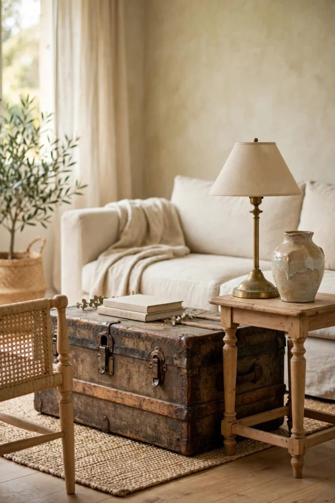
Every room in this style needs at least one piece that looks as if it has a history. It does not have to be a genuine antique. It can be a new piece with an aged finish, a weathered wood frame, a brass lamp with a patina, a ceramic vase with an irregular glaze, or a mirror with a slightly worn frame. That one piece stops a room full of new items from feeling like a catalogue page.Choose the vintage feeling piece early, because it will set the mood for the rest of the room. A warm wooden trunk as a coffee table suggests a relaxed, collected home. A brass floor lamp suggests a slightly more formal, classic home. A carved wooden bowl on a console suggests a home that values handmade things. The rest of your choices should support that mood, not fight it.
If you cannot find a vintage piece you love, look for new pieces that borrow vintage details, such as turned wood legs, a woven cane panel, a scalloped edge or a hand finished glaze. Those details carry the same warmth. Avoid pieces that try too hard, with fake distressing on every edge or an overly ornate shape that fights the clean lines of the rest of the room. One quiet nod to the past is stronger than a loud imitation of it.
Principle Five: Breathing Room on Every Surface
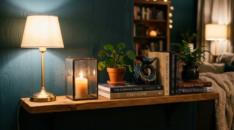
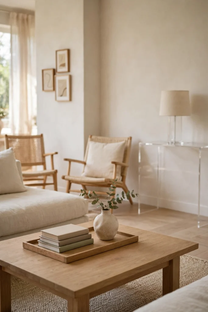
Breathing room is the principle most people skip, and it is often the reason a room feels off even when the furniture is right. Every surface needs some empty space. A coffee table with a tray, a stack of books and a vase looks styled. The same table with those items plus a candle, a bowl, a plant, a remote holder and a decorative box looks crowded. The eye needs a place to rest.A practical way to check is to remove one item from every styled surface and live with the room for a day. Most people find the room feels calmer and larger, and they do not miss the removed item. If a surface still feels busy, remove one more. If it feels bare, add back a single item with a different height or texture. Styling is often subtraction, not addition.
Breathing room also applies to walls and floors. Leave a stretch of wall bare between a gallery grouping and the next piece of furniture. Leave floor space around a rug so the rug frames the seating area instead of filling the whole room wall to wall. In a typical living room, a rug around 8 feet by 10 feet suits a standard three seat sofa with two chairs, while a larger open plan room often needs a rug around 9 feet by 12 feet to anchor the seating properly. A rug that is too small makes furniture look as if it is floating. A rug that is too large can swallow a room.
The Signature Elements at a Glance
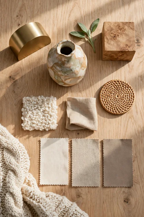
Before we go room by room, it helps to see the whole look in one place. The table below is not a shopping list. It is a checklist for checking a room you already have, or for planning a room you are building slowly. If a room already has most of these elements, it probably only needs one or two changes. If a room has almost none of them, start with the base and the texture rows, because those change the feeling fastest.
| Element | What it looks like | How to use it |
|---|---|---|
| Warm neutral base | Cream, oatmeal, warm taupe, soft warm grey | Use for large upholstery and bedding, then add depth with a second tone |
| Natural wood | Warm oak, walnut, burl wood grain | Use for tables, frames and trays, and repeat the tone in small amounts |
| Woven texture | Rattan, seagrass, jute, woven baskets | Use for baskets, lamp shades, chairs and trays to soften hard furniture |
| Soft layers | Linen, boucle, cotton, wool throws | Layer from the floor up, mixing smooth and chunky weaves |
| Warm metal | Brushed brass, aged brass, matte black | Use sparingly for lamps, frames and tray edges so it reads as jewellery, not hardware |
| One older feeling piece | Weathered wood, patina brass, handmade ceramic | Place where the eye lands first, with clear space around it |
| Greenery | Olive tree, fiddle leaf fig, potted herbs, stems in a vase | Use one larger plant or a few stems, not a forest on every surface |
| Breathing room | Empty surface, clear walkway, bare wall section | Remove one item per surface and live with the calmer version for a day |
Living Room: Where the Look Is Easiest to See
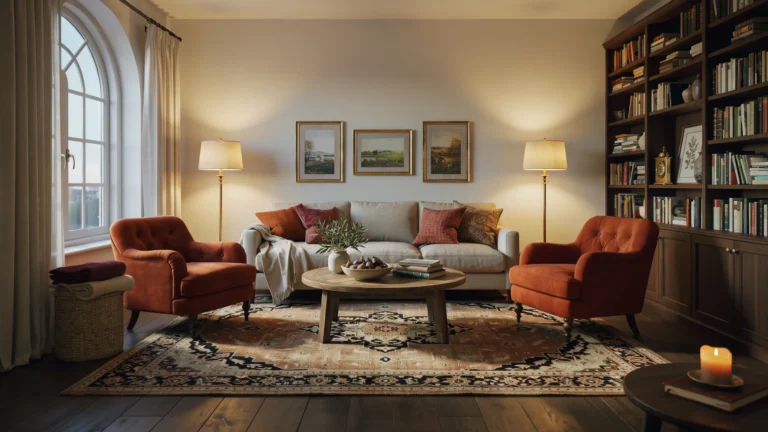
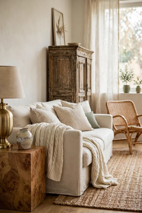
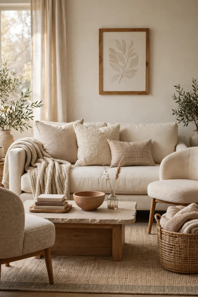
The living room is where most people first try this style, because it holds the most pieces and the most texture. Start with the sofa. A cream, oatmeal or warm grey sofa in a simple shape, with straight or gently rounded arms, will accept almost any cushion, throw or wood tone you add later. Avoid a sofa with heavy patterning or a very cool grey fabric if you want the warm organic feeling. The sofa is the largest commitment in the room, so its colour sets the temperature for everything else.Place a rug first, before you judge the rest of the room. The front legs of the sofa and chairs should sit on the rug, not float just beyond its edge. That one placement rule makes a seating group feel like a room within a room. A rug with a subtle pattern, a border or a visible weave will hide everyday wear better than a plain flat rug, and it will add texture underfoot where it matters most.
For the coffee table, choose warm wood or a wood and stone mix, with a height a little lower than the seat of the sofa. A typical coffee table height is around 16 to 18 inches, which keeps drinks within easy reach without blocking conversation. Style it with three items at different heights: a low tray or stack of books, a medium vase or bowl, and something with a little height, such as a stem or a candle holder. Three items, at three heights, usually look complete. Five or more usually look busy.Cushions and throws are where the mixed material idea becomes visible. Combine a linen cushion, a boucle cushion and a smaller cushion in a subtle pattern, all within the warm neutral family. For cushion combinations that stay calm rather than chaotic, this guide to mixing and matching throw pillows explains size, texture and colour balance in practical terms. Add one throw folded over an arm or draped across a chair, not three throws competing for attention on one sofa.
If your living room leans grey or cool, warm it up with wood and woven pieces before you buy anything new in a bright colour. A woven basket for blankets, a wooden tray on the coffee table and a warm wood frame on the wall can shift the whole temperature of the room. Those small warm notes are often enough. If you want more grey based inspiration that still feels cozy, these cozy grey boho living room ideas show how grey can stay soft when it is paired with texture and warm wood.
Bedroom: Calm, Layered and Easy to Wake Up In
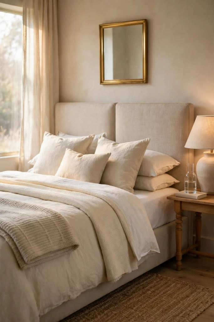
A bedroom in this style should feel calm first and decorative second. The bed is the obvious centre, so start there. Layered bedding is the signature move: a fitted sheet, a duvet or coverlet in cream or white, a second lighter layer folded across the foot, and cushions in linen and cotton textures. The layers should look inviting, not like a display that has to be dismantled every night. If making the bed feels like a chore, remove one layer. Comfort has to survive daily use.Choose a headboard or a bed frame in a warm material, such as upholstered linen, warm wood or rattan. A rattan headboard adds woven texture and a relaxed feeling without needing much else on the wall. An upholstered headboard in oatmeal linen adds softness and works well in a smaller room where a wooden frame might feel heavy. Either choice will anchor the bed and give the room a clear focal point.
Bedside tables are a good place for the vintage feeling piece. A small wooden table with turned legs, a ceramic lamp with a linen shade, or a brass framed mirror above the table can carry the character for the whole room. Keep the surface simple: a lamp, a small book or a carafe, and one small decorative item. A bedside table crowded with chargers, bottles and papers will never feel calm, no matter how beautiful the lamp is. A small tray or a lidded box can hide the practical items without hiding the style.For a guest bedroom, the same principles apply, with one extra thought: a guest should be able to find what they need without asking. A carafe of water, a small stack of towels on a bench, a spare blanket folded at the foot of the bed, and a clear surface for a phone and a book will make a guest feel welcome. If you are planning a guest space from scratch, these elegant guest bedroom ideas for adults show how calm palettes and layered bedding work in a room that is used less often but still needs to feel cared for.
Entryway: Small Space, Strong First Impression
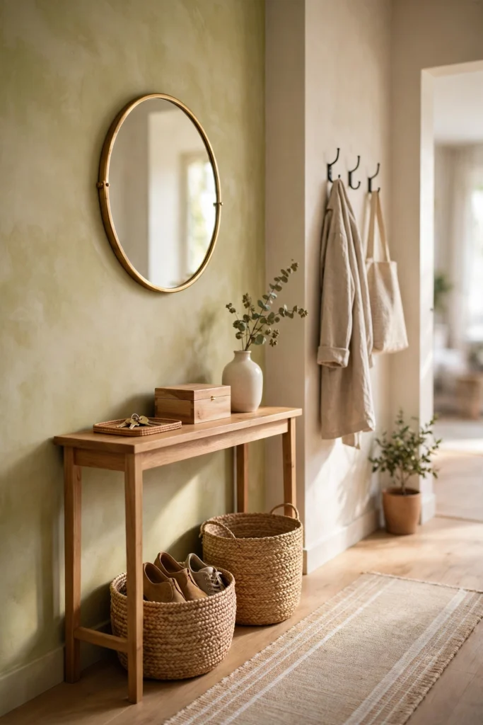
The entryway is small, but it sets the tone for the whole home. A guest forms an impression here in seconds, and you pass through it every day. The Studio McGee entryway is simple: a console or bench, a mirror or art above it, a basket or two, and one plant or stem. That is enough. An entryway stuffed with furniture will feel cramped, even if every piece is beautiful on its own.Start with the console. Its depth matters more than its length in a narrow hallway. A console around 12 to 14 inches deep will hold keys, a tray and a vase without blocking the walkway. If the hallway is very narrow, a wall mounted shelf and a few hooks can do the same job with less bulk. Measure the walkway and leave a comfortable passing width before you choose. A beautiful console that forces everyone to turn sideways is a mistake, not a feature.
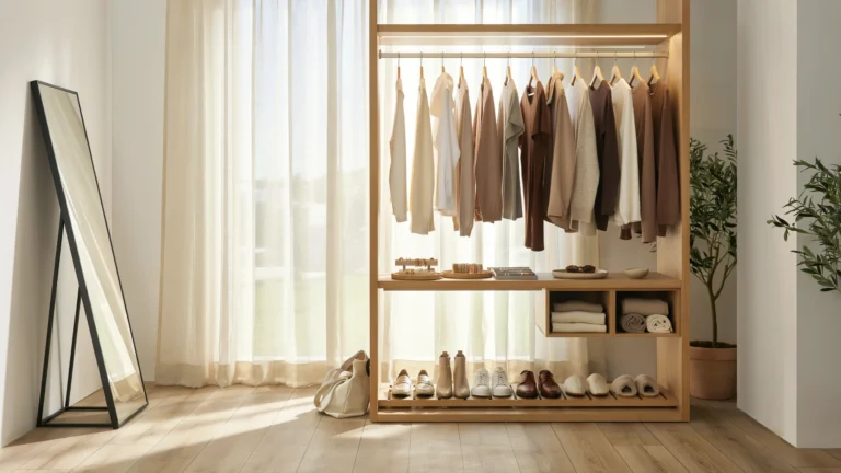
Storage in an entryway should be honest about daily life. Shoes, bags, keys and coats need a place, or they will end up on the floor no matter how pretty the console is. A woven basket for shoes, a lidded box for keys and small items, and hooks at a reachable height for coats will keep the space working. If your entryway doubles as a mudroom, these mudroom wall decor ideas for a welcoming entryway show how hooks, baskets and simple wall decor can stay tidy in a busy household.
Dining Room: Gathered, Not Formal
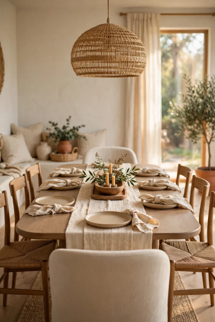
A dining room in this style should feel gathered rather than formal. The table is for long meals, homework, board games and conversation, not only for special occasions. A warm wood table, in oak or walnut, with a simple shape and a matte finish, will suit that kind of use. A very glossy or very dark table can feel formal and can show every mark. A matte wood surface, by contrast, gains character with use and pairs easily with linen, ceramic and rattan.
Chairs are a good place to mix. You do not need eight identical chairs. A set of wooden chairs with woven seats, plus two upholstered chairs at the heads of the table, will look collected and will be more comfortable for long meals. If you already own a matching set, change the feeling with cushions in linen, a table runner in cotton, and ceramic plates in warm cream. Small textile changes can soften a formal set without replacing it.
The centrepiece should be low enough to talk across. A long low bowl, a wooden tray with a few candles, or a vase with short stems will all work. A tall arrangement that blocks faces across the table will make conversation awkward, even if it looks impressive in a photograph. For everyday use, a centrepiece that can be moved to one side in seconds is more practical than a fixed arrangement. Keep the table clear enough for plates, glasses and serving dishes, because a dining table that cannot be used for dining has missed its purpose.
How to Shop Smart: What to Buy First, What to Skip
Shopping smart starts with an order. Buy the base first, then the texture, then the character piece, and only then the decorative extras. The base means the sofa, the rug, the bed, the dining table, or the console, depending on the room. Those pieces set the colour and the scale. Texture means throws, cushions, baskets and curtains, which soften the base. The character piece means the vintage feeling item that gives the room its story. Decorative extras, such as small bowls, candles and ornaments, come last, because they should fill gaps you can actually see, not gaps you imagine while shopping.
What to skip is just as important. Skip matching sets where every piece shares the same wood and finish. Skip sets of identical cushions in identical sizes. Skip decorative items that have no use and no meaning, bought only because they were on a display. Skip a piece that is the wrong size for your room, even if you love it in the shop, because scale mistakes are hard to hide. Skip anything that needs constant tidying to look good, because a room that only looks good when it is untouched will not stay that way in a real home.
When you do buy new, check three things before you pay. First, does the piece fit the measurements you took? Second, does it add a material or texture you do not already have in that room? Third, does it work with the warm neutral palette, or will it fight it? If a piece fails two of those three checks, leave it. There will always be another piece. A room built slowly, with pieces chosen for fit and feeling, will always look better than a room bought in one hurried trip.
Frequently Asked Questions
These are the questions people ask most when they are trying this look at home, with honest answers based on the principles above rather than on a single shopping trip.
Can I get the Studio McGee look without replacing all my furniture?
Yes, in most rooms. Start with textiles and lighting, which change the feeling fastest. Add a rug with a visible weave, cushions in linen and boucle, a throw, and warmer lamps. Then add one wooden or woven piece, such as a tray, a basket or a side table, to warm the palette. Replace only the piece that fights the look most, such as a very cool grey sofa or a glossy black table, and only when you are ready. Most rooms need editing and layering, not a complete replacement.
What colours work best for this style?
Warm neutrals work best: cream, oatmeal, warm taupe, soft warm grey, muted sage and gentle clay. Use one main neutral for large pieces, a second slightly deeper tone for depth, and a third accent tone in small amounts. Avoid very bright white, very cool grey and very saturated colours in large amounts, because they can make the room feel cold or busy. Small amounts of sage, terracotta or dusty blue, in cushions or art, will add interest without breaking the calm.
How do I mix wood tones without making a room look messy?
Pick one dominant wood tone for the largest pieces, then allow one or two related tones in smaller pieces. Warm oak and walnut can sit together if the finishes are both matte and the tones are not too far apart. Repeat each tone at least twice in the room, such as a walnut table and a walnut frame, so no single tone looks like a mistake. Keep the overall palette warm, and use textiles to bridge any gap between tones.
Do I need real vintage pieces, or can new pieces work?
New pieces can work well, provided they have vintage details such as turned legs, a woven panel, a hand finished glaze or an aged brass finish. The point is character, not age. One piece with a story, whether it is inherited, found at a market or bought new with an aged finish, will stop a room from feeling like a catalogue. Avoid pieces with heavy fake distressing on every edge, which can look like a costume rather than a character piece.
How many cushions and throws should a sofa have?
For a standard three seat sofa, three to five cushions usually look balanced: larger cushions at the back, medium cushions in front, and one smaller lumbar cushion for texture contrast. One throw, folded over an arm or draped across a chair, is usually enough. More than that, and the sofa can look like a cushion shop. Choose cushions in similar warm colours with different textures, so texture, not colour, creates the interest.
What plants suit this style best?
Olive trees and fiddle leaf figs suit the style well because their shapes are soft and their green tones sit comfortably with warm neutrals. Smaller plants, such as potted herbs in a kitchen, or a few stems in a vase on a console, can give the same softening effect in a smaller space. Choose a plant you can care for in the light you actually have, and put it in a pot that matches the room, such as cream ceramic or woven seagrass. A healthy plant in a good pot will always look better than a large plant that is struggling.