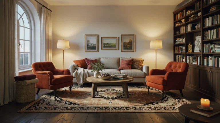
Shelf decor ideas work best when you build in layers. Put the tallest, flattest pieces at the back, medium pieces in the middle, and small, detailed pieces at the front. Vary the heights, leave about a fifth of the shelf empty, and step back to edit before you call it done.
Most shelves look wrong for a simple reason. Everything sits in one straight row, at the same height, at the same depth. The eye has nowhere to travel, so the shelf reads as storage even when the pieces themselves are pretty. Layering fixes that problem without buying anything new. It gives the shelf depth, it creates a clear focal point on each board, and it lets a few ordinary objects look considered.
This guide uses one system from start to finish. You will work back to front, not left to right. You will place anchors first, then supports, then details. You will check height, spacing and colour as you go. By the end you will know what belongs on each layer, how much empty space to keep, and how to fix the shelf when it still looks off.
Start with an empty shelf if you can. Take everything off, wipe the board, and look at the bare shape. Notice where the shelf sits in the room, how high it is, and what sits beside it. A shelf above a sofa is viewed from across the room, so it needs bolder shapes. A shelf beside a desk is viewed up close, so small details matter more. That one observation will shape every choice that follows.
How the layering system works
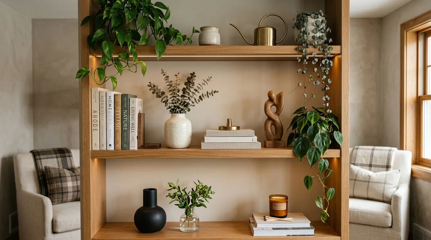
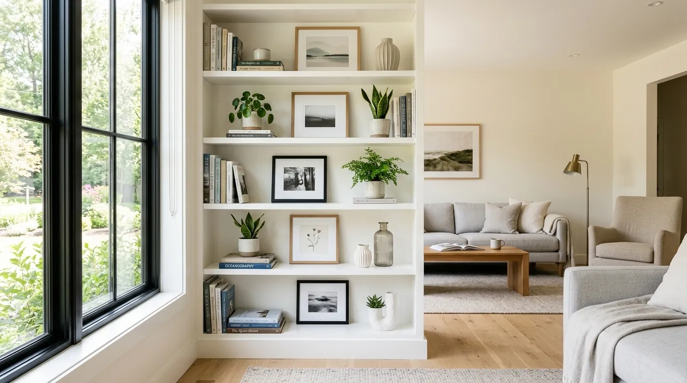
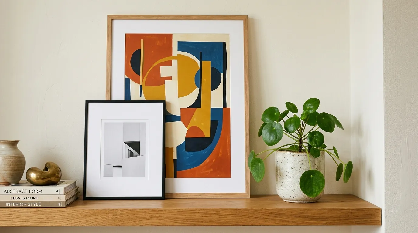
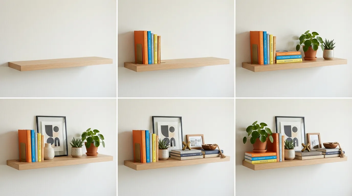
Think of each shelf as a small stage with three rows. The back row holds the tall, flat pieces that set the height and the mood. The middle row holds the medium pieces that add weight and colour. The front row holds the small pieces that reward a closer look. Nothing in the front row should hide the middle row completely, and nothing in the middle row should hide the back row. Each layer stays partly visible, so the shelf feels deep rather than flat.
Colour matters inside the layers too. A useful guide is to let one main colour cover most of the shelf, a second colour cover a smaller share, and an accent colour appear only in one or two small spots. That ratio, roughly 70 percent, 20 percent and 10 percent, keeps the shelf calm without making it dull. It is a guide, not a rule to measure with a ruler. If the shelf starts to look busy, the accent colour is usually the culprit. Pull one accent piece out and the whole board often settles.
Layer one: the back layer
The back layer sets the height of the whole shelf. It is made of tall, flat or upright pieces that sit against the wall: framed prints, a leaning mirror, a large platter stood on edge, tall books stood upright, or a framed photograph. These pieces should be the tallest things on the board, but they should still leave a clear gap to the shelf above. A good working gap is about a hand width between the top of the tallest piece and the underside of the next shelf, so the board does not feel crammed from above.
Lean frames rather than hanging every piece. A leaning frame creates a relaxed, lived in feel and it lets you layer a smaller frame in front of it later. If you hang a frame on the wall above the shelf instead, keep it close to the shelf, roughly a few inches above the board, so the shelf and the wall piece read as one display rather than two separate ones. For ideas on how wall pieces and shelves work together above seating, these above couch wall decor ideas show how scale and spacing change the whole wall, not just the shelf.
Height variation starts in the back layer. If every back piece is the same height, the shelf will look like a fence. Mix a tall frame with a medium stack of upright books, then a slightly shorter frame or platter. The top edge of the back layer should rise and fall like a skyline, with one clear high point and a few lower points. That uneven top edge is what keeps the eye moving.
Layer two: the middle layer
The middle layer is where the shelf gains weight. It holds medium sized pieces that sit in front of the back layer but behind the smallest details: a medium vase, a stack of two or three books laid flat, a lidded box, a small basket, a ceramic bowl, or a plant in a pot that is wider than it is tall. These pieces should be clearly shorter than the back layer and clearly taller than the front layer, so the three depths read as three steps.
Place middle pieces slightly off centre from the anchor behind them. If the frame sits dead centre and the vase sits dead centre in front of it, the vase hides the frame and the grouping looks like a single lump. Shift the vase a few inches to one side so part of the frame stays visible. That small shift creates depth, and it is often the difference between a shelf that looks flat and a shelf that looks layered.
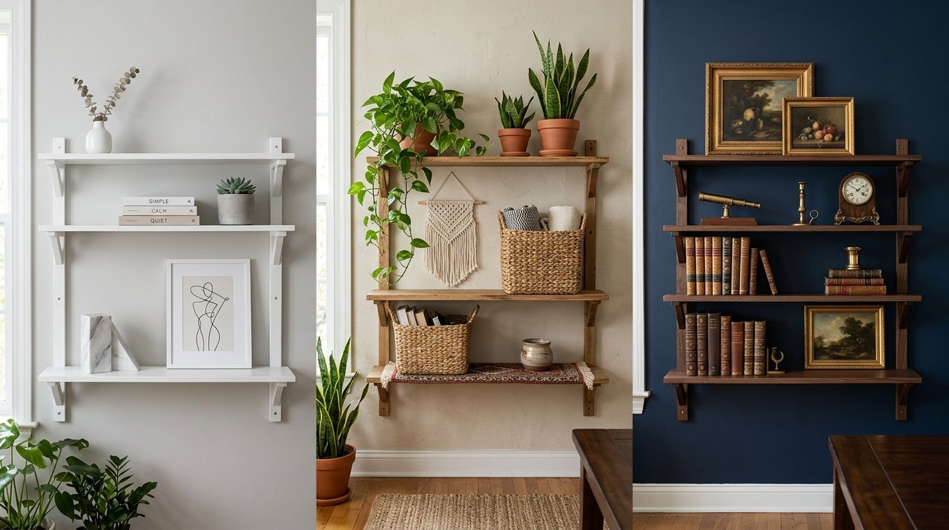
Use the middle layer to repeat a material or a colour from elsewhere in the room. A wooden bowl echoes a wooden coffee table. A brass vase echoes a brass lamp. A woven basket echoes a woven rug. These echoes do not need to match exactly. They need to feel related, so the shelf belongs to the room instead of sitting apart from it. This is also the layer where mixed materials help most, since a smooth ceramic next to rough wood next to soft woven texture keeps the hand and the eye interested. If you want to see how mixed finishes work beyond shelves, these chrome and wood accent pieces show how a cool metal and a warm wood can share a room without clashing.
Stacks belong in the middle layer. A stack of books laid flat gives you a small platform, and it lets you raise a small object to a better height. Keep stacks to two to four books. More than that starts to look like storage, and the stack becomes too tall to sit comfortably in the middle. Turn the books so the spines face different directions, or face the largest book out, if the covers are prettier than the spines. A stack also works as a divider between two groupings, a quiet pause that stops one group from running into the next.
Layer three: the front layer
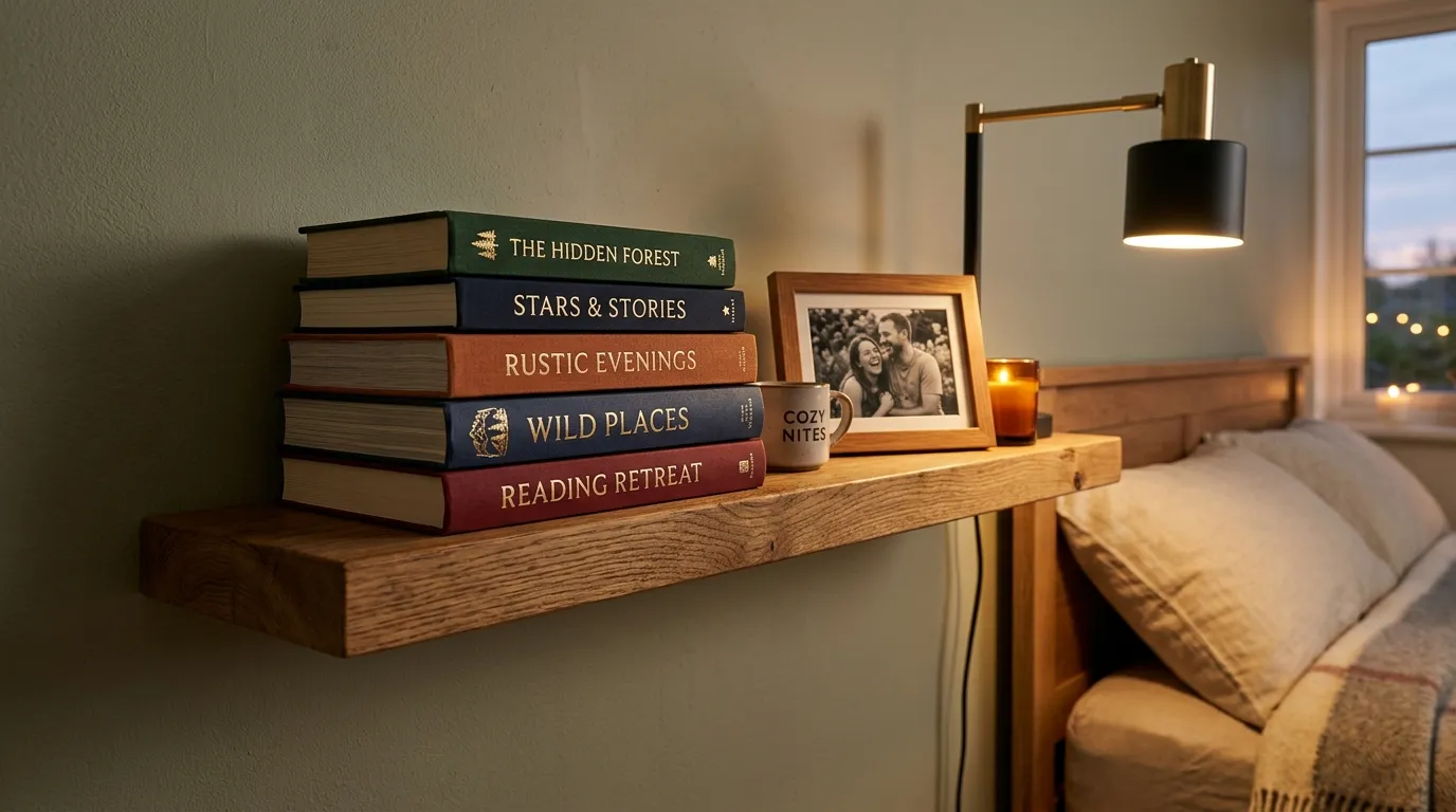
The front layer holds the smallest, most personal pieces: a candle, a tiny sculpture, a small framed photo, a piece of driftwood, a single stem in a bud vase, or a small stack of coasters. These pieces sit closest to the edge of the shelf, but not so close that they look ready to fall. Leave at least an inch or two of board in front of them, and keep them away from the very edge if children or pets pass by.
Front pieces work in odd groups. Three small pieces of different heights look more natural than two matching pieces or four evenly spaced pieces. The rule of three is not about counting for its own sake. It is about avoiding the stiff symmetry that pairs create. One anchor plus two supports is a useful way to think about it: one piece that stands out, plus two smaller pieces that balance it without copying it. Three identical candles in a row will still look stiff, because sameness, not number, is the problem. Vary the height, the material or the shape, and the group relaxes at once.
Keep the front layer light. This is not the place for heavy books or large baskets. Heavy pieces at the front block the layers behind them and make the shelf feel top heavy in the wrong direction. If a front piece is hiding a middle piece completely, move the front piece to the side or swap it for something shorter. Every layer should stay partly visible, or the layering system stops working.
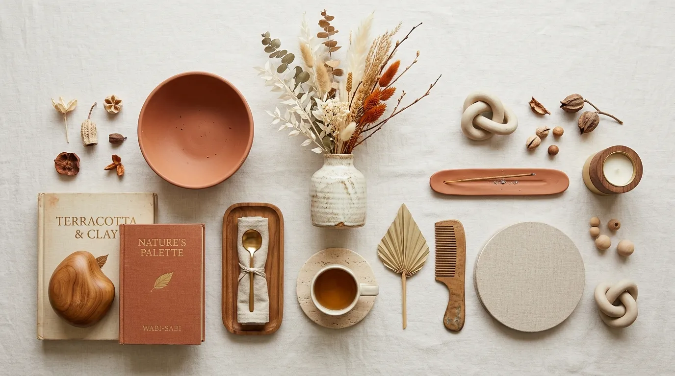
Height and spacing: the numbers that keep shelves calm
Good shelf styling feels instinctive, but a few practical measurements make it much easier to repeat. The table below gives starting points, not strict rules. Use them to check a shelf that feels off, then trust your eye for the final call. Shelf heights, book sizes and room light all change what looks right, so treat these numbers as a first guess you can adjust.
| Part of the shelf | Useful starting point | What to watch for |
|---|---|---|
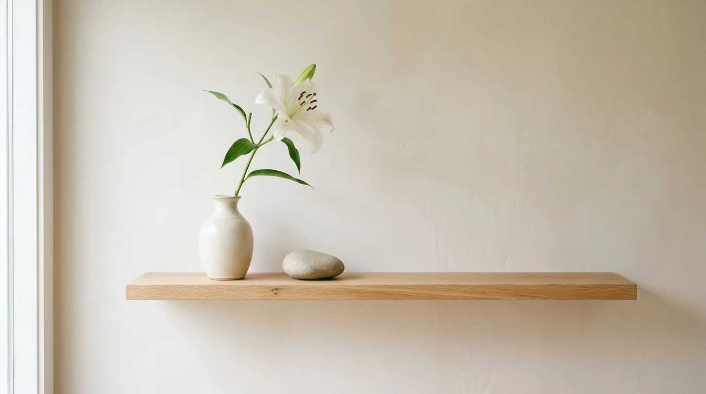
| Empty space across the shelf | About 20 percent of the shelf width left bare | If every inch is filled, the shelf reads as clutter, even with pretty pieces |
| Gap above the tallest piece | About a hand width to the next shelf | Less than that makes the board feel crammed from above |
| Height steps between layers | Back tallest, middle clearly shorter, front smallest | If two layers are the same height, depth disappears |
| Groupings on one shelf | Two or three groups, with a gap between them | Four or more tight groups blur into one long line |
| Book stacks laid flat | Two to four books per stack | Taller stacks look like storage and block the back layer |
| Front layer setback | At least an inch or two from the shelf edge | Pieces at the very edge look unsafe and distract the eye |
| Colour split | Roughly 70 percent main colour, 20 percent second colour, 10 percent accent | Too many accents make the shelf feel noisy, so remove one accent first |
| Books compared with objects | Roughly 70 percent books to 30 percent objects as a loose guide | On a display shelf, reverse it, and let objects lead instead |
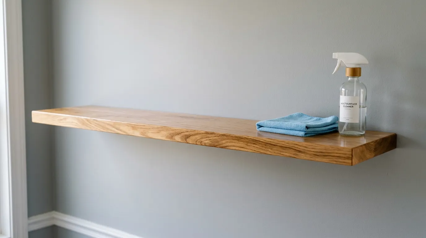
What to put on shelves
Once the layers are clear, choosing pieces gets easier. You are not looking for more objects. You are looking for the right object for each layer, in the right size, with a reason to be there. The four groups below cover most shelves well, and they mix easily with each other.
Books, vertical and stacked
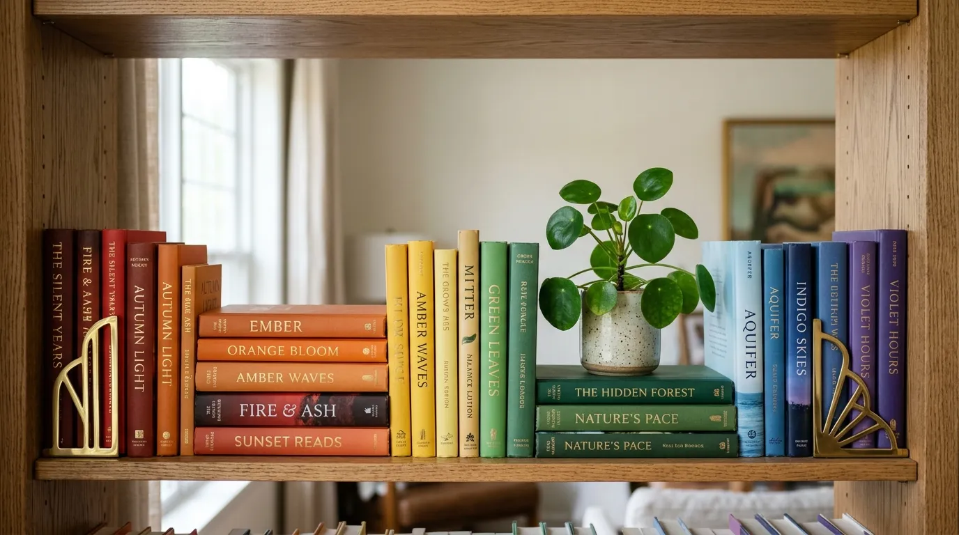
Books are the most useful shelf material because they do three jobs at once. They add height, they add colour, and they give you a platform for smaller pieces. Stand most books upright in groups of five to ten, with a bookend or a heavy object at the end so they do not lean. Then break the row with a horizontal stack. That change from vertical to horizontal is one of the simplest ways to create rhythm on a shelf.
Vertical books work best when their heights vary a little. A row of identical tall books looks like a library wall, which suits a study but can feel heavy in a living room. Mix a few tall art books with medium novels and one shorter book, and the top edge of the row starts to move. If the spines clash in colour, group books by colour family, or turn the loudest spines inward so the page edges show instead. Page edges in cream and white calm a shelf at once, though they hide titles, so use that trick only for books you do not reach for often.
Horizontal stacks need a flat, stable base. Put the largest book at the bottom and the smallest at the top, with the stack no more than four books high. Use the top of the stack for one small object, a candle, a tiny plant or a small sculpture, and leave the sides of the stack clear. A stack with objects piled on every side stops looking like a stack and starts looking like a pile. For a shelf that is mainly about reading, these reading nook ideas with bookshelves show how books, seating and light work as one corner, which helps you decide which books deserve the shelf and which belong in a closed cupboard.

Objects that earn their place
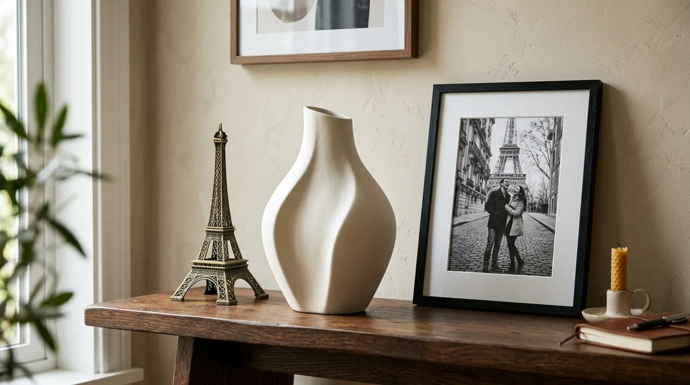
Objects are the pieces that make a shelf personal: vases, bowls, sculptures, boxes, baskets, framed photos, travel finds and handmade pieces. Choose objects with different shapes. A tall, narrow vase beside a low, wide bowl beside a round sculpture gives the eye three different outlines to follow. Three vases of the same shape and height, even in different colours, will still look like a set of matching items rather than a collected display.
Scale is the test for every object. Hold it against the shelf before you place it. A tiny trinket on a deep, wide shelf disappears, while a large sculpture on a narrow shelf crowds everything beside it. As a rough guide, the tallest object on a shelf should be no more than about three quarters of the height between shelves, and the widest object should leave clear board on both sides. If you have to squeeze an object in, it is too big for that spot, even if you love it. Move it to a larger shelf or a tabletop where it has room.
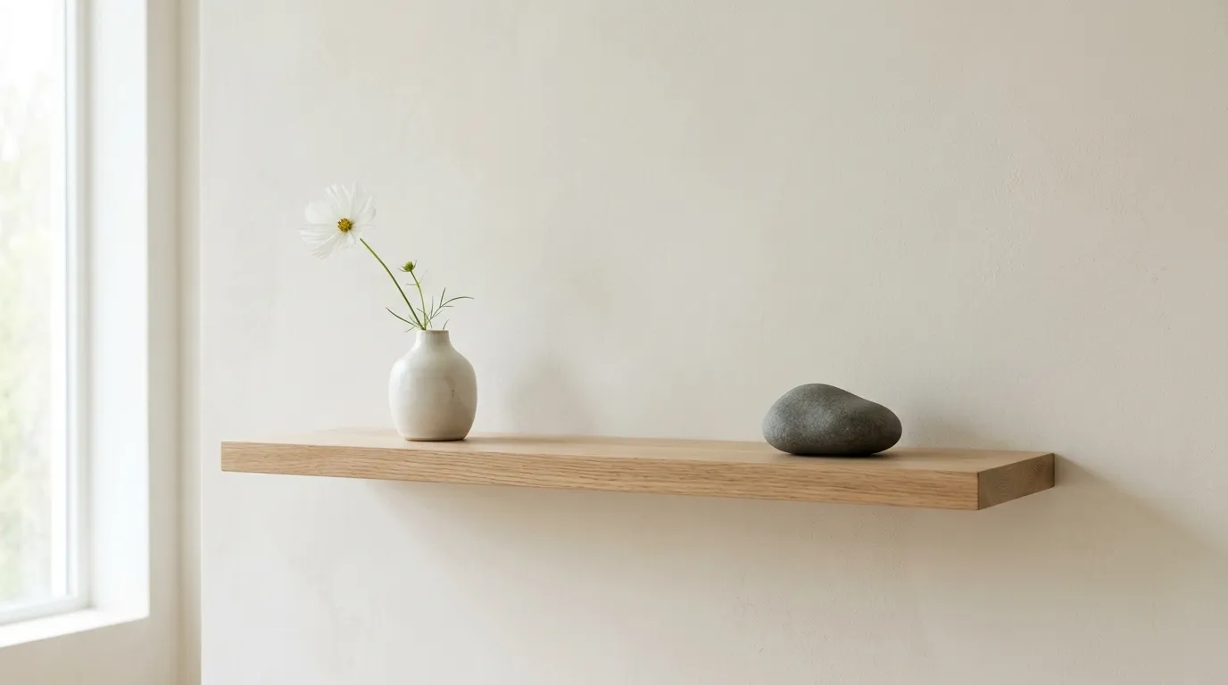
Greenery that suits the light
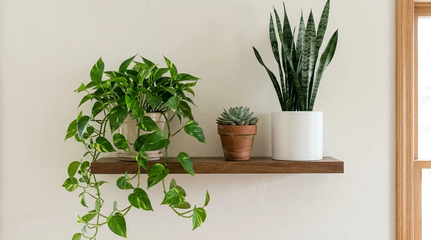
Greenery softens straight shelf lines and adds a living shape that no ceramic can copy. The right plant depends on light and on how much care you want to give. A shelf near a bright window suits a trailing plant that can spill over the edge, while a shelf in a dim hallway suits a sturdy plant that tolerates low light, or a good quality faux plant if real plants struggle there. Honesty about light saves you from a shelf of sad, leggy plants.
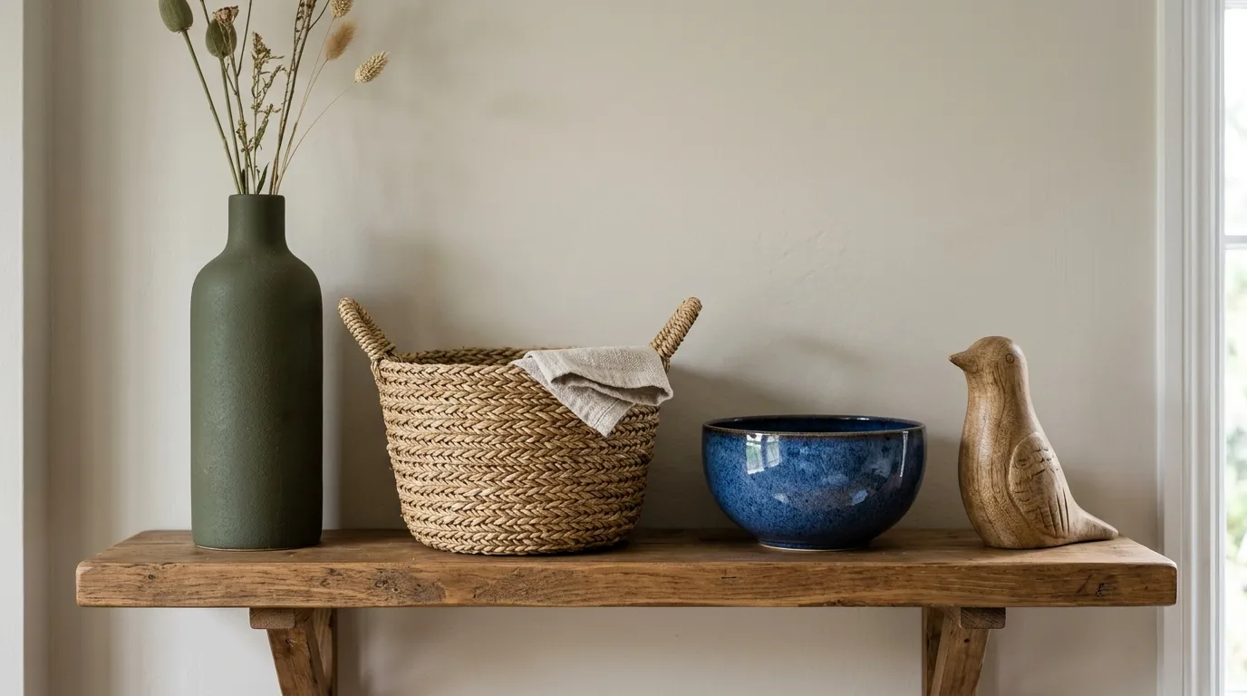
Light that makes shelves glow
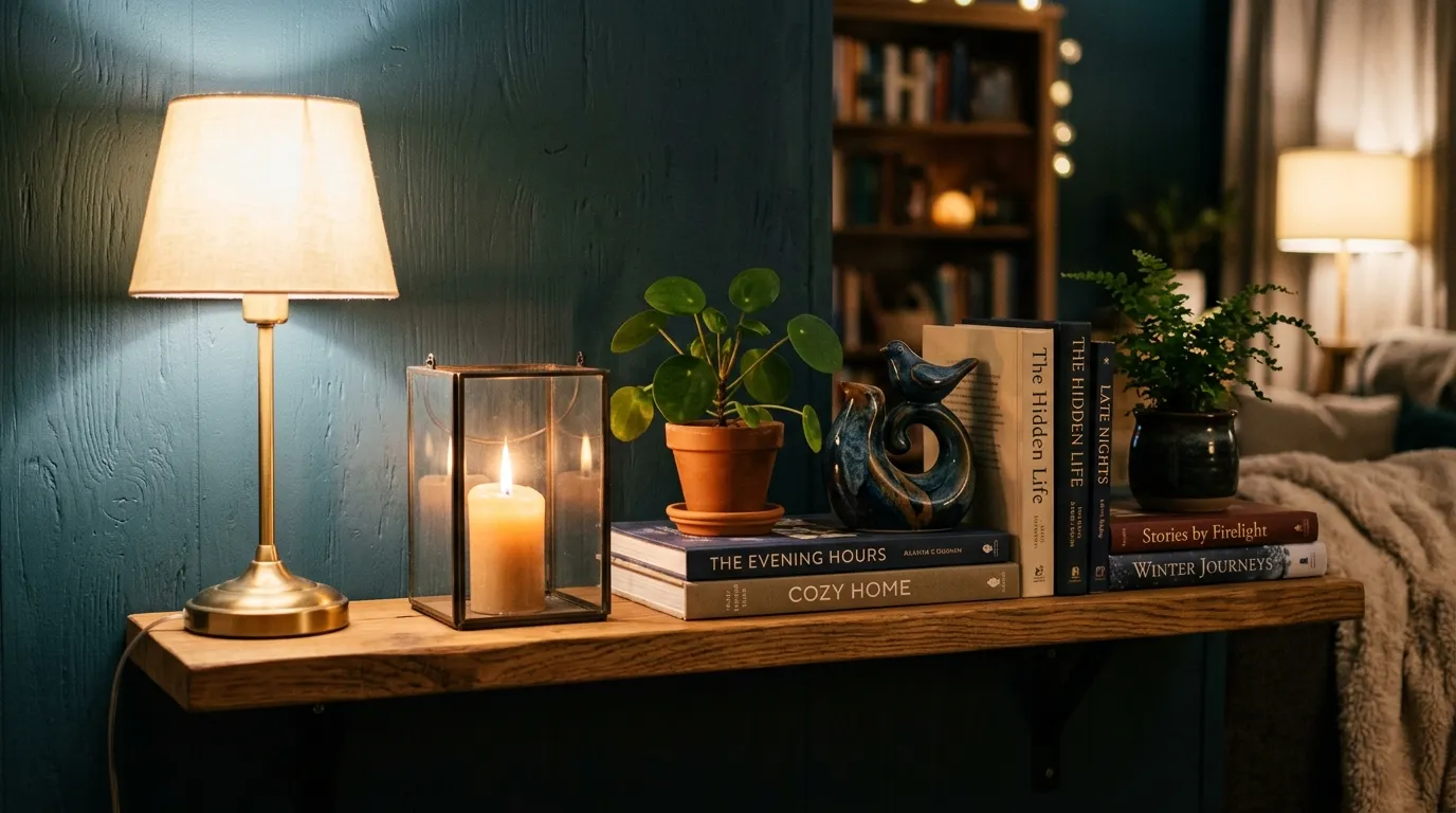
Light is the layer many people forget, and it is the one that changes a shelf most in the evening. A small lamp on a shelf, a battery candle, a tiny lantern, or a strip of warm light fixed under the shelf above all make the pieces in front of them glow. Light also creates shadows, and shadows add depth that flat daylight cannot. A shelf that looks fine by day can look wonderful by evening with one small light source.
Place light low and to one side, not dead centre and not behind a tall opaque object. A candle in the front layer beside a vase, or a small lamp in the middle layer at the end of a shelf, lights the pieces around it without blinding anyone. If you use a light strip, fix it toward the front edge of the shelf above, so the light falls down onto the pieces below rather than onto the wall behind them. Warm white light suits most rooms better than cool white, which can make wood and warm colours look harsh.
Common mistakes, and the fix for each one
Most shelf problems come from a small number of habits. Once you can name the habit, the fix is usually one move, not a full restyle. Work through this list when a shelf feels off but you cannot say why.
Overcrowding is the most common mistake. It happens slowly, one souvenir or small gift at a time, until the shelf has no empty board left. The fix is to remove about a third of the pieces, starting with the smallest ones. Put the removed pieces in a box, live with the lighter shelf for a few days, and only bring a piece back if the shelf genuinely feels empty without it. Most people find they do not miss the removed pieces at all, and the pieces that remain finally get noticed.
Same height everywhere is the second common mistake. When every vase, frame and stack tops out at the same level, the shelf looks like a row of posts. The fix is to add one tall piece and one low piece to each grouping. Lean a tall frame at the back, keep a medium vase in the middle, and finish with a low candle at the front. That three step height change alone can rescue a flat shelf, even if you change nothing else.
Ignoring the room is another easy trap. A shelf styled in isolation, with colours and materials that clash with the sofa, rug or wall colour, will always feel slightly wrong, even if the shelf itself is balanced. The fix is to pull one colour and one material from the room into the shelf. If the room has warm wood and cream, add a wooden bowl and a cream vase. If the room has a strong accent colour, repeat it once on the shelf, in a small piece, not in every grouping. For help choosing that accent, these interior color trends for cozy homes show how warm, muted colours sit together in real rooms, which makes it easier to pick a shelf colour that belongs.
Shelf questions, answered plainly
How many items should go on one shelf?
There is no single number, because shelf length and piece size change the answer. As a working guide, aim for two or three groupings per shelf, with three to five pieces in each grouping, and about a fifth of the shelf left empty. A short shelf might hold one grouping of three pieces and feel complete. A long shelf might hold three groupings and still feel calm, as long as gaps separate them. Count groupings, not individual pieces, and the shelf will stay balanced.
What is the rule of three, and does it always work?
The rule of three says odd groups look more natural than even groups, because the eye does not split an odd group into matching pairs. It works well for small front layer pieces, but it is not a law. A pair of matching lamps, a pair of bookends, or a symmetrical pair of frames can look right in a formal room. The real point is variety: one anchor plus supports, with varied heights and shapes, rather than three identical items in a row. Use odd groups as your default, and break the rule when symmetry serves the room better.
How do I style a shelf without buying anything new?
Start by emptying the shelf and sorting what you already own into tall, medium and small piles. Use books as risers, lean frames you already have, and move pieces from other rooms to test new combinations. A vase from the kitchen, a bowl from a cupboard, or a plant from a windowsill can change a shelf completely. Shop your own home first, and only buy a piece when you know exactly which layer and which gap it will fill.
Should books face out, or should spines face out?
Spines out is the practical choice for books you read, because you can find them again. Pages out, with spines turned inward, is a styling trick for books whose covers clash with the room. It creates a calm cream and white block, but it hides titles and makes the books hard to use. A middle path works for most shelves: keep the books you read spine out, and turn only a small, clashing section pages out, or group those books by colour so the spines themselves form a quiet gradient.
How much empty space should I leave?
About a fifth of the shelf width is a good starting point, though the exact share depends on the shelf. A bookshelf packed with books needs less deliberate empty space, because the books themselves are the display. A display shelf needs more, because each object needs room to be seen. If the shelf feels busy, remove one piece from each grouping before you rearrange anything else. Empty space is not wasted space. It is what lets the remaining pieces stand out.
How do I style shelves above a fireplace?
A mantel shelf is viewed from across the room and from below, so it needs larger, bolder pieces than a desk shelf. One tall anchor in the centre, such as a mirror or a large frame, works better than many small pieces that disappear from a distance. Keep the sides simpler, with a medium vase on one side and a low grouping on the other, so the centre anchor stays the focal point. For mantel specific ideas, these ways to style the area above your fireplace show how scale, symmetry and layering change when the shelf sits above a fire rather than on a plain wall.
Style one shelf tonight: a simple plan
You do not need a whole weekend to test this system. One shelf, one evening, and a clear order of work is enough to see whether layering suits your home. Follow the plan below in order, and resist the urge to skip to decorating before the shelf is empty and sorted.
- Empty the shelf completely and wipe it clean. Put every piece on a nearby table, where you can see it all at once.
- Sort the pieces into three piles: tall and flat for the back layer, medium for the middle layer, and small for the front layer. Set aside anything broken, faded or unloved.
- Choose one anchor for the back layer. Lean it against the wall, slightly off centre if the shelf is long, and check the gap to the shelf above.
- Add the middle layer. Place one medium piece to one side of the anchor, leaving part of the anchor visible, then add a horizontal book stack as a second middle grouping if the shelf has room.
- Add the front layer. Choose three small pieces of different heights, place them in front of the middle layer with space around them, and angle one slightly toward the room.
- Check colour and empty space. Remove one accent piece if the shelf feels noisy, and make sure about a fifth of the shelf is still bare board.
- Step back to the doorway and look at the shelf from your normal viewing spot. Note one thing that feels off, fix only that one thing, and then leave the shelf alone.
- Return after an hour with fresh eyes. Remove one more piece if the shelf still feels full, or add one small piece if a gap feels too empty. That final edit is usually the one that makes the shelf feel finished.
If the shelf still feels wrong after that final edit, check the layer heights first. In most cases, the problem is that two layers sit at the same height, or the front layer hides the middle layer. Fix the heights, and the shelf often falls into place without any new purchases. If the problem is colour, remove the loudest piece rather than adding a new one. Subtraction fixes more shelves than addition.
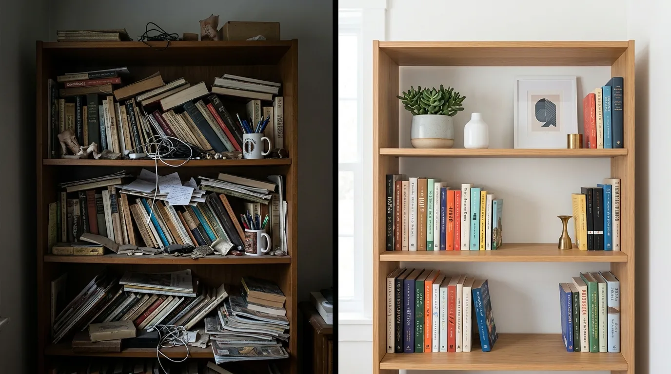
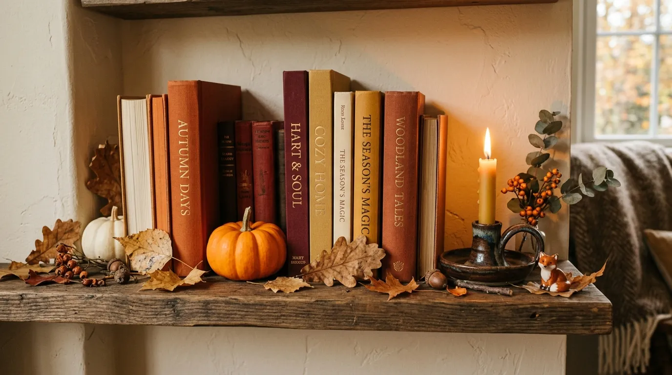
Start with the shelf you see most. Style it in layers, leave room to breathe, and let the pieces you love do the talking. The designer look is not a secret finish or an expensive purchase. It is a tall piece at the back, a medium piece in the middle, a small piece at the front, and the confidence to leave a little space empty.