Color has always been the fastest way to change how a room feels, and this year that’s truer than ever. After a long stretch of cool grays and stark whites dominating our homes, designers everywhere are reaching for warmer, richer, more emotionally resonant shades. That’s exactly why we’ve put together this guide to the Top 10 Color Trends in Interior Design This Year to help you understand where the mood is heading. The mood right now is less about following a rulebook and more about creating spaces that feel grounded, personal, and a little bit indulgent. Think deep, wine-soaked reds instead of primary red, warm chocolate browns instead of cold grays, and jewel tones that feel collected rather than trendy.
What’s interesting about this year’s palette is how much overlap there is between what’s happening in fashion, in art, and in our homes. Colors that once felt risky burgundy, teal, plum are being treated as workhorse neutrals now, paired confidently with wood tones, brass, and natural textures. Below are the Top 10 Color Trends in Interior Design This Year worth knowing about, along with practical ways to bring each one into your own space.
1. Warm, Wine-Soaked Reds
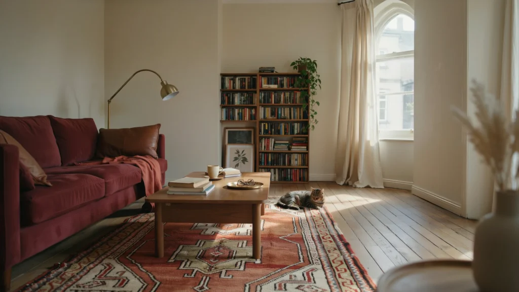
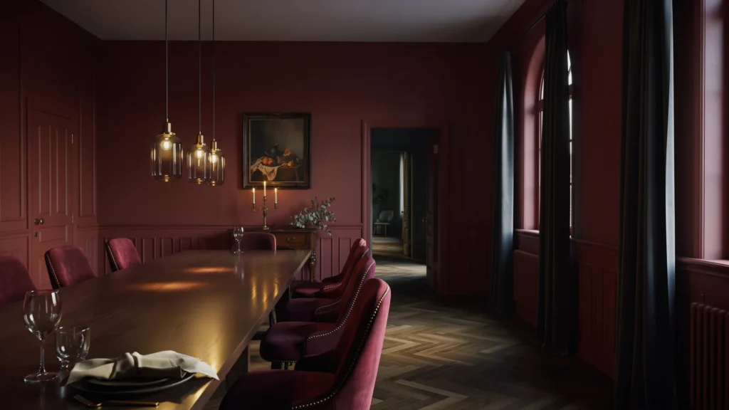
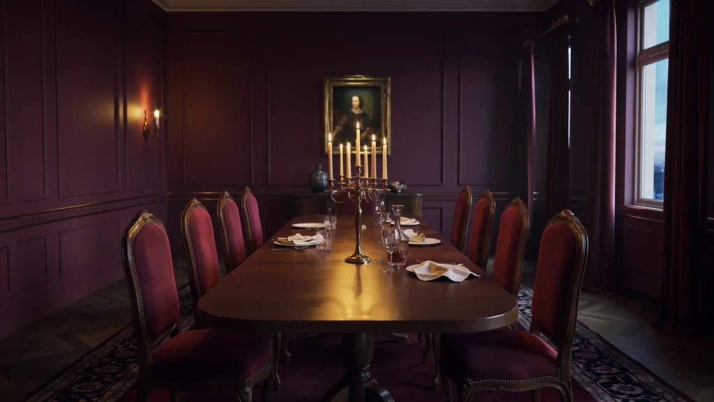
Red has been quietly rehabilitating its reputation over the past couple of years, and this year it’s arrived fully formed as one of the most requested colors in interior design. But this isn’t the fire-engine red of decades past. The reds designers are reaching for now are deeper and dustier oxblood, burgundy, and wine tones that feel closer to a fine leather armchair than a stop sign. There’s a classical, almost historical quality to these shades that makes a room feel instantly more sophisticated.
What makes wine reds so appealing this year is their versatility. They work beautifully in intimate spaces like dining rooms, libraries, and powder rooms, where a bit of drama is welcome, but they also pair surprisingly well with lighter, more casual elements. Try pairing a deep oxblood accent wall with cream linen upholstery and natural wood furniture for a look that feels warm rather than heavy. If you want to dip a toe in without committing to a full wall, a burgundy velvet sofa or a set of richly colored dining chairs can deliver the same sophisticated punch.
2. Rich Chocolate Brown
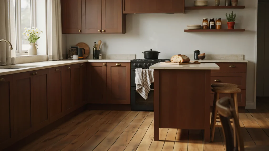
Brown has spent years being overlooked in favor of gray, but this year it’s having a genuine moment, and for good reason. As people continue to seek out warmth and comfort in their homes, chocolate brown offers something gray never quite could: a natural, grounding presence that feels like being wrapped in a soft blanket. It’s a color that immediately makes a space feel more relaxed and inviting, without tipping into anything too dark or moody.
Part of what makes brown so easy to love this year is how well it plays with other colors. It sits comfortably next to soft creams and warm grays for a quiet, tonal look, or it can anchor a bolder palette alongside terracotta, mustard, or olive green. Brown also has a natural affinity for wood tones like walnut and oak, so a chocolate-painted room with matching or contrasting wood furniture feels cohesive rather than overdone. If painting an entire room feels like too big a leap, start with a piece of furniture, a set of curtains, or even kitchen cabinetry in a rich truffle brown.
3. Earthy, Grounding Neutrals
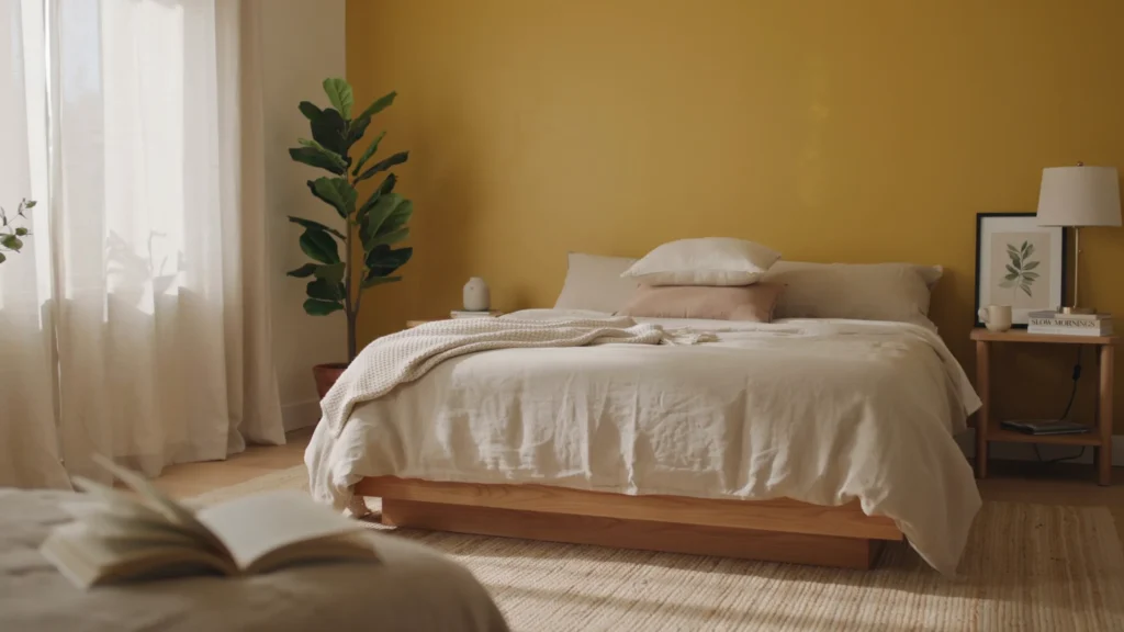
Neutrals aren’t going anywhere this year, but the neutrals themselves have changed considerably. Cool, airy grays are giving way to warmer, earth-inspired shades that feel less clinical and more like a reassuring hug. Mustard, in particular, has emerged as a favorite, thanks to its unique ability to act as a neutral while still carrying real personality a muted yellow with brown undertones that reads as both cheerful and grounded at once.
These warmer neutrals work beautifully as a whole-room palette, especially in spaces meant for relaxing, like bedrooms and living rooms. Mustard pairs particularly well with other down-to-earth tones like cognac, burnt orange, and olive green, but it also holds its own against cooler colors like navy or teal if you want more contrast. Beyond mustard, warm beiges with just a touch of moodiness are proving popular too, since they work equally well in minimal, contemporary spaces and in more traditional, layered interiors. The common thread across all of these neutrals is warmth nothing about them should feel sterile or flat.
4. Calming Seafoam and Teal
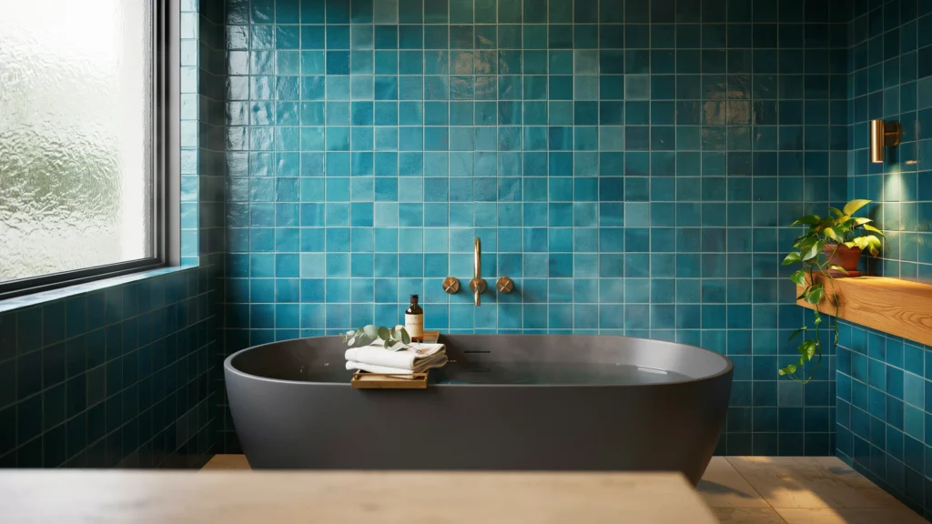
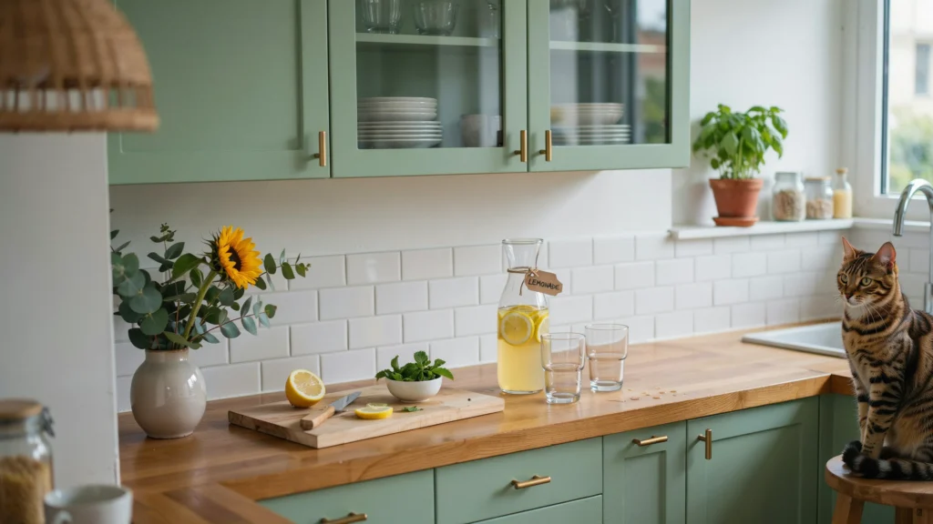
If the rest of this year’s palette leans moody and rich, seafoam green and teal offer a lighter, more restful counterpoint. Seafoam that soft, blue-green hybrid reminiscent of the ocean has been gaining traction for its calming qualities, making it a natural fit for home offices, bathrooms, and bedrooms where a sense of tranquility matters most. Because it has such a short visual wavelength, it also has a subtle trick up its sleeve: rooms painted in seafoam tend to feel larger and more open than they actually are.
For those who want to go a shade deeper, teal has become one of the standout colors of the year, blending the timelessness of blue with the freshness of green. It’s rich enough to feel sophisticated in a dining room or kitchen, yet calm enough to work beautifully in a bedroom. Teal also happens to photograph and catch light exceptionally well, which is part of why designers have started using it more permanently on tile, cabinetry, and even bathroom fixtures rather than just as a fleeting accent color. If you’re drawn to blue-greens but want longevity, teal tile in a bathroom or kitchen backsplash is one of the safest bets you can make this year.
5. Dark, Verdant Green
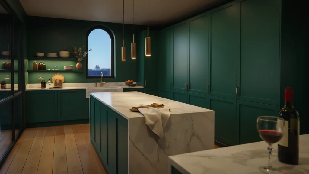
While navy blue has spent the last several years as the go-to dark, dramatic color, this year that spotlight is shifting to deep verdant green. There’s something about a rich, almost black-green that feels both sophisticated and a little mysterious, and designers are using it everywhere walls, ceilings, cabinetry, even floors to bring a sense of depth and warmth into a room that a flat, neutral color simply can’t achieve.
Dark green works exceptionally well in kitchens, where it pairs beautifully with marble countertops and brass hardware for a look that feels timeless rather than trendy. It also makes a striking choice for a home office or library, where a bit of drama and coziness is welcome. Because the color is so deep, it tends to recede visually in low light, creating an enveloping, almost cocoon-like atmosphere in the evening while still reading as elegant and fresh during the day. If you’re nervous about committing to a full room, try it first on a single piece of cabinetry or an accent wall before going further.
6. Sun-Baked Terracotta
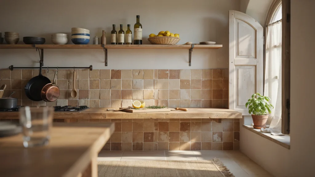
Terracotta has moved well beyond its rustic, Southwestern associations to become one of the most versatile warm neutrals of the year. Inspired by sun-baked clay and the kind of tiles you’d find lining a villa in Portugal or southern Italy, terracotta brings a grounding, earthy warmth to a room without feeling as heavy as a true red or brown. It works particularly well for anyone whose design style leans slightly rustic or Mediterranean, but it’s flexible enough to feel at home in more contemporary spaces too.
Terracotta shows up beautifully as a paint color, but it’s just as striking in tile form on floors, backsplashes, or even a statement bathroom wall. Its warmth pairs naturally with other earthy tones like olive green, warm white, and soft blue, echoing the kind of sun-drenched coastal palettes that have been inspiring designers this year. If you want to bring terracotta in without repainting an entire room, consider it for a kitchen backsplash, a set of dining chairs, or even a collection of ceramic vases and pottery displayed throughout your space.
7. Golden Caramel Tones
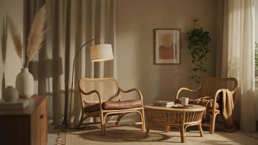
Once considered dated, caramel and butterscotch tones have made a genuine comeback this year, proving that even the most maligned colors eventually find their moment again. These golden, honeyed hues bring an irresistible coziness to a room, and designers are increasingly pairing them with richer browns, warm whites, soft pinks, and even blues to create palettes that feel collected and layered rather than one-note.
What’s driving caramel’s resurgence is its natural affinity for the tactile, natural materials that are so popular right now think wicker, rattan, warm wood furniture, and stone finishes. A caramel-painted room becomes the perfect backdrop for these textures to shine, creating a space that feels inviting and lived-in rather than sterile. This is a particularly good color choice for living rooms and bedrooms where comfort is the priority, and it pairs beautifully with brass or gold hardware for an extra touch of warmth.
8. Icy, Frosted Blue
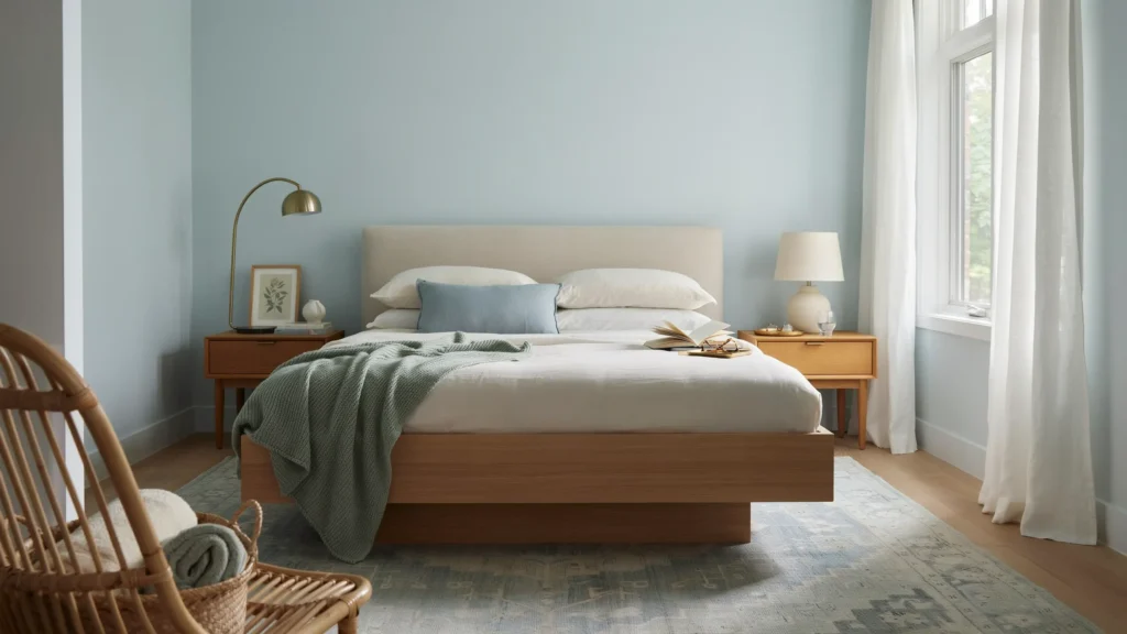
Not every trending color this year leans dark and moody icy blue has emerged as the perfect palate cleanser against all that richness. Unlike the denim or Swedish blues that dominated the last decade, this year’s ice blue is crisp, pale, and a little frosty, with none of the milky softness of past trends. It functions almost like a bright neutral, offering a cool, clarifying contrast when paired with the deep reds and browns that are also having a moment.
Icy blue is particularly effective used in small but punchy doses a pendant light, a ceramic lamp base, or piping on upholstery rather than covering an entire room, though it can also work beautifully as a full wall color in a bedroom or bathroom for a fresh, airy feel. One of its most compelling pairings this year is alongside burgundy or oxblood, a combination that feels both retro and completely current at once. If you love the idea of a cooler palette but don’t want your space to feel cold, icy blue paired with warm woods and brass accents strikes exactly the right balance.
9. Playful Chartreuse
Of all this year’s trending colors, chartreuse might be the most unexpected. This tart, acid-greenish yellow has crept into homes almost without anyone noticing, following closely on the popularity of both warm yellows and grassy greens over the past year. It has a citrusy, energizing quality that works a bit like a squeeze of lime it wakes up a room and adds a flavor that wasn’t quite there before.
Chartreuse is at its best used as an accent rather than the star of the whole room a tiled bathroom wall, a set of curtains, or an upholstered piece of furniture set against warmer, more neutral surroundings like natural wood, cognac leather, or soft khaki. It also plays exceptionally well as a complementary color against reds and browns, echoing classic color theory in an updated, slightly unexpected way. If you’re drawn to bold color but want something that still feels playful rather than heavy, chartreuse might be the most rewarding trend on this list to experiment with.
10. Sophisticated Plum
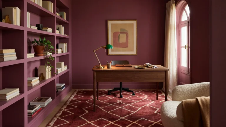
Rounding out the list is plum a cooler, more purple-leaning cousin to burgundy that carries just as much richness but with a more playful, youthful energy. There’s something inherently a little daring about aubergine and plum tones, but when used thoughtfully, the payoff is enormous: a room that feels elegant, welcoming, and undeniably interesting all at once.
Plum works beautifully on walls, trim, and even wallpaper, especially when balanced with neutrals and natural textures to keep the overall look grounded rather than overwhelming. It pairs particularly well with greens and other warm neutrals, and adding a touch of pink or fuchsia into the mix creates a palette that feels full of intrigue without ever tipping into chaos. Plum is also remarkably flexible in mood — pair it with lilac and blush for something soft and springlike, or with darker woods and black accents for something moodier and more dramatic. However you use it, plum proves that a bold color choice doesn’t have to sacrifice sophistication.
Frequently Asked Questions (FAQs)
1. What is the most popular interior color trend this year? Warm, wine-toned reds like burgundy and oxblood are among the most requested colors this year, prized for their sophisticated, slightly moody warmth compared to brighter reds of the past.
2. Are cool grays still in style? Cool grays have largely given way to warmer, earth-inspired neutrals like mustard, caramel, and warm beige, which feel cozier and more grounded than the stark grays that dominated the last decade.
3. What colors pair well with deep green in interior design? Deep verdant green pairs beautifully with marble, brass hardware, and warm wood tones, creating a look that feels both elegant and inviting, especially in kitchens and home offices.
4. Is teal a good choice for a small bathroom? Yes, teal works particularly well in small bathrooms, especially in tile form, since it catches natural light beautifully and creates a calming, spa-like atmosphere without feeling overly bold.
5. How can I try a bold color trend without a big commitment? Start small with an accent piece like a lamp, throw pillow, or single upholstered chair rather than painting an entire room, allowing you to test how the color feels in your space before committing further.
6. What’s the difference between terracotta and burnt caramel tones? Terracotta leans more orange-red and rustic, evoking sun-baked clay, while caramel and burnt caramel tones lean more golden-brown, offering a cozier, honeyed warmth that pairs beautifully with natural materials.
7. Are pastel colors still trending this year? While the boldest trends this year lean toward deep, rich tones, softer colors like icy blue continue to hold their place as a calming, versatile counterpoint to moodier palettes.
8. What color trend works best for a home office? Calming shades like seafoam green or icy blue are ideal for home offices, since their cooler, receding qualities promote focus and tranquility while still feeling current and stylish.