Autumn oil painting printable art is the cheapest way I know to put a real landscape on your wall this fall. You find a public domain autumn painting, print it at the right size on the right paper, frame it with a proper mat, and it reads as a painting, not a printout.
The trick is not the painting itself. It is the three small decisions most people skip: checking the file is sharp enough, matching the print size to the wall, and giving the print a mat and a frame with some weight. Get those right and a free file can carry a whole room.
Last October I swapped one tired summer print in my hallway for a golden New England landscape I had printed at home. Nothing else in the hallway changed. The same console table, the same bowl, the same rug. Yet everyone who walked in asked where the painting came from. That is the whole point of this guide. A good autumn print does not need a big budget or a big renovation. It needs a good file and a little care at the end.
Where Good Autumn Paintings Hide in the Public Domain
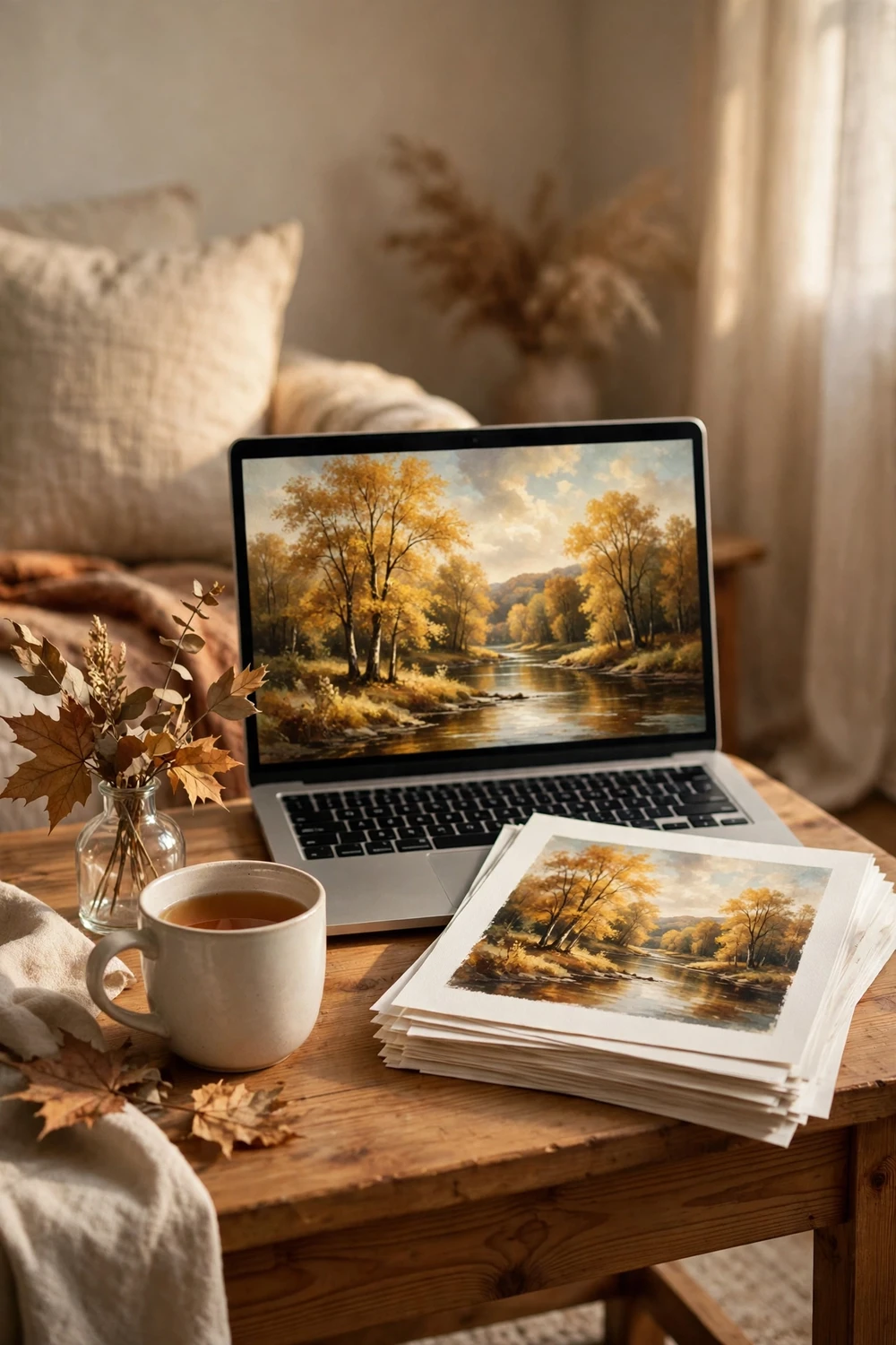
The best autumn paintings for printing are not sitting on random freebie blogs. They live in museum and library collections that have put their holdings online for anyone to use. Paintings by artists who died more than 70 years ago are generally in the public domain, which means you can download a high resolution scan and print it for your own home without paying a license fee. The museum did the hard work of scanning the canvas. Your job is to find the scan.
Start with the big open collections. The Metropolitan Museum of Art, the Art Institute of Chicago, the Rijksmuseum and the National Gallery of Art all offer free downloads of public domain works, and each one holds autumn landscapes worth framing. Search their sites for words like autumn, fall, October, harvest and woodland, then filter for paintings. You will find golden river valleys, quiet country lanes, harvest fields and misty hills that suit a living room far better than a generic stock photo ever could.
One warning matters here. Not every image labelled free is actually free to print. Some sites bundle public domain paintings with their own watermark or sell a low resolution version and call it free. If a site asks you to create an account, pay for the full size file, or accept a watermark across the middle, walk away and go to the museum source instead. The genuine file is almost always available directly from the collection that scanned it.
Keep a short list of three or four paintings rather than one. You may want a large landscape for the living room, a smaller vertical scene for a hallway, and a quiet one for the bedroom. Building a small set from the same season gives your home a calm, connected feel, and it costs nothing extra to download them all now.
Spotting a Print-Ready File Before You Waste Ink
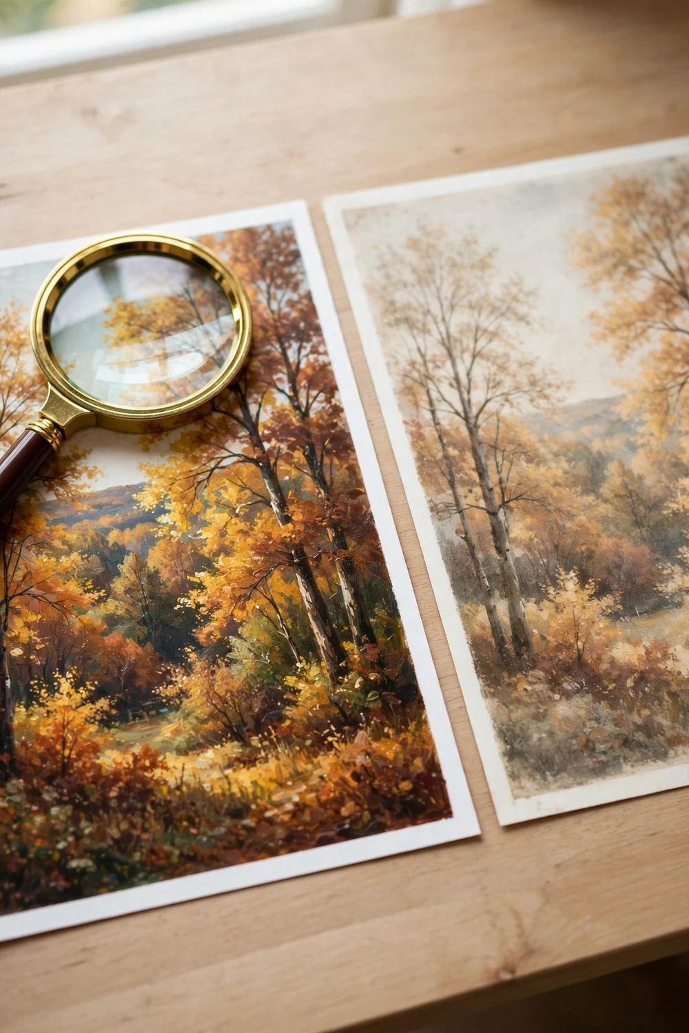
A blurry print is almost never the printer’s fault. It is the file. A small image stretched to fill a large frame will always look soft, and no paper or frame can rescue it. Check the file before you print, and you will save ink, paper and a lot of quiet disappointment.
The number to look for is the pixel size of the file. Open the image details on your computer and read the width and height in pixels. A good rule is 300 pixels per inch at the size you plan to print. That means an 8 by 10 inch print wants a file around 2400 by 3000 pixels. A 12 by 16 inch print wants roughly 3600 by 4800 pixels. If your file is much smaller than that, print it smaller or pick a different file. A 1000 pixel wide image will look fine at 5 by 7 inches and tired at 16 by 20.
Zoom in to 100 percent on your screen and look at the edges of trees, the line of a roof, and the texture of brushstrokes. In a good scan you will see paint texture and small detail. In a poor scan you will see blocky squares or a soft haze where detail should be. Pay attention to the sky too. A sky that shows bands of colour instead of a smooth gradient will show those same bands on paper, and they look worse in a frame than they do on a screen.
For a deeper look at what separates a sharp print from a disappointing one, our guide to vintage landscape oil painting printable art walks through print quality checks in detail. This post is different: it is about finding, printing and styling autumn art rather than buying it. Read the quality guide first if you want the full background, then come back here for the autumn plan.
Autumn Oil Painting Printable Art: Picking the Right Print Size for Every Wall
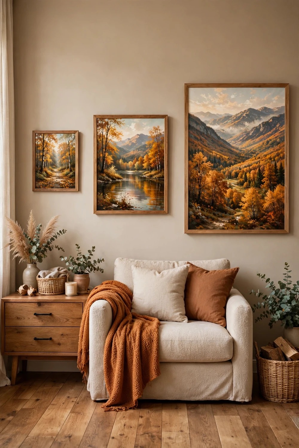
Size is where most printable art goes wrong. A lovely painting printed too small floats on a big wall and looks lost. The same painting printed too large crowds a small wall and makes the room feel cramped. The fix is simple: measure the wall and the furniture under it before you choose a size, not after.
Start with the golden rule for art over furniture. A framed piece should span about two thirds to three quarters of the width of the furniture below it. A sofa that is 84 inches wide wants art around 56 to 63 inches wide in total, which usually means one large piece or a pair that adds up to that width. A console table 48 inches wide wants art around 32 to 36 inches wide. Tape paper templates to the wall first. Painter’s tape and a sheet of newspaper cost nothing and show you the true scale in a way a screen never will.
Height matters too. Hang the centre of the art at about 57 to 60 inches from the floor, which is close to average eye level. Over a sofa or a bed, leave 6 to 8 inches between the top of the furniture and the bottom of the frame. That gap keeps the art connected to the furniture without crowding it. In a hallway, where people walk past rather than sit, you can hang a little higher, but keep the centre near eye level so the painting is easy to look at.
The table below gives a starting point for common spots. Treat it as a guide, not a law. A tall narrow hallway wants a vertical print. A wide wall over a long sofa wants a horizontal one. Always check the painting’s own shape before you force it into a size it does not suit.
| Spot in the home | Good print size | Frame size with mat | Why it works |
|---|---|---|---|
| Above a three seat sofa | 18 by 24 inches | 24 by 30 inches | Fills the wall without overwhelming the sofa |
| Above a bed | 16 by 20 inches | 20 by 24 inches | Calm scale that suits a restful room |
| Hallway or entry wall | 11 by 14 inches | 16 by 20 inches | Easy to enjoy at close range while walking past |
| Small shelf or desk | 8 by 10 inches | 11 by 14 inches | Small enough to lean, big enough to notice |
| Dining room feature wall | 20 by 30 inches | 24 by 36 inches | Anchors the room and suits a long table |
| Reading nook | 8 by 10 inches | 11 by 14 inches | Intimate scale for a quiet corner |
Printing at Home: Paper, Settings and Ink That Look Real
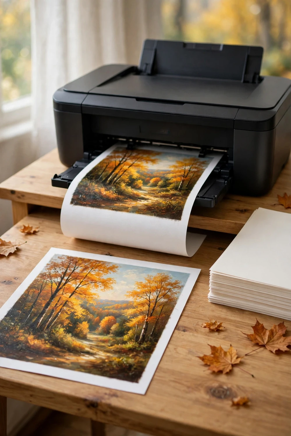
Home printing is the fastest way to get autumn art on the wall, and for sizes up to 8 by 10 inches it can look genuinely good. The secret is paper. Ordinary copy paper soaks up ink, dulls the colour, and gives the print a flat office look. Matte photo paper or fine art matte paper holds the ink on the surface, keeps the golds rich, and gives the print a soft texture that feels closer to a painting.
Paper weight tells you a lot. Look for paper around 200 to 250 grams per square metre for a print you plan to frame. It feels solid in the hand, lies flat in a frame, and does not curl at the edges the way thin paper does. Matte is the safer choice for autumn landscapes because it avoids glare and shows brushstroke texture well. A light lustre paper is a good middle ground if you like a hint of shine without the mirror glare of glossy paper. Glossy paper suits photographs more than oil paintings, and it can make a vintage landscape look like a poster.
Printer settings matter as much as paper. In your print dialogue, choose the paper type that matches what you loaded, set the quality to best or high, and turn off any automatic colour correction that tries to brighten the image for you. Printers often add their own idea of vivid colour, which pushes autumn oranges too far. If your printer offers a setting for matte paper, use it. If it offers borderless printing, use it only when you want the image to run to the edge of the sheet. For a framed print, a white border is useful because the mat will cover it anyway.
Let the print dry flat for at least 15 minutes before you touch the surface or slide it into a frame. Inkjet prints feel dry sooner than they are, and a fingerprint on a damp print will not come off. Lay the print face up on a clean table, away from direct sun, and let it settle. If the paper curls a little, place it under a heavy book overnight with a clean sheet of paper on each side. That simple step makes framing far easier.
Using a Print Shop for Large Autumn Landscapes
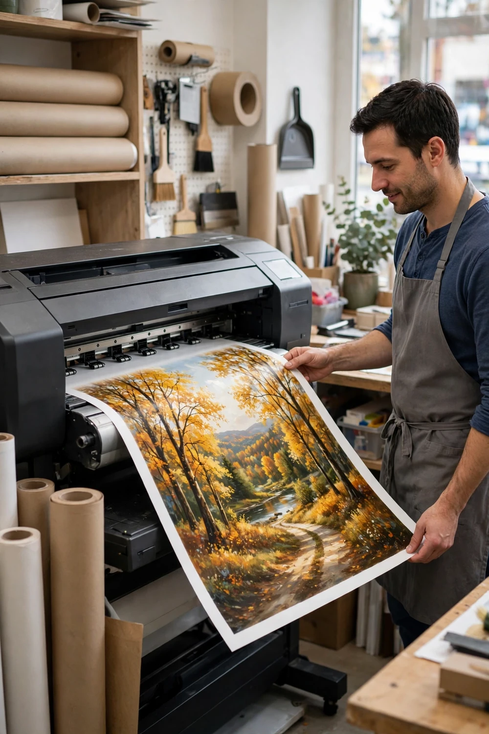
For anything larger than 11 by 14 inches, a print shop is usually the better choice. A shop printer handles wide paper, lays down ink evenly across a large area, and offers papers your home printer cannot feed. The result is a large autumn landscape that stays sharp from edge to edge, which is exactly what a feature wall needs.
Before you go, prepare the file properly. Save it as a high quality JPEG or TIFF at the size you want, at 300 pixels per inch if the file allows it. If the file is smaller, tell the shop the largest size it can honestly support and let them advise you. Bring the file on a USB stick as well as on your phone, because email and messaging apps often shrink images without telling you. A shrunken file prints soft, and you will not know until you collect the print.
Ask the shop what papers they offer and look at samples before you choose. Matte fine art paper is my first pick for autumn oil paintings because it keeps the texture and avoids glare in a bright room. A canvas textured paper adds a slight weave that suits oil painting reproductions nicely. Ask to see a small sample print of your own image if the shop offers it. A 5 by 7 inch sample costs little and shows you the true colours before you pay for a large print.
Talk through the finish with the staff. A print that will hang in a sunny room benefits from a UV protective spray or a laminate, but ask first, because some coatings change the surface sheen. A print that will sit behind glass needs no extra coating, since the glass already protects it. If the print will hang without glass, a light protective spray helps keep dust and fingerprints off the surface.
The table below compares the two routes side by side so you can decide quickly for each print.
| Factor | Print at home | Print shop |
|---|---|---|
| Best size | Up to 8 by 10 inches | 11 by 14 inches and larger |
| Paper choice | Matte photo or fine art paper you buy | Wide range, including canvas textured paper |
| Colour control | You adjust and reprint at once | Staff calibrate, sample print helps |
| Cost per print | Low for one small print, ink adds up | Higher per print, better value for large sizes |
| Turnaround | Minutes | Same day or next day in most shops |
| Best for | Small prints, tests, gifts | Feature walls, dining rooms, large frames |
Framing Autumn Oil Painting Printable Art So It Looks Like a Real Painting
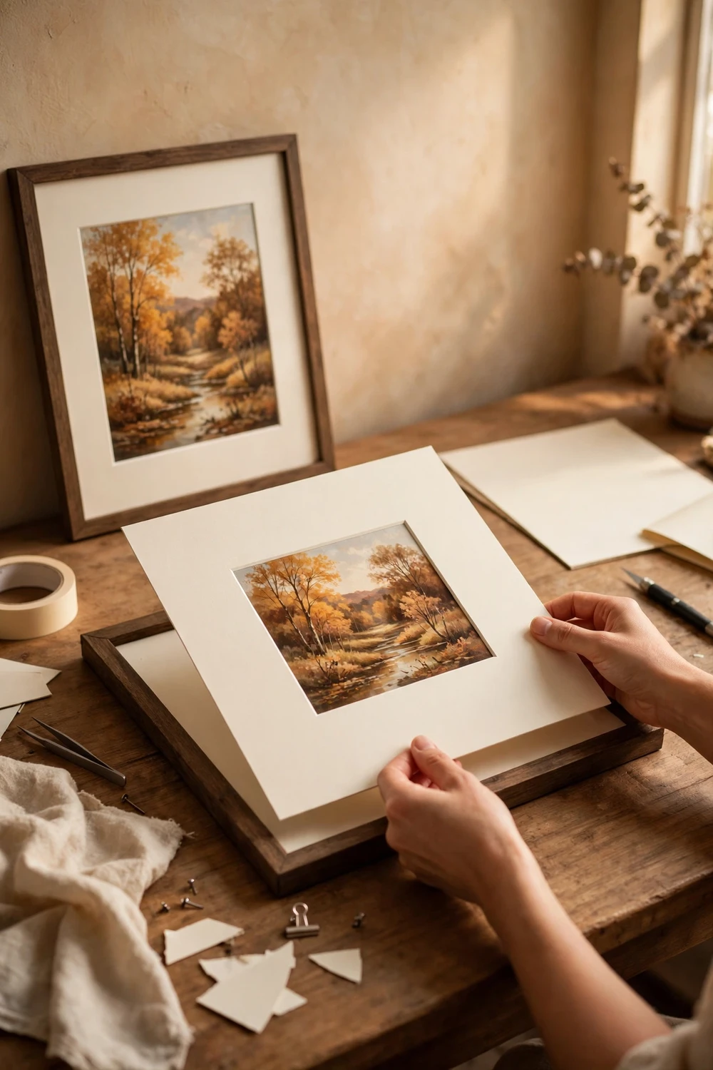
Framing is the step that turns a printout into a painting. A good frame and a generous mat change how the eye reads the image. Without them, even a beautiful print can look like a page torn from a magazine. With them, the same print looks deliberate and finished.
Start with the mat. A mat is the border of thick card between the print and the frame, and it does three jobs at once. It keeps the print from touching the glass, it gives the eye breathing room, and it makes a small print look substantial. For autumn landscapes, a warm white or cream mat suits the golds and russets far better than a stark white one. A mat that is 2 to 3 inches wide on each side suits an 8 by 10 inch print. For a 16 by 20 inch print, a mat of 3 to 4 inches feels balanced. The bottom edge of the mat can be a little wider than the top, which is an old framing habit that keeps the image from looking like it is sliding down.
Frame colour should echo something in the room, not fight the painting. Dark wood frames suit autumn art beautifully because they pick up the browns in tree trunks and the warmth of the season. A thin black frame works well in a modern room, and a gold frame suits a traditional room with warm metals. Avoid frames that are too ornate for a simple landscape. A heavy carved frame can overwhelm a quiet river scene, while a plain wood frame lets the painting do the talking.
Assemble the frame on a clean table. Lay the glass face down, place the mat on top, then the print, then a backing board. Tape the print to the mat from the back with small pieces of acid free tape at the top edge only, so the paper can expand and contract with the seasons without wrinkling. Add the backing board and the clips or points that hold it in place. Hang the frame and step back. If the print sits straight and the mat looks even, you are done. If it tilts, adjust it now, before the frame goes on the wall for good.
Autumn Art Room by Room: Where Each Painting Earns Its Place
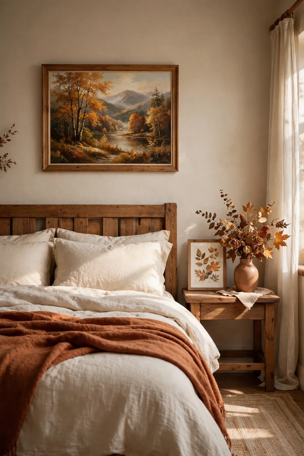
Autumn art works in every room, but the same painting does not suit every room. A large dramatic valley suits a living room where people gather. A quiet misty lane suits a bedroom where people rest. Match the mood of the painting to the mood of the room and the art will feel like it belongs there.
The living room is the natural home for your largest autumn print. Hang it over the sofa or on the longest empty wall, and let it set the colour palette for the season. Pull one colour from the painting, such as rust, gold or deep green, and repeat it in a cushion or a throw. That small echo ties the room together without turning it into a theme park. If your living room already holds a gallery wall, an autumn landscape can anchor it. Our guide to a free printable Audubon bird gallery wall shows how to build a wall of prints that feels collected rather than cluttered, and the same spacing rules apply here.
The bedroom wants a calmer painting. Choose a scene with soft light, a gentle river, or a quiet path, and hang it where you can see it from the bed. Avoid a busy harvest scene with strong contrast right above the bed, because it can feel restless at night. A small print on the bedside table works well too, especially if the wall above the bed already holds something else. Keep the frame simple and the mat generous, and the bedroom will feel warm without feeling loud.
The entryway is the most underused spot for autumn art. A medium print at eye level greets everyone who walks in and sets the seasonal tone at once. Because people pass through quickly, a bold scene with clear shapes works better than a subtle one. A golden valley or a bright maple tree reads clearly from a few steps away. Pair it with a console table, a bowl of small pumpkins, and a basket for throws, and the entryway feels finished with little effort.
The dining room suits a large horizontal landscape because the wall over a sideboard or a long table is usually wide and empty. A harvest scene or a wide river valley fits that shape and gives dinner guests something calm to look at. Hang it low enough to enjoy while seated, with the centre around 57 inches from the floor. If the dining room doubles as a workspace, a quieter scene is better, since a bold painting can distract during the day.
Styling Autumn Prints With the Rest of Your Fall Decor
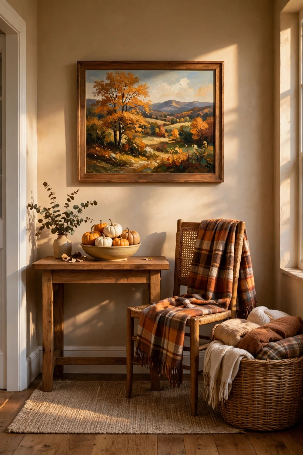
An autumn painting is the anchor, not the whole display. The rest of your fall decor should support it, not compete with it. That means choosing a few natural textures, a restrained palette, and leaving empty space where the eye can rest.
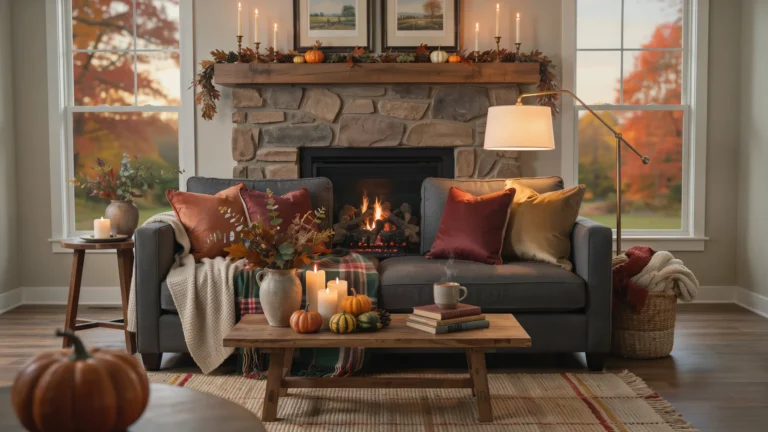
Start with the colours already in the painting. Pick two of them and repeat them in small ways. If the painting holds gold and rust, add a rust throw and a gold toned candle, then stop. If the painting is mostly green and gold, a green vase with dried branches is enough. The mistake is to add every autumn colour at once, which turns a calm room into a crowded one. A painting with a clear palette deserves decor that listens to it.
Natural materials suit autumn art better than shiny ones. Wood, linen, wool, dried leaves and woven baskets all sit comfortably beside an oil painting. A bowl of small pumpkins on the console below a landscape print is a classic pairing, and it works because the shapes are simple and the colours repeat the painting. If you want pumpkins that last the whole season, learn how to keep pumpkins fresh all fall before you buy them. For a painted pumpkin that echoes the art, our guide on how to paint modern pumpkins offers five styles that pair well with framed landscapes.
Keep the surface under the painting simple. One bowl, one vase, or one stack of books is enough. A console table crowded with five small objects will pull the eye away from the art. If you like a fuller look, group objects in odd numbers and vary their heights, but leave at least a third of the surface empty. Empty space is not wasted space. It is what lets the painting breathe.
For a wider seasonal refresh on a small budget, our fall home decor under 40 guide shows how far a little money goes when the art already sets the tone. And if your autumn decorating stretches toward Thanksgiving, the versatile Halloween decor pieces that work for Thanksgiving list helps you choose pieces that serve both holidays, so your autumn print does not sit beside decor that already feels out of date.
My own rule is simple and it has served me well. If a new decoration does not make the painting look better, it does not go on the same wall. That one test has saved me from more clutter than any decluttering guide ever did, and it keeps the autumn art as the star of the room, which is where it belongs.
Your Autumn Print Questions, Answered Straight
Where can I find free autumn oil painting printable art?
Start with museum collections that offer public domain downloads, such as the Metropolitan Museum of Art, the Art Institute of Chicago and the National Gallery of Art. Search for autumn, fall, October or harvest, and download the largest file offered. Library archives and Wikimedia Commons can help you find more, but always check the source and the pixel size before you print.
What size should I print an autumn landscape?
For a first print, 8 by 10 inches is a safe and useful size that most home printers handle well. For a wall over a sofa, 18 by 24 inches is a better fit. For a dining room feature wall, 20 by 30 inches anchors the room. Always check the file is at least 300 pixels per inch at the size you choose, and tape a paper template to the wall before you commit.
Can I print autumn art at home and have it look good?
Yes, up to about 8 by 10 inches, if you use matte photo paper or fine art matte paper, set the printer to best quality, and let the print dry flat for 15 minutes. Home printing struggles with larger sizes and with glossy paper, which can make a vintage landscape look like a poster. For larger prints, a print shop gives a sharper result.
What paper is best for printable oil paintings?
Matte fine art paper is the best all round choice because it avoids glare, holds colour well, and gives the print a soft painted texture. Look for paper around 200 to 250 grams per square metre so it feels solid and lies flat in a frame. A light lustre paper is a good second choice if you like a hint of shine.
How do I frame a printable so it looks like a real painting?
Use a wide mat in warm white or cream, 2 to 3 inches on each side for a small print, and a simple wood frame that suits the room. Keep the print from touching the glass, tape it from the back at the top edge only, and hang the centre at 57 to 60 inches from the floor. The mat and the frame do most of the work, so do not skip them.
Is it legal to print a vintage autumn painting for my home?
Paintings by artists who died more than 70 years ago are generally in the public domain, and museum scans of those works are free to download and print for personal use at home. Always check the terms on the museum or library page where you download the file. Do not print work by a living artist, or a recent reproduction with its own copyright, without permission.
One Print This Weekend Is Enough to Start
You do not need a full gallery wall, a new printer, or a shopping trip to begin. Pick one autumn painting you love, print it at a size your printer handles well, frame it with a proper mat, and hang it where you will see it every day. That print will teach you more about size, paper and framing than any amount of reading, and it will change the feel of the room at once.
Start this weekend. Find the painting, check the file, print it, frame it, and hang it. By Sunday evening you will have an autumn landscape on your wall that cost you almost nothing, and you will wonder why you waited so long to try it.