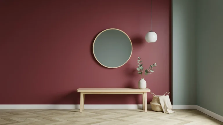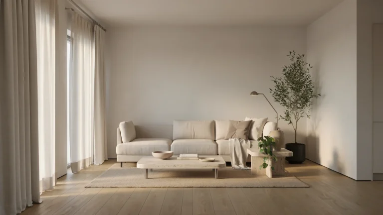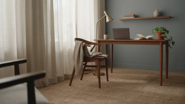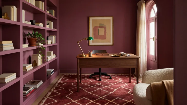
Color is the single most powerful tool in interior design. It can make a small room feel spacious, a cold room feel warm, and a plain room feel like it belongs in a magazine. That’s exactly why learning 12 ways to use color in interior design like a pro can transform the way you approach every room in your home. Yet most homeowners either play it too safe with endless shades of beige, or go too bold and end up with a space that feels chaotic instead of curated.
The difference between a room that looks “put together” and one that looks accidental almost always comes down to how color is used not which colors are used. Professional interior designers don’t guess. They follow proven principles rooted in color theory, lighting, proportion, and psychology.
In this guide, you’ll learn 12 practical, designer-approved ways to use color in interior design like a pro, whether you’re refreshing a single room or planning a whole-home color scheme.
Why Color Matters More Than Any Other Design Choice
Furniture, layout, and decor all play a role in a finished room, but color is what your eye registers first often before you consciously notice a single object in the space. Studies in environmental psychology consistently show that color influences mood, perceived temperature, and even how long people feel comfortable staying in a room. A poorly chosen palette can make an expensive renovation feel flat, while a well-planned one can make budget furniture look intentional and expensive.
The good news is that using color well isn’t about talent or an “eye for design” it’s a skill built on repeatable principles. The 12 tips below cover everything from foundational ratios to advanced tricks for correcting a room’s proportions, so you can move from guessing to designing with confidence.
1. Start With a 60-30-10 Color Ratio
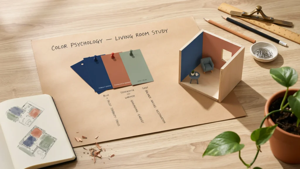
Professional designers rely on the 60-30-10 rule to keep a room balanced. Sixty percent of the room should be a dominant color usually walls, large furniture, or flooring. Thirty percent is a secondary color, often seen in upholstery, curtains, or an accent wall. The final ten percent is your accent color, used sparingly in pillows, art, or accessories. This ratio prevents any single color from overwhelming the space while still giving the room a clear, cohesive identity.
2. Choose a Color Palette Before You Choose Furniture
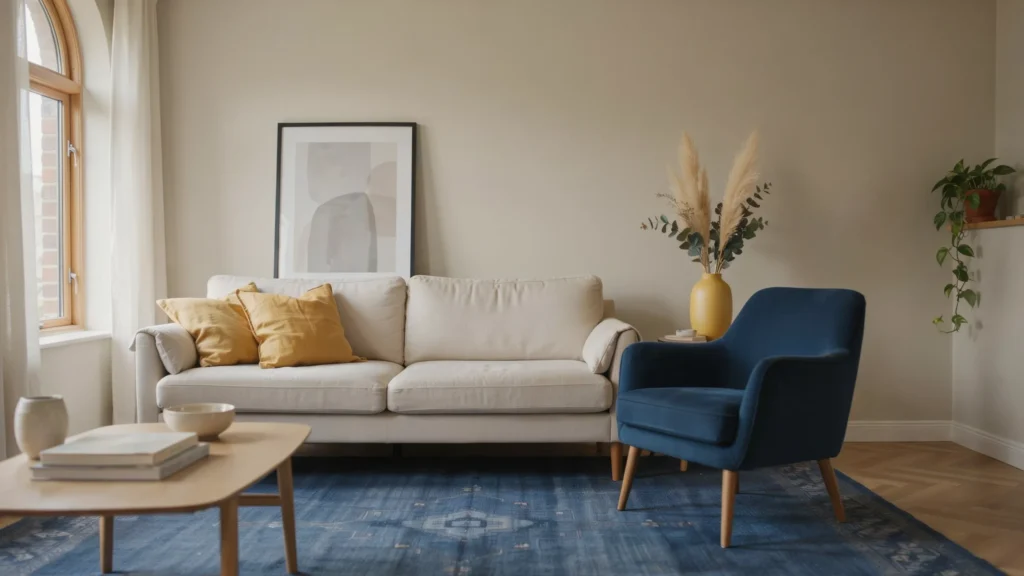
One of the biggest mistakes homeowners make is buying furniture piece by piece and hoping it all matches later. Professionals build a color palette first typically three to five colors and then shop with that palette in mind. This could start with a favorite rug, a piece of art, or even a tile you love. Once your palette is locked in, every purchase becomes easier because you already know what “works.”
3. Use Color Temperature to Set the Mood
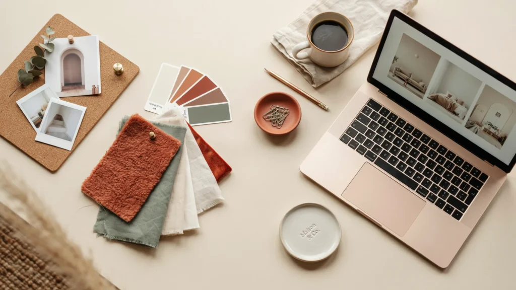
Warm colors reds, oranges, yellows energize a space and make it feel cozy and social, which is why they work well in kitchens and dining rooms. Cool colors blues, greens, purples feel calming and restful, making them ideal for bedrooms and bathrooms. Before choosing a palette, decide what mood you want the room to have, then let color temperature guide your choice rather than picking colors purely because you like them in isolation.
4. Test Paint Colors in the Actual Room Lighting
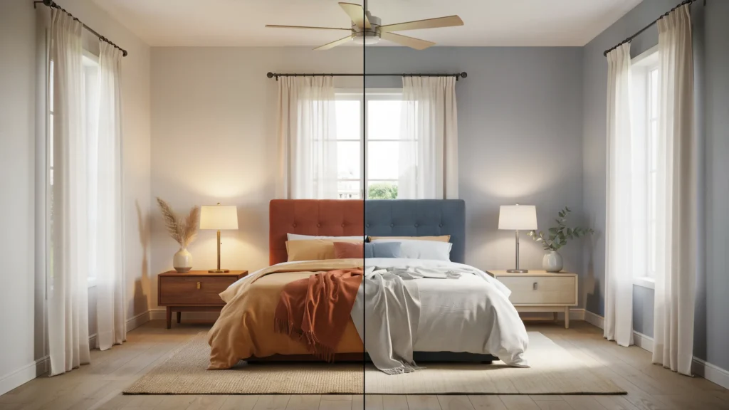
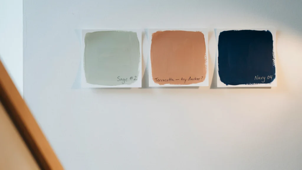
A color that looks perfect in a paint store or on a screen can look completely different once it’s on your wall, because lighting changes everything. North-facing rooms get cooler, bluish light, while south-facing rooms get warmer light throughout the day. Professionals always paint large test swatches directly on the wall and observe them at different times of day morning, afternoon, and evening before committing to a full room.
5. Anchor the Room With a Neutral Base
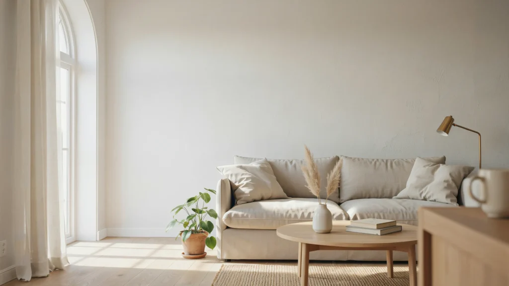
Even the boldest, most colorful interiors need a neutral foundation to keep them from feeling overwhelming. Whites, greiges, tans, and soft warm greys on walls and large furniture pieces give your eyes a place to rest. This neutral base also makes it far easier to update your color scheme later you can swap out pillows, art, or accessories without repainting an entire room.
6. Create Depth With Tonal Layering
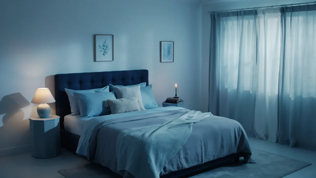
Tonal layering means using multiple shades of the same color throughout a room instead of one flat tone. A bedroom might combine navy, denim, and powder blue across the walls, bedding, and accessories. This technique adds visual depth and sophistication without introducing a completely new color, and it’s one of the easiest tricks for making a room feel professionally designed.
7. Use Contrast to Highlight Architectural Features
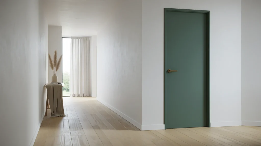
Contrast draws the eye exactly where you want it to go. Painting a door, trim, built-in bookshelf, or fireplace in a contrasting color instantly turns it into a focal point. This is a favorite trick among professional designers because it adds drama and personality to a room without requiring a full repaint just one bold, intentional detail.
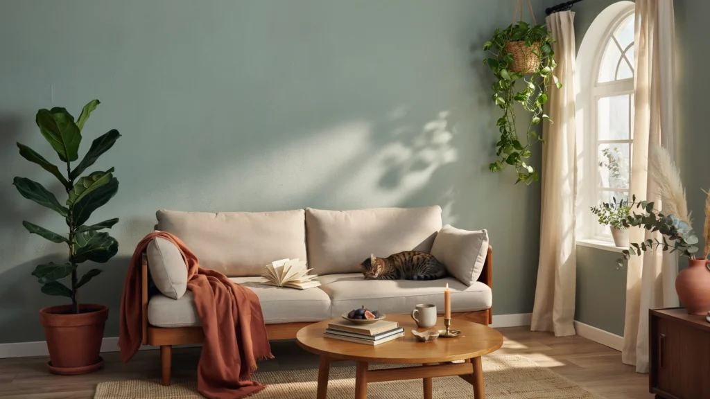
8. Bring the Outdoors In With Nature-Inspired Palettes
Colors borrowed from nature sage green, terracotta, sand, sky blue, stone grey tend to feel instantly calming and timeless because our brains are wired to respond positively to them. These palettes also age well and rarely look “trendy” or dated the way some saturated fashion colors can. Pairing nature-inspired colors with natural materials like wood, rattan, and linen strengthens the effect even further.
9. Use Color to Correct a Room’s Proportions
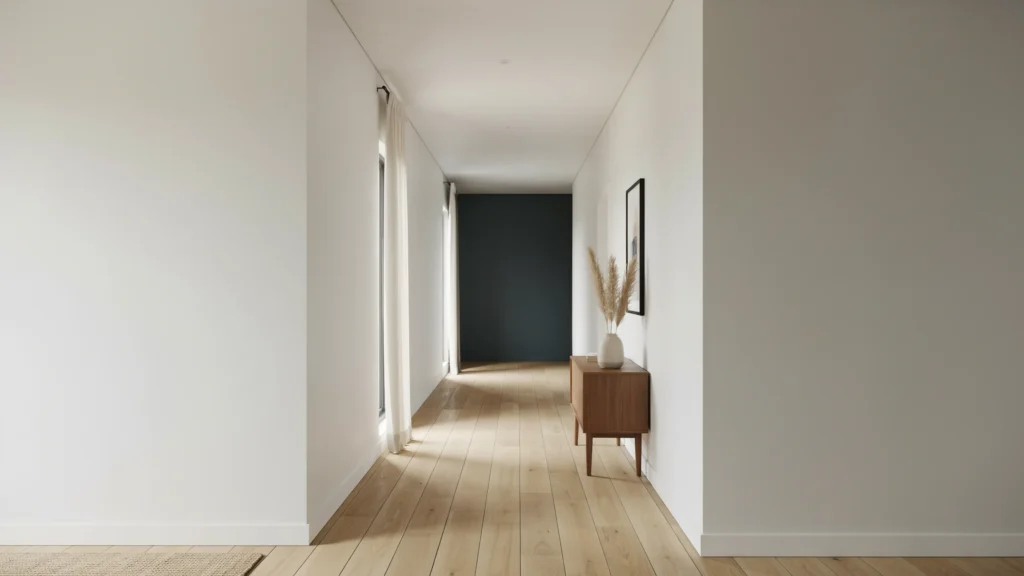
Color isn’t just decorative it can visually reshape a room. Painting a low ceiling white or a very pale color makes it feel taller, while a dark accent wall on the far end of a long, narrow room can make it feel shorter and more balanced. Professionals use these tricks constantly to correct awkward proportions without any construction work, just strategic paint choices.
10. Let One Statement Piece Set the Whole Palette
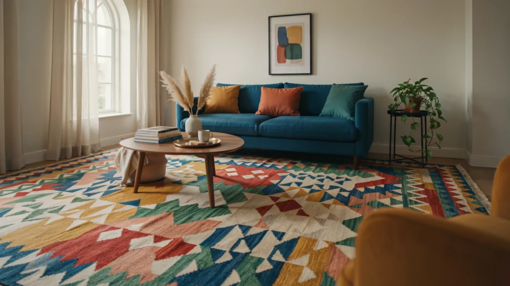
Instead of starting from scratch, many professionals design an entire room around one standout piece a patterned rug, a piece of art, or a statement sofa. Every other color in the room is then pulled directly from that piece, which guarantees everything feels intentional and cohesive rather than randomly assembled.
11. Don’t Be Afraid of Color in Small Spaces
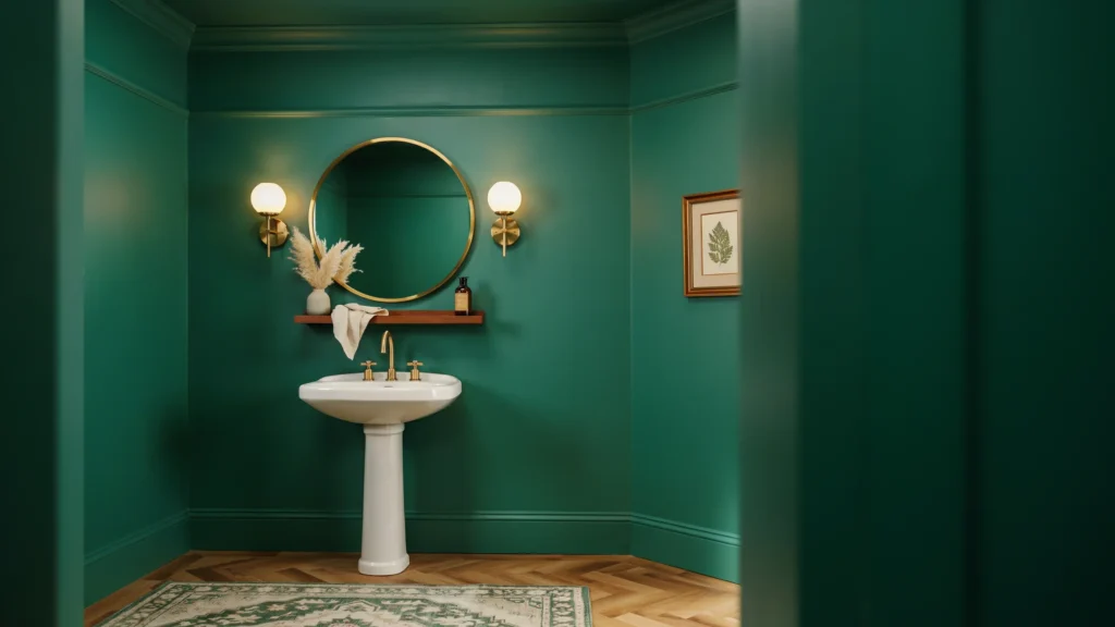
Image Prompt: A small powder room fully painted in a rich deep emerald green walls, ceiling, and trim with brass fixtures and a round mirror, dramatic and cozy small-space interior design.
There’s a common myth that small rooms must stay light and neutral to avoid feeling cramped. In reality, fully saturating a small space like a powder room, reading nook, or hallway in one bold color can make it feel like an intentional, enveloping retreat rather than an awkward leftover space. This “cocooning” effect is a favorite technique among designers for powder rooms and entryways.
12. Repeat Your Accent Color at Least Three Times
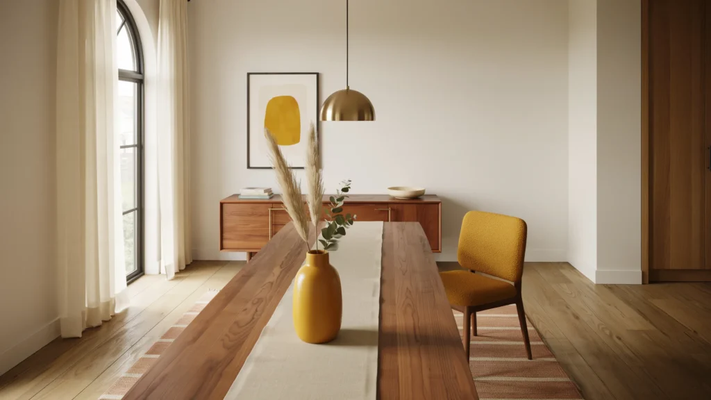
A single pop of color can look like an accident, but repeating that same accent color at least three times throughout a room creates a deliberate rhythm that ties the whole space together. This could mean matching a cushion, a vase, and a piece of art in the same accent shade. It’s a simple rule, but it’s one of the fastest ways to make any room feel professionally styled.
Frequently Asked Questions
1. What is the easiest color rule for beginners to follow in interior design? The 60-30-10 rule is the easiest starting point. It keeps your dominant, secondary, and accent colors in proportion so the room feels balanced instead of chaotic.
2. How many colors should I use in one room? Most professionally designed rooms use three to five colors, including neutrals. Going beyond five colors can start to feel busy unless you’re deliberately layering tones of the same hue.
3. Should I choose paint colors before or after buying furniture? Ideally, build your color palette first, even if it starts with just one item you love, like a rug or piece of art. Shopping with a palette in mind saves time and prevents mismatched purchases.
4. Do dark colors make a small room feel smaller? Not necessarily. Dark, saturated colors used consistently on all walls and even the ceiling can make a small room feel cozy and enveloping rather than cramped, especially in spaces like powder rooms or reading nooks.
5. What colors make a room feel calm versus energetic? Cool colors like blue, green, and soft purple tend to feel calming and are great for bedrooms and bathrooms. Warm colors like red, orange, and yellow feel energizing and social, making them better suited to kitchens and living rooms.
6. How do I know if a paint color will look right in my room? Always test large paint swatches directly on your wall and view them throughout the day. Lighting direction and time of day can dramatically change how a color reads in a space.